
EDIT: The more time I spend with this the more proficient I get in css… I haven’t figured out if that is good or bad.
3 Likes

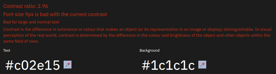
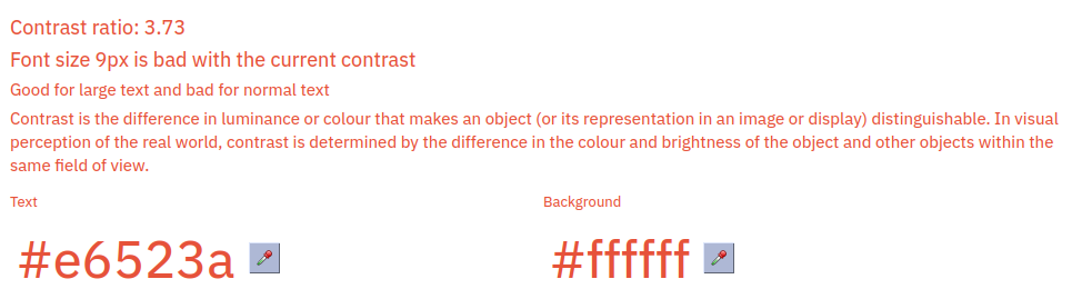
The smaller links in the upper right corner below the search box are too low contrast to comfortably read, with a contrast ratio of 2.96:
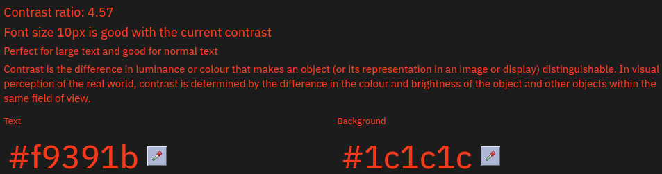
Thankfully the colour for other link text has better contrast:
Recommending to change the colours of this element as well:

The white button background is too harsh compared to the darker page background. Doesn’t have to be these exact colours (#2f2f2f for text, #aeaeae for background), but similar shades could be used instead for better comfort while still having good contrast:

Would it be possible to either get rid of this glow or at least have it conform to the button group?

1 Like
Yes, I’m not finished. ![]()
the glow is there on the light mode too.
I can remove it, and I can remove the frame too.
@win8linux Is this better?
Since you provided valueable feedback above it would be nice if you could see if i’ve adresed everything. : )
1 Like
For reference, this changes the light mode too, personally I like it : )
(except the black on orange above, will fix that.)
1 Like
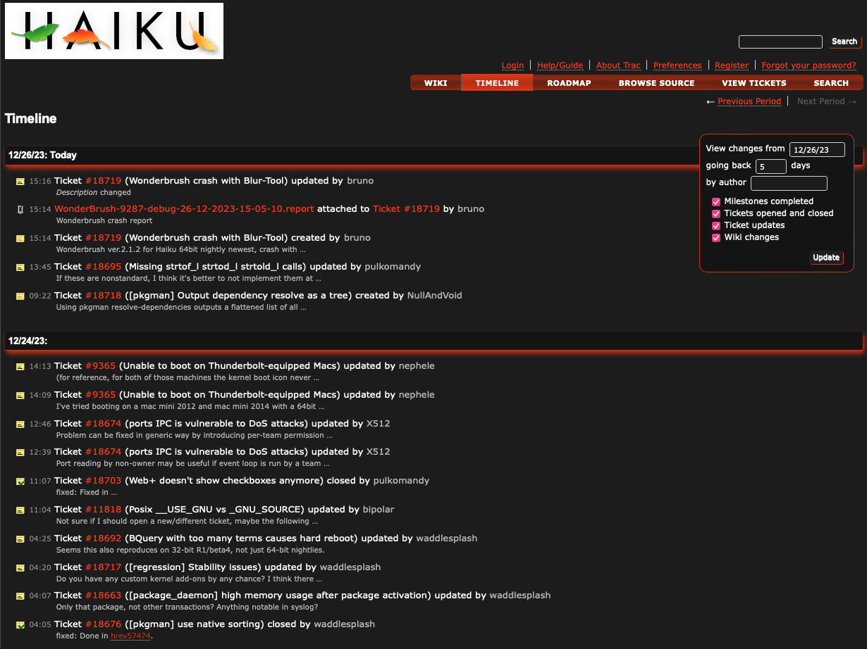
The dark mode looks better, however the smaller link text colour still doesn’t give enough contrast with the page background:

Perhaps change the colour to have slightly higher lightness/value, a bit closer to a pastel shade maybe?
Here are some suggestions:
- Tangerine (
#F28500) - Carrot Orange (
#ED9121) - Fulvous (
#E48400) - Caramel (
#ffd59a)
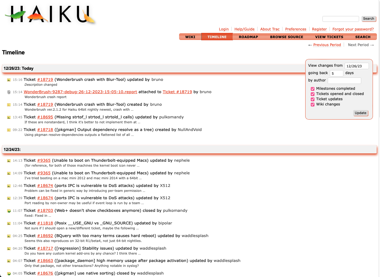
As for the light mode, the link text colour for everything also has bad contrast:
Recommending a brown shade for this as orange shades in general unfortunately do not work well with pure white backgrounds for text. Here are a couple suggestions:
- Mahogany (
#c04000) - Rust (
#b7410e) - Titian Red/RAL 050 50 60 (
#bd5620)
These at least have enough orange in them that there is some dispute on whether they’re actually shades of brown or orange.
Thanks, I will implement your suggestions.
I’ve just had the idea to take a link color in HSL color space and copy the lightness from the CanvasText, unfortunately there seems to be no way to just copy it like that, only to get the color in rgb space from the canvastext, unless I am missing something
These are two of the suggested colors, I think this looks a lot more orange.
Note also that I’ve enabled link underlines now.
(In reality the entire text span for the tickets is a link, but i’ve underlined only the link colored part)

2 Likes
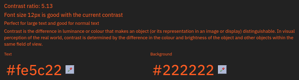
Looks good and the link text colour contrast checks out for both modes:


However the middle colour of the selected button gradient in both modes doesn’t have good contrast with the white button text:

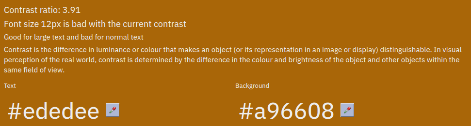
The options here are to either darken the button background gradient or make the text colour black too.
Note that the background color is user agent dependant. on Haiku you would get a higher contrast probably.
Huh, that’s peculiar. If there isn’t already a color contrast checker utility for Haiku already, I may either port Kontrast (software that I used here) or have that be my first Haiku app.
peculiar in what way? I did this on purpose. If you select black as document color in Haiku then this will be black too.
Oh, I read your previous message as the page background changing depending on the web browser and OS; that’s my bad, sorry.
That is correct
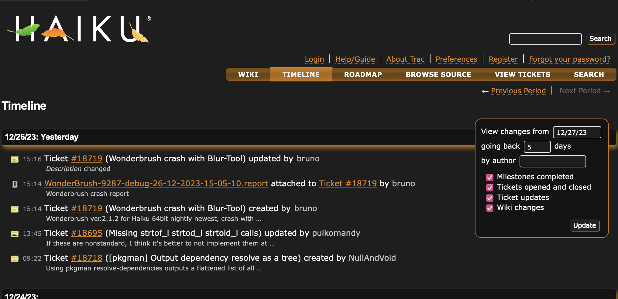
Sor the menu I would just use the same look (or at least the same colors) as in The Haiku Book: Welcome to the Haiku Book
That is, orange text on grey background. You have done the opposite (black/white text on orange background).
But then, I’m just here writing forum comments and you’re the one actually putting the work in, so, .o as you wish ![]()
Good point, I will do that.
For getting the same style (also adding the haiku leaf and adding the phrase “BUG TRACKER”) I think I need to change html too, unfortunately I don’t know where that is stored : )
I assume it is generated from some templates or something?
Yes, Trac uses templates, I think it uses Jinja now and it used to be done with Genshi before that. Trac themes can modify or replace the template
Just checked the colours there and the orange shade used for link text could use some tweaking as well:

Where is the CSS for the Haiku Book? That colour only needs to be slightly lighter for better contrast:
It’s on gerrit.
We should use the same link color for both. : )