Haiku Community
Call for Haiku R1/Beta 3 Installer logo
Development
X512
June 26, 2021, 3:17am
25
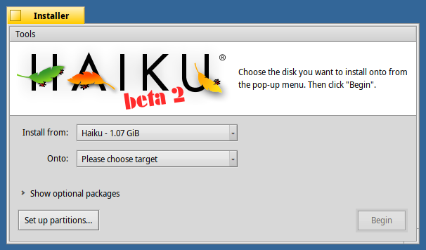
Just use the same design as before?
8 Likes
Voting for Haiku, R1/Beta3 installer image
show post in topic