Hello,
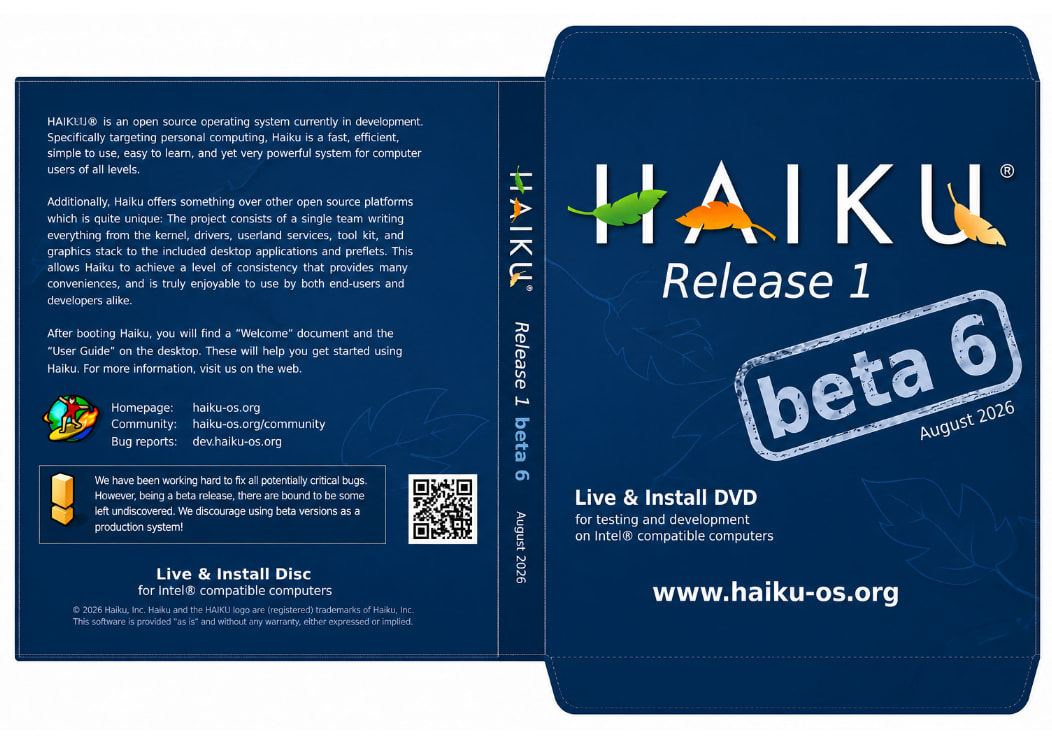
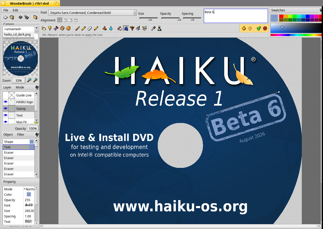
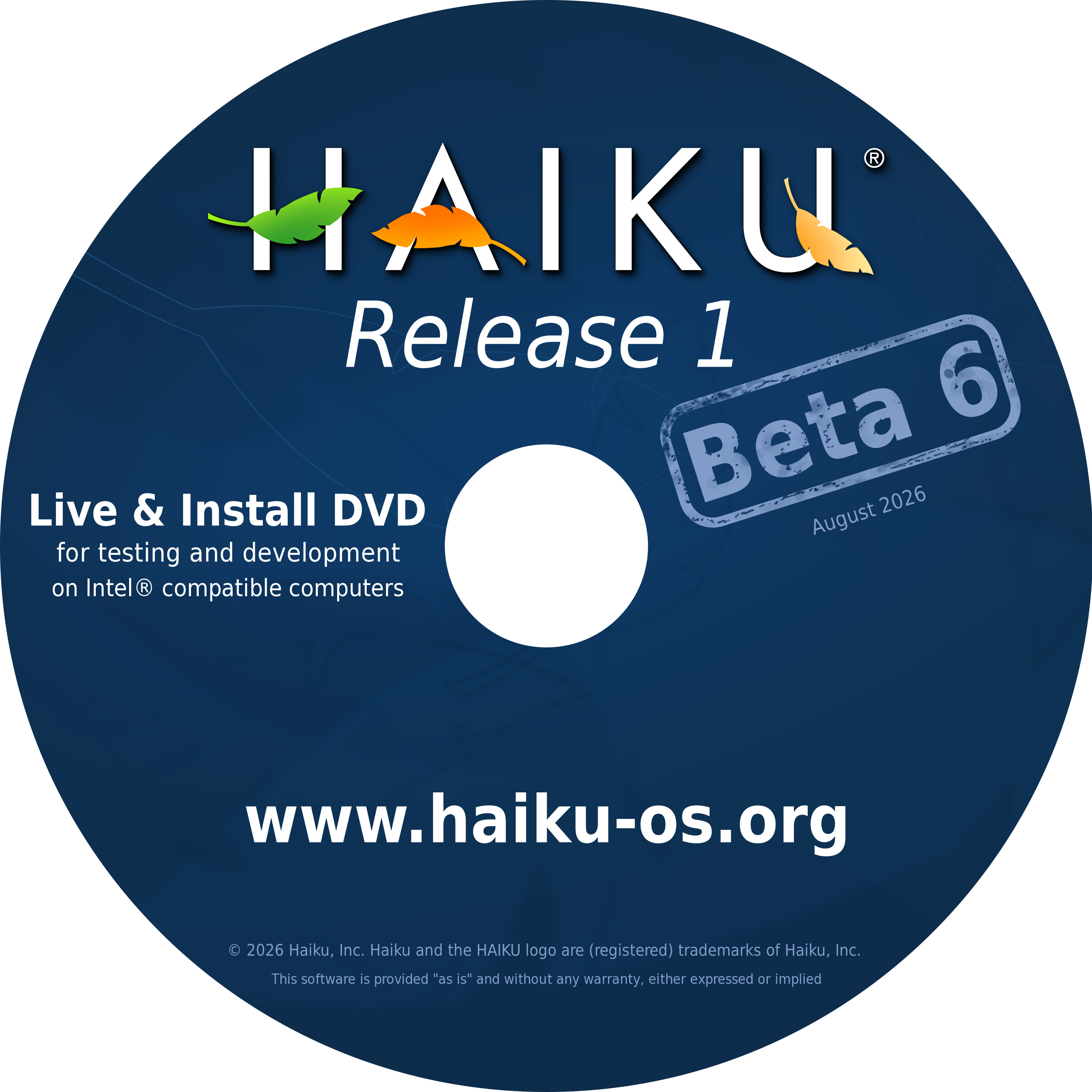
I was just updating the artwork for Haiku R1B6 release as someone mentoined
they wanted to create a few DVDs for an upcoming event.
Example:
Hello,
I was just updating the artwork for Haiku R1B6 release as someone mentoined
they wanted to create a few DVDs for an upcoming event.
Example:
It’s looking very nice, and in line with previous artwork for such purpose.
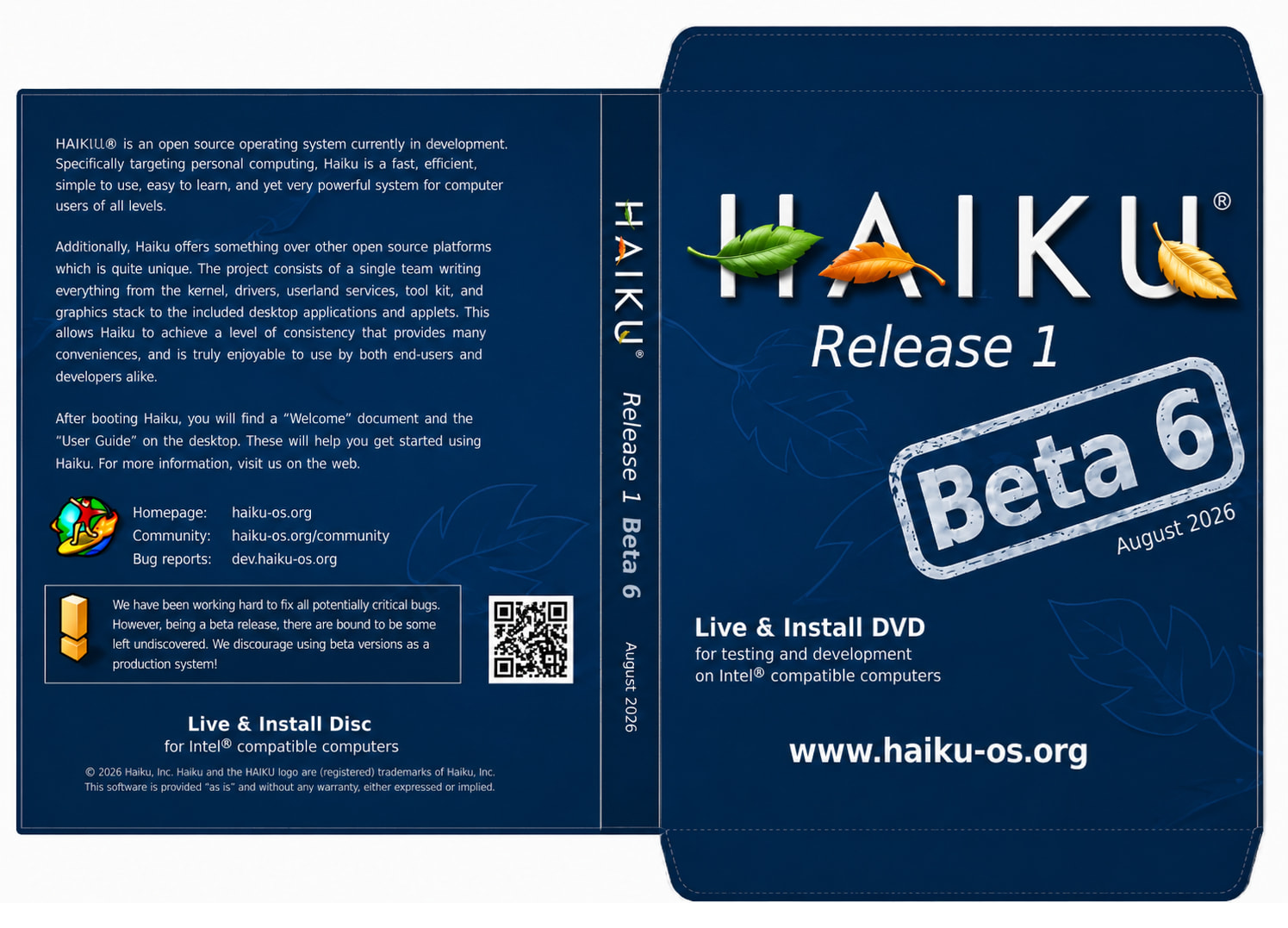
Maybe using a uppercase B for Beta ? I don’t know if we previously used lowercase or not, though.
It was, but for alphas that was using a “stamp-like” font, which was removed in beta 1 (some poeple really didn’t like it). So it may make sense to switch to uppercase now that the font is removed.
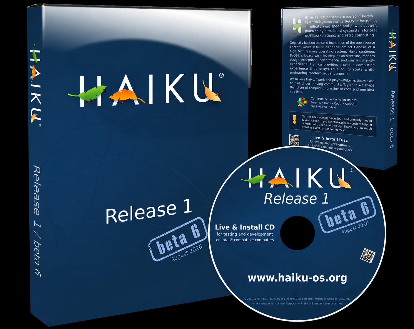
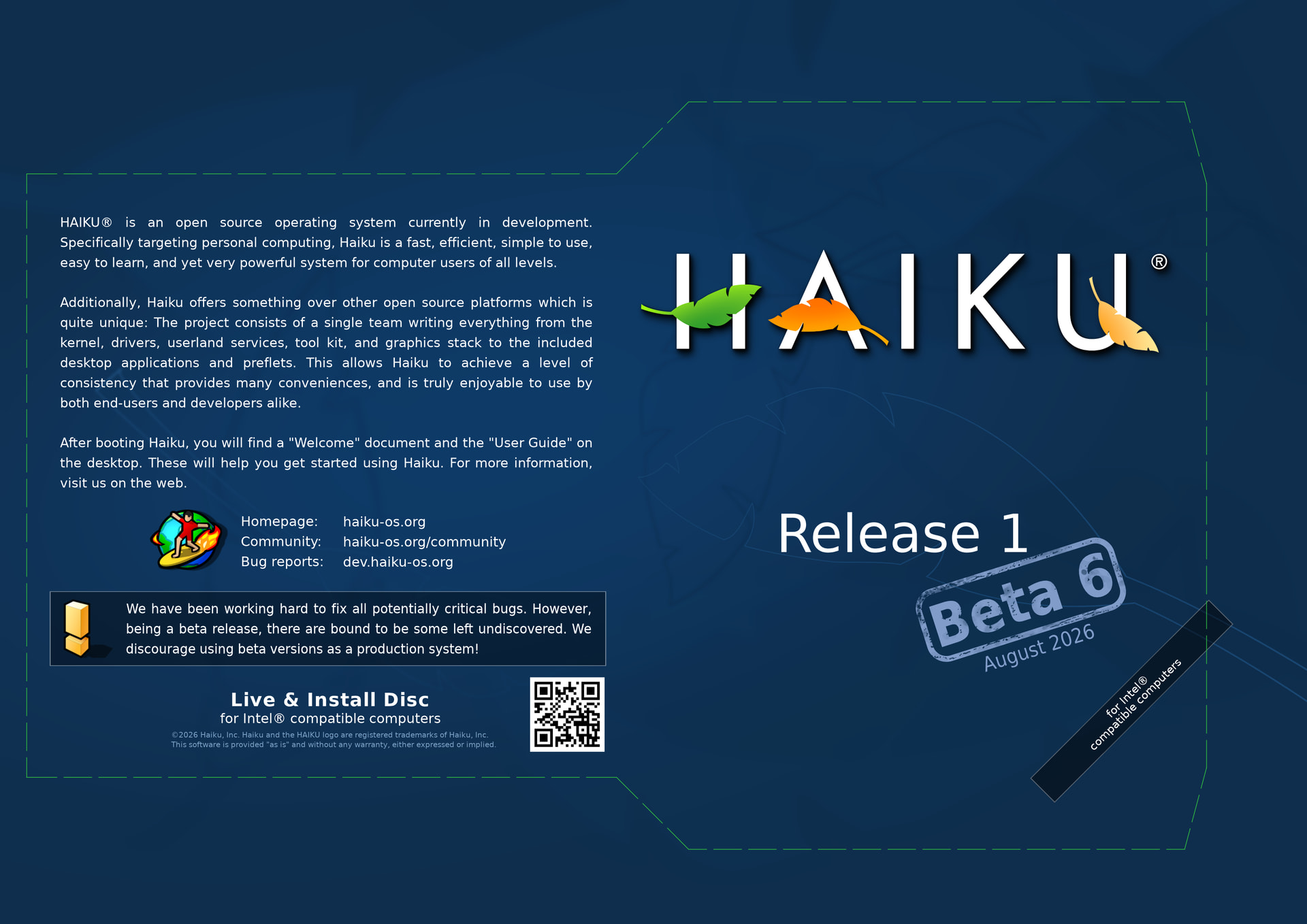
When I did the beta 1 design I worked from the template provided by the DVD manufacturer (in my case for a cardboard sleeve, because that is much lighter and easier to ship). The design usually needs to be adjusted to the manufacturer specifications and template.
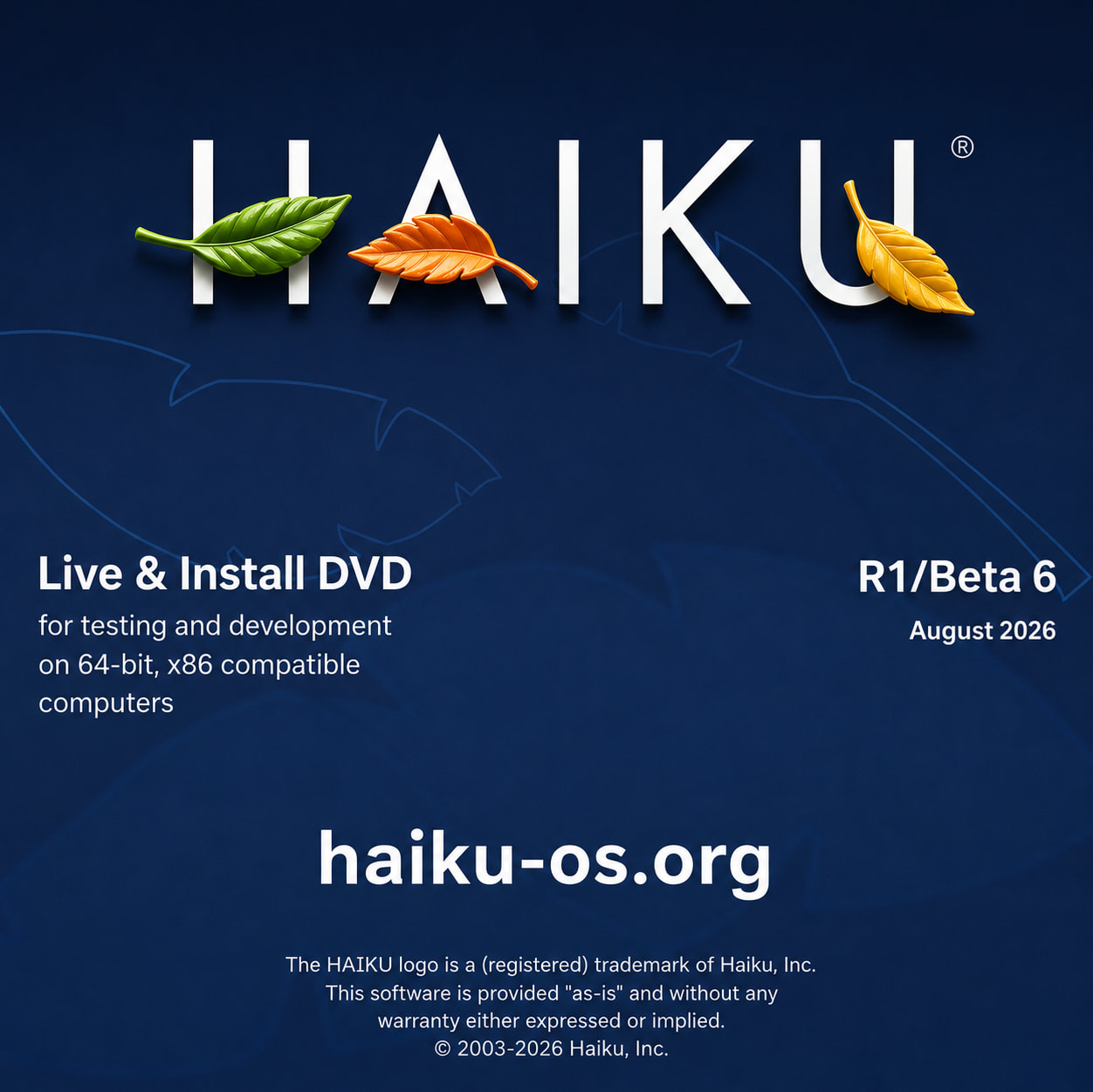
That’s not the official Haiku logo. It looks AI generated. Is it?
I would rather not have AI-slop-looking artwork on any Haiku DVD (official or not). Not just the logo, but the background leaves as well (or whatever mangled skeleton is left of them).
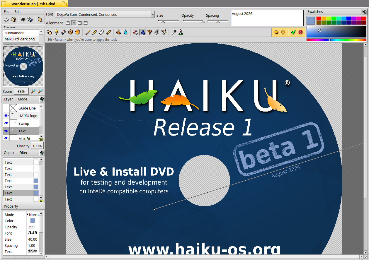
A bit sad to use AI when it’s a 10 second job to change the version number in the Wonderbrush file…
I use various tools - even GIMP and ArtPaint!
Hope we can stop derailing one’s efforts now to contribute… 
Strange Font now (“B”)
This one is original and great to use, for me!
Nice work. I won’t enter IA debates but, I definitely prefer original Haiku leaves. 3D ones that you used on second version of sleeve are a bit too catchy and are eclipsing the text. Somehow, they also give a less modern look. Sometimes, you have to try to see that something doesn’t fit…
Ok; so why did you not provide the altered sources and only some either super wierdly deformed or AI generated images?
Posting AI generated images is still not allowed on this forum, and I ask you to refrain from posting any in the future.
EDIT: quite frankly this kind of “I made a quick edit” with no actually useable files is a huge waste of our time, and quite insulting tbh.
Again, arguing? Purposeful? Really?
Ok, means I stand corrected, we used to have beta not capitalized. I should have check that myself, sorry for have not that before.
And comparing both change my mind, not capitalized looks better.
True. Neither alpha nor beta CD/DVD artwork currently uses capitalized “Alpha” nor " Beta".
Also, apha releases used the ladybugs on the feathers of the Haiku logo.
I posted the PNG and have the updated wonderbrush file. None of this is official - just displaying updated file work.
Even made a nice design for USB memory sticks.
Well, I see DVD printing is alive so guess we’ll see the official printing of the sleeve, DVD cover, or jeweled boxing…
I love the ladybug!
I think for alpha a WIP sign (or any other visual transporting the concept of something currently in construction) would have been more sense, while a small ladybug under a leaf for beta release is more truthfully what it is: some bugs are probably still there.
But I guess maybe it’s too late to change that, now that we’genly use ladybug symbol for alphas.
The story is, alpha1 had one ladybug, alpha2 had two, … and then someone pointed out that the number of bugs is supposed to decrease between releases.
At the moment they are used in the nightly builds splash screen, but not in the releases.
If I do a “digipack” packaging, there is space inside it for a lot more text and graphics than we have now. So, the ladybugs may return…