Accent colours

There is an emerging trend of various desktops having accent colour settings, wherein some elements of the active colour scheme can be set to a specified colour from one place (e.g. highlights, selections, window tab, etc.). I think it may be a good idea for Haiku to implement it, since it simplifies customisation to the end-user a lot. It should be noted that this doesn’t necessarily have to replace changing elements of the colour scheme individually; that’s too useful for advanced or more discerning users.

Here’s a video from a KDE developer that explains the general concept of accent colours and shows off their implementation of it:

NOTE: The video is months old; accent colour preferences have since been merged in time for the upcoming KDE Plasma 5.23 release.

There is now an enhancement ticket for this, so that it can be tracked more easily by developers:
https://dev.haiku-os.org/ticket/17290

This came about from discussions regarding customising the appearance of Haiku in Matrix and IRC channels. It is hoped that this thread can generate some discussion on this proposed feature, especially how it could be designed and implemented in Haiku.

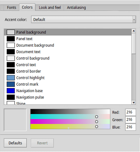
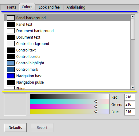
There are two possible places within the Colors tab in Appearance where accent colour settings could be placed:
image

One the one hand, where the blue line is seems to be the most obvious choice to put it in. On the other hand, perhaps it could also be put where the yellow line is instead? This might allow for the colour sliders below it to be used for setting a custom accent colour.

Then there’s the matter of showing preset accent colours to users. Looking through some Haiku applications, I found this:
image

Some variation of this could be used for the accent colour settings. However, I’m unsure about the big square being discoverable enough that users will know that clicking it will open up a colour picker and let them set a custom colour. It may seem obvious enough for creative applications, but what about for system settings?

Anyways, looking forward to getting some feedback about this.
2 Likes

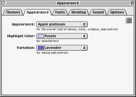
Some time ago, someone (I think @pulkomandy?) posted a picture of the Mac OS 9 theme color picker, which looks like this:

image

Indeed we should probably do something similar, and hide the “longer list” in favor of 2-3 basic colors that users pick, from which all other colors are computed.

10 Likes

I like the idea in general. But, I don’t like the idea of hiding what we have now from the user. If it was never an option then it would be different. but, I think taking away options we as users have now is not something I am in favor of. I personally use it to change a few of the colors, one being the slider bar, to my liking. Taking that away would be annoying to me. But adding preset color themes I am in favor of.

3 Likes

I’ve already said that editing individual aspects of the colour scheme shouldn’t be necessary:

1 Like

Made a couple of quick mockups showing different states of an accent colour settings implementation.

Default (no change to colour scheme):

Padding may be a bit off, sorry.

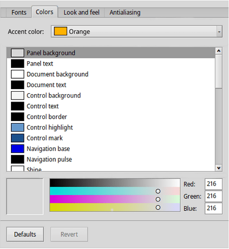
Preset accent colour (based off the Mac OS 9 theme colour picker):

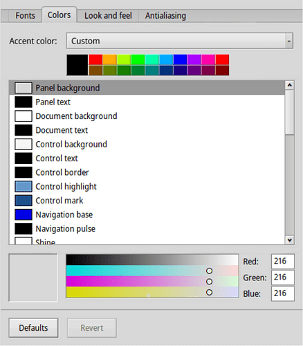
Custom accent colour:

1 Like

Instead of a custom setting the current colour list should be used.

1 Like

Default accent colour is basically just using the colour scheme as-is. Having that set while changing the colour scheme means that it will not override anything. A custom accent colour however would override parts of the colour scheme, just like preset ones would; it still avoids having the user change individual elements of a colour scheme.

Using accent colors is a good idea. IMO: The mix between accent and custom settings list is not, since it would create chaos in the design/programing of decorators and controlLooks. Maybe if we want to keep the ability to choose each color of our interface as now, the decorator or controlLook would be the one who should enable that option. So, with a control designed for accent colors we could only choose accent colors, instead for one designed for custom colors we could customize it in all aspects to our liking.

Default colour list should only be accessible through an “Advanced” button or something.

3 Likes

I already have a WIP patch for this for dark mode, it will replace the color selection with a single accent color picker plus a dark mode toggle (and potentially other modes for accesibility, not too sure yet)

Custom specific colors will stay working, but I see little reason for these 39 sliders in the normal preferences.

2 Likes

+1 to removing the current endless list of colors from Appearance preferences. It is still possible for someone to provide it as a separate app or as part of ThemeManager, but such level of customizations don’t need to be in the main preferences.

5 Likes

Feel free to submit stuff to ThemeManager btw, it needs some love…

6 Likes

I’d love for Appearance to offer a basic set of selectable themes for BeOS classic, Dano, Gonx and Zeta. Maybe even compile system sound sets that compliment those themes.

3 Likes

It should be noted that those are decorators, not accent colours.

That’s called a theme and that’s what ThemeManager handles, just sayin :smiley:
There are some already around that might need some tweaking.

1 Like

Specially, IIRC they used old fixed paths for images and such, and they don’t work correctly in Haiku I think. We should have some placeholders to specify tokens for find_path() maybe…

Anything that the user can set like that should ideally be accessible immediately post-install without needing to install anything.

I agree that a giant list of every option for which a color can be set is a little user unfriendly for most. But whatever is done shouldn’t impede anyone who wants that access or force them to set up a whole theme (by hand? with a third party tool?) to get it the way they want it,

1 Like

Nothing about anything personalization-wise is necessary, but we add it anyways in the name of giving users freedom with their operating systems. I think having some color schemes would be great, but DO NOT hide away the current color settings from the user like Windows and most Linux DEs did, and even though to me accent colors are just some crap that KDE and WIndows came up with to give people a false sense of customization I still agree with it being added nonetheless.

Also, I +1 what @mmu_man is saying, it would be great for the ThemeManager to get some support.

3 Likes

Back in the mid to late '90s I was a BIG fan of BeOS (I still have all my boxes and disks for BeOS AND BeProductive (no longer around - crying face).

I was also a BIG fan of OS/2 2.0 ßeta through OS/2 Warp 4.x . One of the things that I liked in OS/2 was that you could have separate boarder color, background color (or image) for each window. It made it much easier to be able to instantly recognize which one of typically 30+ apps I would be running at any given time.

I could have compilers running with one boarder color and background (or image) and terminal with another and so forth. I don’t remember off hand what changed when one became the active window, maybe it gained shadow?, but being able to do that is something that I really miss with all other OSs that I have used. So I would be THRILLED if BeOS gained that.

PS: The cool thing was that to change the color (or background) for anything, you just either went to the color palette and dragged and dropped it onto the boarder or background that you wanted to change. I think that if you just dragged and dropped it, it changed for all windows where you hadn’t specified a color/image for any particular window or you did something like alt-drag and drop for one specific program/window.

Just my two cents.

4 Likes