Hey,
I know some people like to read those “what are you working on” posts, so here are some images :)
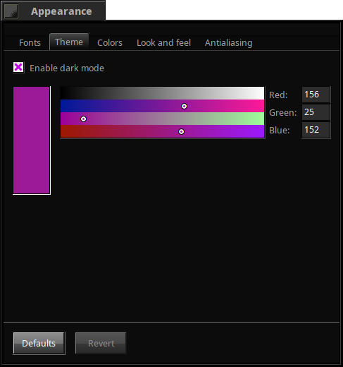
Work in progress Theme tab for appearence:
The goal here is to eventually be able to get rid of the Colors tab in release mode, so that the theme tab is an easier to use alternative for setting an accent color that then gets applied to the whole OS automatically. (the colors tab might move into a different application then, let’s see)
And a “wallpaper” I made for my personal use, for the dark mode (unedited for now, would like to make the bg true black for AMOLED later)
(scaled down as png 50%, converted from HEIC, CC0)
We already have the navigation highlight color, my changes would use it as a base to more automatically generate a complete theme, to avoid picking at 20 sliders just to get a workable dark theme :) (this is somewhat important to me as i am highly sensitive to light anyhow)
M$ is based in Redmond.
Accent colour is one of “novelties” they introduced in windows 10. Actually, it is the only colour you can change. There was not even a dark setting at the beginning. It tends to make things always looking the same and makes you feel like you have no control.
I prefer the idea of a main theme switch that would regroup colours for systems and terminal, control look, decorators and even sound themes with the possibility to modify each of them individually on an advanced panel.
I also think that playing with these settings are baby steps in the process to learn a system.
The most annoying in making a colour schemes are apps with old layout, the menu and apps like HaikuDepot tabs which are over lightening colours, some apps like Otter browser and its insane mix of colours in progress bar and few other places here and there. Also apps where document text colour is used over a panel background colour. There are still things in Qt like colours shifted or dropdown menus when they are not activated.
By the way, there are already few dark schemes available to use with Flat control look.
I don’t see why having 39 sliders as the default would be preferable to having a consistent theme, and one major color to costumize for. Also I am a bit lost on what you mean by regrouping colors, if you want a theme manager that seems to exist already in haikuports, for terminal i am planing to fix it to use the system colors by default.
The most annoying in making a colour schemes are apps with old layout, the menu and apps like HaikuDepot tabs which are over lightening colours, some apps like Otter browser and its insane mix of colours in progress bar and few other places here and there. Also apps where document text colour is used over a panel background colour. There are still things in Qt like colours shifted or dropdown menus when they are not activated.
Atleast for some apps i have fixed the colors already (teammonitor, aboutsystem), and for some i am still in the progress of doing so (e.g tracker).
It’s not my idea actually, It was mentioned in this ticket.
You would have only one setting visible by default, the one to switch theme. The other would be on an advanced panel and it could also include other things like knob and slider styles. Goal being to obsolete ThemeManager.
Myself don’t have problems with how things are, except what said above and that you can’t drop colours in Terminal prefs or that it’s difficult to drop a colour from top of the list to the bottom in Appearance.
Sorry but most of the developer team disagrees. The reason ThemeManager is there in the first place is we don’t want a full-on theme system in Haiku preferences, but something simple where you just pick one or two colors and a light/dark mode (and different control looks if you want) and the OS computes the appropriate colors for you.
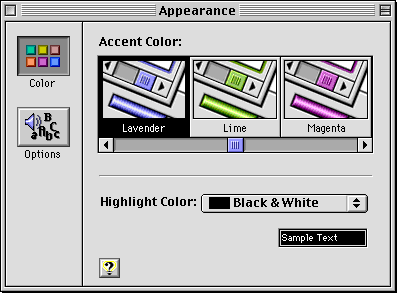
You think Microsoft invented that? Of course not. This is how it worked in Mac OS since Mac OS had support for color displays. Microsoft, as usual, copied the idea from Apple with a 15 year delay. Here is a version from Mac OS 8:
In the MacOS design language there are two colors:
One “highlight” color for selected items (in text boxes, menus, etc)
One “accent” color purely for making things more visible (progress bar filling, scrollbar buttons, etc)
We may keep the existing “colors” tab as an advanced mode, maybe. We’ll see how it turns out.
A “Custom” theme option, where users could have detailed control over the system colours would be nice. AFAICS, there are a lot of Haiku users out there with non-orthodox colour schemes.
Ditto. These two are the only inconsistent parts of the Haiku UI right now, in my opinion. Actually, not only list items, all grey selections should be replaced with the a light blue colour for the sake of consistency.
For the yellow border, I see many users preferring it, including myself.
@nephele Thank you for the Tracker fix, it already looks better.
We will need a bit more time to get used to colour on desktop but it is also a good move.
The problem is that most people are setting the same colour (or very near) for document text colour and for panel text colour (the colour used when you select outline icon label in background) so it doesn’t make a good alternative. It’s mainly due to Qt…
Allow people to pick the alternative colour instead of using panel text colour would do it.
this doesn’t have anything to do with qt, it’s just stuff in tree, using the panel text color makes no sense because trackers bg color is document background normally
To MY way of thinking, all those color sliders remind me too much of the Adobe ‘Tintii’ & ‘UrbanLightScape’ Photoshop plug-ins that were re-coded as standalone apps for Linux. I never could get the hang of the adjustments, and I’ve been tinkering with them on & off under Puppy for the best part of a decade…graphic design being a long-standing hobby of mine.
I don’t see the issue with having a proper theme-switcher. What’s the ‘beef’?
@ bitigchi:-
A “Custom” theme option, where users could have detailed control over the system colours would be nice. AFAICS, there are a lot of Haiku users out there with non-orthodox colour schemes.
Mm-hm. You’re probably right. I’ve never yet come across ANY distro that I really like the looks of, OOTB…
I certainly fall into that category, for definite…!
Nice… but imho, Backgrounds needs an overhaul really (or at least I think it’d be nice if it did). I’ve always hoped for and imagined something like how OS X and macOS 11 does it where someone can just pick or drag in a picture and set it, rather than the old school way of going about it.
I didn’t do these mock-ups. There are few “old” tickets like these asking for enhancements in different parts of Haiku. Now that users can vote for tickets, it may be interesting to take the time to check them out.
Here we are messing up with Tracker and better be cautious but this kind of small improvements here and there in Haiku don’t always require a deep knowledge and could be good tasks for beginners…
To came back to Backgrounds, you can already pick up a picture on your disk and drop it in Backgrounds, if it was what you meant. You can also drop a colour from Appearance or another app to use it as background colour.
Personally, I think that this app only needs few adjustments.
Make more obvious that you are setting up things for folders or the Desktop.
We should encourage setting up things for the default folder. It isn’t a good idea to set up an image as background for each and every folders.
The image setting is stored as an attribute of the folder, there should be a graphical way to remove it. Otherwise, even if you remove the image and come back to default setting, it doesn’t follow “default folder” setting.
On desktop side, there should be also another scaling method.
The actual method tries to scale without distortion till both width and height have reach screen borders and crops what exceeds. It works well most of time but fails for images that don’t have the right aspect ratio for your screen. You can see that trying to scale Haiku logo. I think that in this case, it should scale without distortion but only take care that the biggest dimension fit in the screen. This would leave you with borders but, at least it wouldn’t crop parts of the image. That’s important for people who want to put a family picture for example.