Please no blinking, that´s really annoying, even if only for a few seconds. At least to me.
1 Like
How is somebody who is not familiar with computers going to get Haiku on his/her computer? Unless of course somebody else installs it for them. Then it is their job to show them around and explain stuff.
I think the whole “first boot” or “welcome” situation should be left as it is. It’s fine. There are many other places in our operating system that need improvement. 
At the first moment when the blinking of the leaf came to my mind, it was also a back and forth for me, because of course it’s annoying when something is blinking.
But the longer I think about it, it would be the simplest, most noticeable and least changing detail that gets 100% attention (subtle blinking).
You could also configure it so that it blinks until the first use and then it goes and stays off.
Then we could add a notice function that welcomes the user, e.g. with “welcome to haiku, you are on the desktop” and then other information such as “to make settings click on the leaf and select your choice in the preferenes menu”.
Same for application menu or what would also be important “if you are looking for further software then go to the application menu and open HaikuDepot to see our software offer”.
Think about it
I also would say that anyone that installs Haiku would be technically inclined enough to search about how to use it, or even daring enough to risk clicking on the leaf !
But to maybe help something : isn´t there some moment during the installation process when a simple picture/message about the Leaf menu could be shown ?
Also, if other person sets the system up, then this person will have already dismissed the Welcome Screen to finish configuration , and thus our hypothetical user of the system will not see it …
4 Likes
The funny thing is that our installation process is usually quite fast and there’s no time to show anything during the installation ![]()
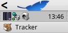
Our experience shows otherwise. At this point we have a significative number of people trying Haiku and never discovering that the leaf opens a menu.
And if you miss that, well, you will find Haiku very strange and complicated to use. But if you ran some Linux distribution or another unusual OS like that before, you may think “ok, it’s just yet another OS where people have no clue about UX design, probably they expect everyone will use a Terminal”
And this one did not happen just to youtube reviewers. People I know personally who tried Haiku, had to ask me about this. And they are not unskilled, I’m talking about sotware developers with many years of experience here, and who use or at least know a lot of different OS.
The fix is probably something simple like adding a “menu” label on the leaf button if we don’t want to change anything else. I don’t think we need animations, tour apps (to solve this specific problem anyway), or etching things on the desktop background. Just a small subtle hint will make it 10x better already.
1 Like
Maybe just add the Haiku logo somewhere above/below the leaf? That way it sort of makes it obvious that this is the equivalent of the Start menu.
Thanks, it is just a simple Wallpaper!
User can use it or not!
What is your idea to click the Deskbar-Menu?
Adding “menu” would help!? Just try!
Here a《 sign can help on the left side next by the leaf
2 Likes
Why not add a hey script to the first boot script to open the leaf menu automatically?
I kinda like Bruno’s idea. Actually, if it doesn’t help to find the deskbar at least they will learn to change the background quicker. 
The problem with a wallpaper is that people are using different resolutions and so Background app may crop a part of things.
Change the menu default to be a bar on bottom and everybody will find it. Though the risk is that they will find it obsolete because they won’t play with it’s position.
1 Like
You can use a Haiku blue color + an overlay image, just as the current Haiku logo is placed on the desktop.
Currently we can place only one image on the desktop, probably it is a kind of artifical limitation. It would be nice to be able to assign more than one image…
1 Like
 Haiku
Haiku
Haiku🔻
menu
Press “H” for Help/Haiku/menu?
How about using a short notification pointing the user to the leaf menu?
I think adding a “Menu” label next to the leaf would be enough. Sorry, but annotating the wallpaper sounds like the lamest idea ever, akin to admitting that “Sorry, we failed to UX in our operating system, so much that we need to add explanations to the wallpaper”.
Unfortunately not all keyboards have a list button to open the Haiku menu… I use it often!
What about using the Options or the Windows-key?
English:
I think in the end this will have to be done via a survey in the community, because it is the users who should be reached in the end.
-
For my part, I think the idea with the flashing leaf symbol is the best (not just because it comes from me), because everyone knows something that flashes from cell phones or other software. Oh there is a message or info, I go on it. After touching or clicking, the flashing stops forever and the user knows the location of the menu.
-
Or an arrow to the left of the feather, known in the haiku UI as open up.
-
Of course, a “menu” instead of the leaf would also help, but then the recognition value is gone, because the pen is also a distinguishing feature and should therefore be visually impaired only slightly, if at all.
-
A solution via notice would also be interesting because it gives the user tips or helps with the first steps, I think Zeta has done this before.
-
A background with tips could certainly be represented in the wallpaper selection of the system, but generally as a background does not look professional.
German:
Ich denke am Ende wird dies über eine Umfrage in der Community laufen müssen, denn die Nutzer sind es die am Ende erreicht werden sollen.
-
Ich für meinen Teil finde die Idee mit dem blinkenden Federsymbol am besten (nicht allein weil es von mir kommt), denn etwas blinkendes kennen alle vom Handy oder andere Software. Oh da ist eine Nachricht oder Info, da gehe ich drauf. Nach dem Berühren oder anklicken erlöscht das blinken für immer und der Nutzer kennt den Standort des Menüs.
-
Oder aber einen Pfeil links von der Feder, der in der Haiku UI bekannt ist als öffnet nach.
-
Natürlich würde auch ein “Menü” anstelle der Feder helfen, aber dann ist der Erkennungswert weg, denn die Feder ist auch Erkennungsmerkmal und sollte daher wenn überhaupt nur wenig visuell beeinträchtigt werden.
-
Eine Lösung über notice wäre auch interessant da der Nutzer damit Tipps erfährt oder bei den ersten Schritten hilft, ich glaube unter Zeta gab es das auch schon mal.
-
Ein Hintergrund mit Tipps könnte zwar in der Wallpaper Auswahl des Systems durchaus vertreten sein aber generell als Hintergrund sieht nicht professionell aus.
1 Like
Place an icon “Apps” on the Desktop to open the Deskbar-Menu and the Apps folder!?
Edit: BeOs did this if I’m not wrong!
then we should show the tracker open rather than default. but that takes up a lot of space from the desktop and might appeal to a few