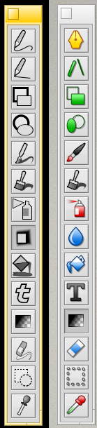
Modern Linux monochrome look makes it impossible to identify what each icon does, they are all way too stilized and restricted to a single color. This was ok on the first Macintosh in 1984 which had a monochrome display, but today, why?
On Linux I spend more time than I’d like to get color icons back in my apps, installing GTK patches, custom themes, even a special thunderbird extension…
Please use the color icons in Haiku and Haiku apps
I agree with colored icons for Haiku applications for consistency reasons.
However, just for reference, I would like to point out that grayscale icons do indeed serve a purpose in professional graphics software. The idea is that UIs are kept entirely in monochrome as not to mess with the color perception of the user and to not distract from the content they are editing. This usually extends to the icons (Affinity Photo has a preference for monochrome icons, for instance).
For now, I don’t see ArtPaint and Haiku being used on a level where that kind of thing really matters, though. I don’t even think Haiku currently has color management.
I think at some point in the future, a system-wide API for retrieving standard icons would be useful. Not just for consistency, it would also make it easier to write new software. There is just no reason to re-design a brush tool icon for every single program on the system. And if ever a system-wide setting for grayscale icons was introduced (which is, where I believe such a preference should live), developers would only have to add grayscale versions of their custom icons, not the whole set.
Looks like I’m in the minority that likes the greyscale icons better for ArtPaint…
Maybe, it’s because I’m used to ArtPaint tools looking like that for the last 20 years (though admittedly I’m more a WonderBrush user).
To me the current 1st icon is more intuitive: freehand pen. I don’t get the fountain pen tip at first glance.
The similarity to the 2nd icon immediately tells me: straight pen line.
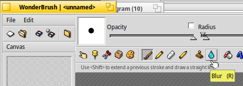
The blur icon (8th) is intuitive, the water drop isn’t (to me).
The rubber icon (12th) looks more rubbery to me.
Anyway, if it’s decided to go with the new coloured icons, the set needs to be complete.
For a small poster you need high resolution at least 300dpi better 600!
And for printing you need CMYK means you need 4 times that much memory for one point to print… and much more if you work with Wonderbrush… which even does not have CMYK only RGB
If you work for Web only, so there is no problem to use Wonderbrush
I guess that our friend 3dEyes just did a mockup with first icons he had on hand. Some of them do a perfect job like brush or spray can, others do not, like fountain pen.
Well you’re not entirely alone, anyway! I find the current set much more intuitive than the coloured ones. And the lack of colour doesn’t bother me at all.
So that’s what it’s supposed to be! I absolutely couldn’t figure it out. I find the current set intuitive in every case. Many of the colour ones are not.
The highlighting could be a little stronger maybe, but does the job for me. I also think there’s a good reason for greyscale icons – they don’t have to draw attention to themselves, they’re “background elements”. Frankly, I much prefer the coherency of the current set – the coloured ones don’t have that, and to me that’s a strong negative.
Traditionally, i.e. in software taking a cue from Adobe products:
a fountain pen is used to represent a vector tool that draws editable béziergons by manipulating control points and tangents
a pencil is used for freehand drawing tools that are either designed for manipulating single pixels (in raster graphics software) or drawing freehand polylines (in vector graphics software)
a brush icon represents a tool that repeatedly stamps a tip bitmap of an adjustable size along the path of the mouse
In my opinion it makes sense to stay within these conventions to not confuse experienced users.
The water drop for the blur brush tool is immediately obvious for anyone who has experience with software like The GIMP, Photoshop, PhotoLine or Affinity Photo. But it is not at all obvious for a beginner. Then again, nor is the original ArtPaint blur icon, which might also represent some kind of drop shadow or motion blur effect.
The grayscale straight line pencil tool to me is a bit less clear than the colorful one since it is only obvious that the defining feature of the grayscale icon is the straightness of the line after comparing it to the freehand pencil icon above.
From a purely aesthetic perspective, overall, I kind of prefer the grayscale icons as, somehow, they look a bit less busy and more consistent with each other to me.
But frankly, there is so much about ArtPaint’s GUI that could be improved with some minor tweaks (some icons extending too far towards the tool button edges, the controls in the document window being inside the area with the scrollbars, just to name a few), but there isn’t much point in worrying about all that until the base functionality of the software is completely robust.
You’re in luck, this will be fixed in the new version!
I’m fixing bugs and ui issues so hopefully the usability and robustness will be noticeably better soon. Whether or not it’s the right time to worry about icons, just rest assured the core app is under development right now.
Using the drop image for the blur effect icon is a common practice in almost all icon sets and graphic programs. If you don’t believe me, try googling “blur icon” and almost all icons will be like that.
I’ve got to admit that I can’t remember using the blur tool, because I don’t work with pixel images very often. I do have to rely on the tool tip anyway, because it’s not intuitive to me. I’m perfectly fine to use what seems to be standard icons, just stating my personal opinion here WRT ArtPaint and its traditional icons.
Hey everyone, I posted a PR for fixing the ugly gray artifacts when using the line, ellipse, and rectangle tools. Basically it’s just redrawing the affected portion of the image. It works great on my machine, and it sounds like it works for humdinger as well, but since it’s redrawing potentially the entire screen with a large shape I’d love if more people could test.
So: if you have the ability to pull the source and my PR from HaikuArchives/ArtPaint, give it a try - I’d appreciate it!