Lately the Deskbar has received the new “mini mode”, with the shelf growing to the left from the top right corner of the screen. It replaced the standard Deskbar “mini mode” when the Menu and the Applications Expander were sharing the top row and the Shelf was growing to the bottom in rows.
I find this change very frustrating and kindly ask to revert it.
Firstly, this is not how Deskbar behaved on BeOS. If Haiku sets its goal for R1 as being the as-close-as-possible implementation of BeOS in open source, then Haiku’s components should resemble the BeOS’ ones, except for the obvious bugs. All UI changes and enhancements should be saved for R2, or at least everything that was in BeOS R5 should be also in Haiku. That was the original idea, wasn’t it? Then the mini mode of the Deskbar should behave as it did in BeOS.
Secondly, I am a heavy user of the tabbed interface, and my tabs usually take all the top row more or less up to the Deskbar. Now I have to choose whether I want to see the tabs or the Shelf with notifications which are also important. Besides, the place immediately to the left of the Deskbar is a very convenient place for the volume replicant, which saves me one click for every volume change.
Third of all, the space below the Deskbar is utilized for launchers, not by me but by many Haiku users. I, for example, know how much the Shelf would grow during the typical usage, and I placed the launchers in the way they aren’t covered by the Shelf.
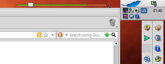
This is how my top-right corner looked before the change:
This is how I use the Deskbar since the days of R4.5, and this, in my opinion, is the best arrangement possibe, while the new “mini mode” is very unconvenient and frustrating. Please at least make the previous “mini mode” an additional option.
I hadn’t noticed the change, since I usually hide the deskbar in small screens. The new mini layout allows the system tray to be visible even with other windows around and probably works better when you have a lot of those system tray icons. I agree, however, that the old layout should be kept as an option at least until R1.
I’m open to feedback but we are NOT building a BeOS clone, we are building a replacement to BeOS and we don’t have to keep compatibility with BeOS where it doesn’t make sense. IMHO this is one of those cases where keeping BeOS compatibility doesn’t make sense. Deskbar is allowed to evolve in new directions and we don’t have to wait for R1 to change it. The Haiku philosophy is sane defaults, not maximal configurability and building an OS that provides a fluid Desktop experience on personal computers. If we’re going to pick on Haiku for making incompatible changes to BeOS let’s revisit the package management debate and see how the cries of users were ignored and certain members of the community rage-quit as a result. I’m not a Haiku dictator, hell I don’t even get my way most of the time but I do respond to feedback and adjust my changes to suit the whims of users. The squeaky wheel gets the grease and the squeaks I’ve hear so far have been mostly positive about the new mini mode. I’ve been watching screenshots of what people actually use and I’ve seen a few people who the new mini mode. Do you actually miss the old mini-mode or are you just trying to keep compatibility with BeOS? It’s possible to have both mini modes at the same time, but I don’t think it’s worth the effort.
Point 1 is specious as I’ve already stated. The goal of Haiku R1 is NOT to be as-close-as-possible implementation to BeOS and it never was.
Point 2, if you use tabs so much your volume replicant is going to get covered up anyway once you have a bunch of tabs open. I’d say switch to vertical expando mode to fix point #2 but that wouldn’t work with your launcher underneath as outlined in point 3.
Point 3, sorry I destroyed your ability to have a launcher underneath in vertical expando mode and ruined your ability to have volume replicant on the side in mini-mode. It’s hard to predict how everybody will use Haiku.
I’m sorry that the new mini-mode is inconvenient and frustrating to how you use Haiku but if we try to cater to how they BeOS worked we’ll never be able to evolve the system.
I’m happy to hear that you’ve been using BeOS since 4.5 and I solute you, but I’m not very receptive to this argument which sounds like an appeal to tradition more than anything. I ruined your carefully constructed layout, but new mini-mode has the benefit of allowing maximized windows to take up the whole desktop without covering the replicant shelf icons.
Until the default zoom behavior got changed (by me) a while back the zoomed window would cover your Deskbar replicants making them inaccessible and it would cover your launchbar too, certainly this was the case back in BeOS R4.5. And until the auto-raise setting got changed (by me) it was hard to make Deskbar come forward over icons again. There’s a balancing act between screen real estate and Deskbar accessibility and I’m trying to accommodate most users by providing options that will work for most people. It’s impossible to make everybody happy all the time.
Software changes. BeOS is dead. Long live Haiku. While I’ve increased the frustration in this case, I’ve reduced it in other cases. Perhaps this mini-mode change will get reverted and you’ll get your wish. Perhaps I’ll get around to adding the old mini-mode option back, but maybe not as I’ve got a lot on my plate.
I must confess I never was an enthusiast of the Deskbar mini mode. I always went back to normal top right, full size, mode.
I understand and respect both opinions. My suggestion to keep an option to use the old mode only makes sense if 1) it does not imply a lot of effort to maintain, or 2) there is indeed a substantial base of interested users.
Haiku does not need to be the same as BeOS, ok, but for old-time users a small change like this can be quite an emotional thing .
We could introduce a vertical mini-mode (old mini-mode) and a horizontal mini-mode (new mini-mode.) Technically the new mini-mode is vertical because the orientation is defined by the layout of the app menu, which is vertical. But we could pretend that new mini-mode is horizontal since the replicant shelf icons grow Deskbar horizontally compared to how it used to work where Deskbar shelf icons would grow Deskbar vertically. Right now the only horizontal mode we use is expando mode while vertical mode has three options, expando mode, mini mode, and full mode (which not used but is still present in the source code and Deskbar API.)
The mode-switching UI is not very good because it’s not very discoverable that you are able to change the mode by dragging the little dragger widget on the side of the screen. The solution to this problem in my head is to add a second tab to Deskbar preferences that would allow you to set the mode with a nice visual UI of all the different options.
That would be a really nice solution. While the dragger, IMO, should stay, it can be backed with a drop-down list of the Deskbar modes in the Deskbar Preferences. And, possibly, something that looks like the Screen preflet with its hot corners to choose the position of the Deskbar on the screen, because it doesn’t make sense to duplicate the functionality of the dragger in the preferences only partially.
The lack of discoverability of the dragger is not an issue, because, well, all the user needs to do is to read the user guide which he/she should do anyway or notice the tiny dots that literally call “drag me!” Note that on Windows since Win7 the position of the taskbar is changeable but there is no visual clue of what should be dragged in order to change it. We have at least the dragger.
Regarding the little deskbar handle discoverability, I would just add it suffers from the same problem of many other interface widgets. In newer his resolution displays, we need to increase the font size, which allows Haiku to be usable. But many controls can’t be resized this way yet.
My argument for keeping the old mini mode is that it’s a lot niftier (if that’s a word) than the new more generic mini mode. By that I mean that it’s so small and humble yet so powerful, and as a result it’s quite satisfying that it can be the start of so much after clicking on it. I liked the concept of moving so much out of the way visually while still having so much available just a mouse click away.
That made it (feel) really attractive, well thought out and a special element to the OS.
Don’t get me wrong: I see the usefullness of the new mini mode and it’s a relevant option and an improvement as such. But I feel it would be wrong to introduce it as a replacement to the old mini mode. So IMHO it would be best to let them both live together.
Thinks like this are why I suggested converting the entire deskbar to a bunch of replicants and the Deskbar itself being just a container/manager for them… similar to Plasma on KDE just not bloated.
Something like a replicant grid view would be needed… and people could design their own layouts for things that way. Might be useful for productivity applications also… kind of like GIMP with it’s tool panel but less clunky.
I would pretty happy if the current Deskbar would simply allow us to create folders or categories of applications. Doesn’t have to be anything fancy, just something that works. There will always be someone wanting something different, and not all can be done.
You can add new folders in Deskbar menu by adding items in /boot/home/config/settings/deskbar/menu. For example you can add “Categories” folder and organize applications inside it as you like.
We are not happy with the way it’s implemented at the moment. It’s not easy to do, and when doing it, your DeskBar is not automatically populated anymore.
mmu_man had proposed a system to use queries instead of virtual folders in DeskBar, which we probably need to revisit, finish up, and experiment with.
It is unlikely that automatic and manual application link creation will work simultaneously. If user want to reorganize links, he should use separate directory like “Categories” or disable automatic folders.
The idea was not to allow full, unlimited customization with this, but to have a choice of “flat” or “categorized”. In flat mode it would be the applications menu is now, just one very long list. In categorized mode, apps would be in categories. The categories would be set by an attribute in the app executable. A query would collect all apps with such attributes and show them at the right place in DeskBar. Customizing could be done by editing the attribute on executable files.
This was just some experiment, it probably has much limitations and maybe it doesn’t work good enough. But it wouldn’t need the “blue/virtual folders” hack and that would already be a great thing.
I guess we’re going for a larger rethinking of the DeskBar menu at some point anyway, adding a search field or some kind of type-ahead filtering maybe? The current flat list clearly doesn’t work now that there are more than 6 apps available for Haiku
 .
. or notice the tiny dots that literally call “drag me!” Note that on Windows since Win7 the position of the taskbar is changeable but there is no visual clue of what should be dragged in order to change it. We have at least the dragger.