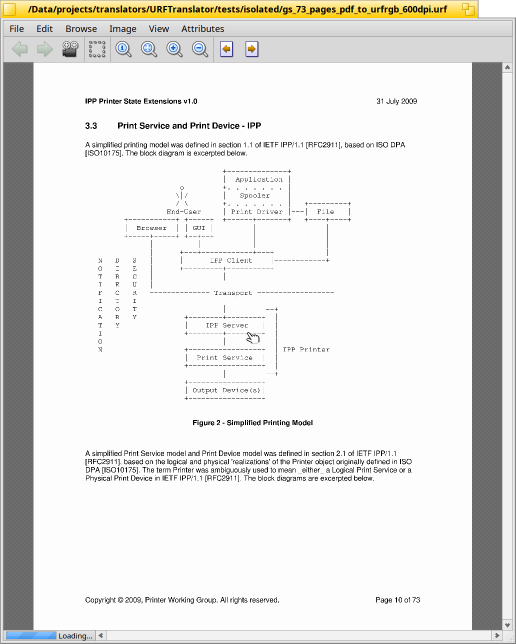
In the context of the WIP CR to improve ShowImage progress reporting for long loading time, and fixing at the same time #12211, I’m strugglingbig time to figure how to layout the ProgressStatusView I’ve made,
a small view with a status text and a BStatusBar/BarberPole hybrid, over the main view of ShowImage.
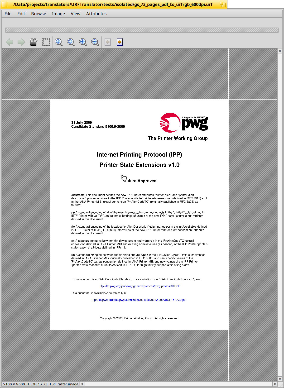
ATM, I’ve fallback by adding this view right after the menu so I could move to the progress reporting code, at least. It looks[1] like that:
Clearly, this progress status view should NOT stay there, what I’m looking after is help to understand how to:
place it over the image view area, centered, auto sized (at top, currently it take the whole width, but that’s not what I want for an over position)
being able to show and hide it at will (the reporting logic already have a quiet period to avoid showing it if the loading time is fast enough)
The ShowImageWindow use a BGridLayout where is ImageView, the vertical BScrollBar, the image info status view and the horizontal BScrollBar. A grid of 2 x 2.
Should I create some transparent overlay view ? How to place it over, on demand ? By putting everything in the control of a BCardLayout ?
I don’t want to just draw it manually directly from ImageView::Draw(), because I don’t want to lose those then:
the autolayout/autosizing of the progress status view
the animation of the BarberPole
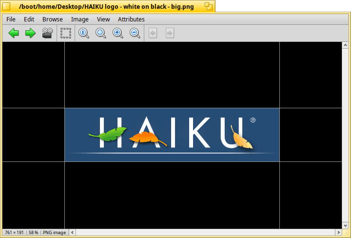
Otherwise, while exploring ShowImage code, I’m also proposing to change the background area around the image:
use instead of plain black a stripes pattern, which make easier to see the limits of images will large portions of black, and we already use stripes pattern to show “emptyness” in other apps, like in DriveSetup until a disk/partiton is selected.
transparent/translucent part of the image remain visible via the usual checkered pattern.
in fullscreen / slideshow mode, I propose to keep the black background around the image, it make more sense. Or maybe it should be only in slideshow mode?
What’s your opinion about that change of background?
Don’t be confused, it’s not showing a PDF document, it’s a raster image of a page from a large 73-pages URF/AirPrint file of 200MB - hence the loading time ↩︎
WRT the background around an image, all sound good. Keep the black in full-screen. When choosing the colour for the hatching stripes, don’t use too much contrast. WonerBrush gets it right IMO:
No, I don’t use the light mode. But I expect all documents to use the document background color, unless there is a really good reason not to. Usually people pick the light mode because they have some preference for it? (I don’t see any difference between a picture on a light bg and a ODT text on a white bg; also WebPositive does the exact same thing)
I’m not really sure the boundaries lines needs to be a user setting: it make perfect sense for any app allowing to zoom out of the document dimensions.
I don’t think it does, but you can just display it next to it if needed. The Scrollbar will shrink to acomodate you (and since it is only usefull after the image is loaded I don’t think it’s diminished size will be a problem)
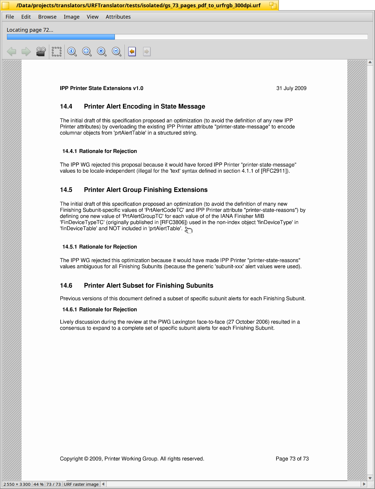
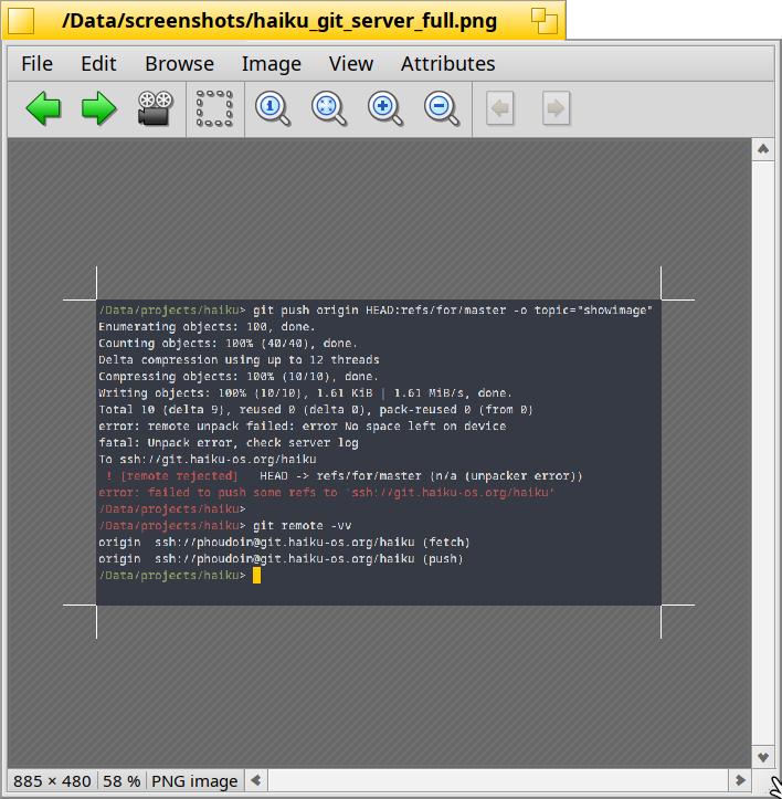
Well, while trying to push the CR regarding ShowImage background and boundaries lines marks, I got this error, which I screenshot to share it as viewed by this CR’s ShowImage:
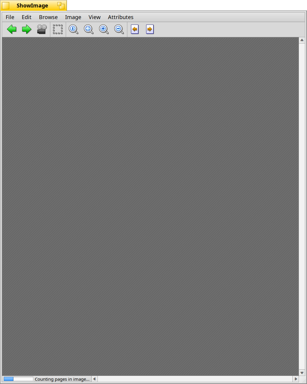
Here my current progress about improving ShowImage… load progress reporting:
When the load take less than 200ms, nothing is visible, the image is shown as today, and that it.
When it take too long time, if/when the translator don’t provide any progress status (or not anymore), it show a barberpole and the last status text received (or “Loading…” if none were ever received):
When the load is completed, the status bar returns to its usual behavior.
The second screenshot was taken on a first image being loaded by ShowImage. I forgot to adjust the title in that case, it’s not yet updated because currently it’s done on image loading completion. Will fix that.


 .
.