By the way, for people lacking a three button mouse, the same action is also mapped to Modifier+Right click (cf. how the regular Right click context menu is also mapped to Modifier+Left click).
I personaly believe that this new menu needs to be 100% customizable since what it offers is already quite redundant and the alphabetic organization could be relegated to third party menu sorter apps. Aslo, how does this feature conflict with programs that support the middle-click clipboard?
To repeat what I said in the code review, I think this is not a great use of the middle click, for several reasons:
Some machines (laptops with touchpad) don’t have a middle click, which would make this menu unreachable. So if we put anything useful here, we also have to put it somewhere else
It reserves the middle click for this functionality which means we cannot use it for something else, on the Desktop and probably also all Tracker windows (since the Desktop should, as much as possible, behave like other Tracker windows)
Also, what you suggest is another way of starting apps. Why not use the DeskBar menu for that? Why a completely different menu? And if you don’t like the DeskBar menu, why not improve that?
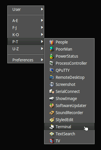
This was actually my original intention, however this being a RFC I wanted to show off different possibilites here (admittedly maybe then to the detriment of the as-simple-as-possible approach). However, I’ve since added a modifier key check to the patch set to showcase both possibilites; holding down the Modifier key while Mid clicking now shows the extended menu as per the screenshot above, while Mid click without Modifier brings up only the user folder menu as per below, making it more like a personalized shortest-way-to-favourites (more on this below) feature. No sub-folders are (currently at least) parsed for this one either, but maybe this is actually the dead simplicity one would be after in a case like this?
See above - “By the way, for people lacking a three button mouse, the same action is also mapped to Modifier+Right click (cf. how the regular Right click context menu is also mapped to Modifier+Left click).” Also, I would argue that most relatively modern laptops probably have touchpads that support multitouch, and then often also e.g. one/two/three finger tap actions simulating left/right/mid clicks respectively (of course, this capability may or may not extend to more niche operating systems like Haiku, so YMMV perhaps).
Well, the Tracker/Deskbar UX hasn’t evolved significantly the last 20 or so years, so it’s not like there’s a (widely known?) long queue of candidate proposed actions to assign this to, but hence also this RFC to solicit input from the community. As for the Desktop closely matching the File Manager (Tracker in Haiku’s case) and the two being closely (and arguably in quite messy fashion) mashed up even code-wise, this was a flawed concept already on other operating systems (cf. e.g. Windows Explorer), as these two UI elements are completely distinct entities UX-wise, as is the Deskbar. Yes, consistency is important where it makes sense, but (IMHO) not at the cost of UI element specific optimization of capabilities.
The core idea here is really to simplify some frequent UI actions by providing alternatives catering to different workflows. Sure, the Deskbar could really use some polishing UX-wise (IMHO at least), and perhaps also some adjusted defaults, but due to it’s nature and typical (default top-right) placement it requires more mouse movement back and forth on larger screens, plus the associated lengthier Deskbar menu diving. Contrast that with a “one click right where I am on the desktop” quick launch approach as per e.g. the screenshot above, which becomes more similar in reachability to a keyboard shortcut, but a mouse-driven one in this case (because different people have different workflows and so on).
To summarize, all in all, I don’t think there’s any harm in having a friendly community discussion - maybe at some point even a new Glass Elevator discussion? - around Haiku’s current (including maybe some of its defaults?) and possible future candidate UX design choices. What I provide with the patch set in Gerrit is simply a possibility for others to try out one such possibility for themselves, in a “letting code speak / try it out for yourself / seeing is believing” kind of fashion.
Thanks for the input so far - please keep it coming!
I must say that to me this looks like a pretty arbitrary way of assigning the middle mouse button. I think if this is added there should be a general definition of what the middle mouse button is supposed to do in Haiku. This only makes sense to me if the middle mouse button has some common function users can expect to happen at places where it makes sense.
Currently as a user it wouldn’t be clear to me what the difference to the right click menu is, why some items are in the middle click and some in the right click menu.
So the above would mean that if this menu gets implemented that there should be some recommendation in the user interface guidelines of Haiku explaining the use of the middle mouse button. Namely that it would be recommended for applications to use the middle mouse button to show a menu of some kind of auxiliary items, if applicable. And there needs to be some definition which kind of items would go there and which would belong in a normal context menu. But currently this is all unclear to me.
This seems like a rather obtuse feature to have, IMO. It is not intuitive (users largely won’t figure this out) and for the most part, duplicates existing Deskbar functionality.
While Haiku offers some flexibility in workflows, it has an intentional vision and design. Users who need more workflow customisation can install third-party programs (i.e. 8Dock, DockBert, LnLauncher, etc.) or add-ons. Could this be implemented as a separate program or add-on? This seems like a more mouse-driven counterpart to QuickLaunch.
Haiku doesn’t need to follow UX decisions taken by other operating systems. as a reminder. They could be considered, but not needed to be heeded. What might make sense for other systems may not apply to Haiku.
Why not instead of a middle-click menu, improve the existing right-click menu? This idea seems rather reminiscent to what *box WMs do with their right-click menus.
The haiku HIG advises against using the middle mouse button… not because many computers lack it, but simply because many users don’t understand how to use it, rightclick plus a modifier key is not a good alternative either in that case.
In addition, as a user it would not be clear why middle mouse and right click does something different on tracker.
Skills you can expect the user to have:
* Single-click
* Double-click on primary mouse button
* Single click with secondary mouse button
* Drag with primary mouse button

Skills the user might have:
[...]
* Single-click with tertiary mouse button
[...]
Don't Use These:
[...]
* Secondary/Tertiary click with modifier keys