I want to ammend the Icon Guidelines to add some better support for dark mode.
Having used Haiku icons on Dark mode for some years I think there is only a couple of edge cases that make the icons work badly now. In generall they are very colorfull, and usually work great on Dark mode.
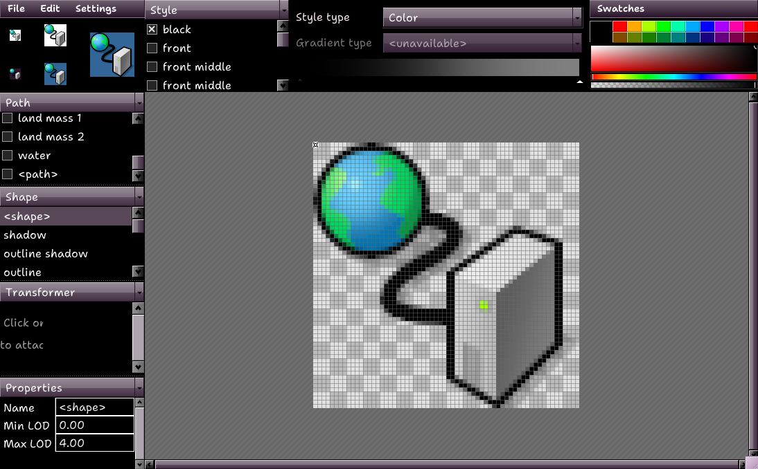
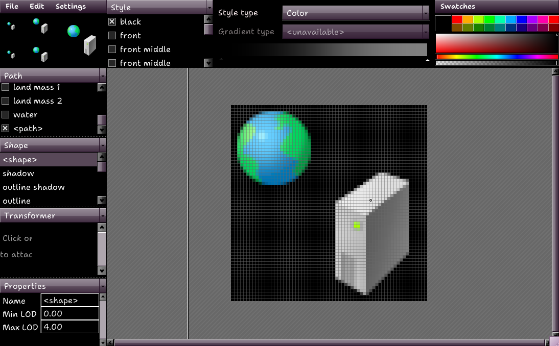
The main Problem i’ve identified is using very dark or black colors to represent functional elements. One good example is the icon for the network preferences, the wire between the globe and the server uses a black wire.
One option would be to disallow functional elements that have the same color as the outline. One other I could think off would be adding a white outline to these specific detals instead.
I guess the ideal solution would be that such elements could change color depending on the background color? Or the white outline should show up depending on the background color.
Maybe something similar to the LOD setting could be used for that, allowing for parts of the icon to be parametric.
But this requires changes to the icon format.
Until then, maybe we can try changing the color for this wire and see if we find a color that works in both cases.
As PulkoMandy said, the borders/outlines should at least be white in dark mode, or transition from black to white passing through the shades of grey as darker it gets (here we should have to be careful to not have a linear transition, in order to not have an exact equal grey outline-grey background at the middle of the transition).
But it could also get the outline’s color based on the current accent, if that’s currently a thing in Haiku.
I don’t think making the icon outline white generally makes sense. The icons were not designed for a white outline, and in practice the black one works very well.
Having white outlines optionally for specific parts of an icon could work though.
Please refrain from posting mostly unrelated spam links. The RFC in the topic title means „request for comments“. Random articles on dark mode have nothing to do with the icon design guidelines, or this specific problem.
The articles are not random, there are some interesting parts about color palettes and combinations, it is possible to take parts of the articles, about icons and color choice, a lot of things in the articles, they are really not necessary, just some parts.
If you have relevant parts you want to contribute then please do so, just dumping a pile of links does not help anyone. I have a search engine for that.
I‘m not going to spend an hour looking through everything to figure out what you might have ment to contribute.
edit: especially since you quoted my previous message completely, did you intend to make a comment about the outlines… or not? I have no idea if you just leave links without comments.
Can you elaborate why you think that, e.g
why do you think the outline needs to be replaced with a different color?
Using gray blue for example would make the icons stand out much more in dark mode, but would make them stand out less in light mode.
What is the problem that would be solved by replacing the outline color and Why would this be preferable to the mechanism pulkomandy suggested?
(allowing some colors for the icon to be controled by the renderer)
The issue would be similar to the art of old video games or pixelated images, where there were color limitations, it was necessary to combine colors to give a visual perception of color, a color that did not exist.
Color needs to visually appear black, but it doesn’t need to be black, we need to find a tone that visually works in both modes.
How do you propose to do that?
One major problem i see is that the two modes… just don’t exist. Haikus dark colors and light colors, as available now (two arrays in the source code(edit: note that the dark mode colors exist only out of neccesity for an edge case in webkit.)) are a suggeston at best. and with waddlesplashes new code will generate a theme on the fly. Not to mention you can simply download a theme with ThemeManager and apply it.
My personal theme uses purple for a lot of window controls and menus. But that doesn’t mean that using cyan would be a good idea for the icons.
I also disagree that the outlines visually need to appear black. On light mode the outlines are very much needed, but in the dark mode (in my experience) they are not needed at all.
As there are no defined modes, only suggestions, it makes sense to apply color theory, at first, not using borders, perhaps replacing some colors completely, is an idea.
It makes sense to take icons from other OS, test their behavior in both modes, see how the icon colors visually behave.
Are the the icon guidelines needing an update then? I’m in favor of a version of HVIF that supports multiple palettes because that shouldn’t take too much added space.
Didn’t the experimental WonderBrush 3 have support for shared sections of images when used in a multi image context? I’d try it myself if I knew how to modify its Jamfile for 64-bit Haiku.
Having multiple icons would be less space efficient but every time I brought up the issue suggesting that HVIF could be made differently, I ran into trouble. The format is designed for small memory footprint and good visual detail regardless of the screen resolution. It is not designed for flexibility like WonderBrush is.
HVIF already supports variants using the “LOD” setting: each shape can have a “level of detail” min and max value, and will only be rendered if the icon is rendered at a level of detail in that range. Several of Haiku icons use this to remove some detail in the 16x16px rendering, which would otherwise be too messy and unreadable.
There could be something similar based on the brightness of the background, but then we have to tell the renderer what color the background is.
As the background can be black, white, grey or anything else in between, there is really only one safeguard - i.e. if a single icon has to work under all conditions: A white glow for a black cable or a corresponding dark drop shadow for a white cable. Similar to cursors, which also have an outline.
You should also make sure to adjust the colours in general. In dark themes, saturation and luminosity are always reduced somewhat, as some colours otherwise pop too much on dark backgrounds. (Hence the different colour palettes in design systems.)
With universal icons that have to work in light and dark, this is of course a little more difficult
Im tracker code for similar considerations it is done quite easily:
if the contrast is fine use as is
if it is not pick a lighter / darker shade
We can do a similar thing. Have a design brightness for the icon, compare this with the passed brightness, if the contrast is too little use versionB for design elements