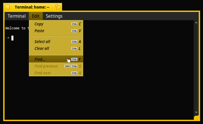
as a quick side track to other development I’ve been working on an small Interface Kit patch to decouple the menubar design (which then follows the window panel i.e. blends in well with no menus open) from the actual menu/item design (which can then typically be set more freely without the window looking insane ) as follows:
Only some additional testing remains, but it seems to work really well in practise, with both light and dark colour schemes, and it allows more creative design overall in my experience so far (more tweaking could follow elsewhere of course, e.g. wrt the control looks, menu separators, etc).
Let me know what you think (and/or whether you’d like the patch code/binary to try it out for yourselves perhaps).
Do you mean introducing separate Menu and Menu Bar colour and font settings? Generally, I don’t particularly like it, and there’s such a thing as too much customisation, IMO.
No - just that the Menu Bar uses window panel settings (except for the selected item’s colors when a menu is open), while the actual Menu and its item uses menu settings (colors, font). This implicitly also means you have more freedom when defining the menu settings, as they don’t get plastered onto every window regardless of whether a menu is open or not.
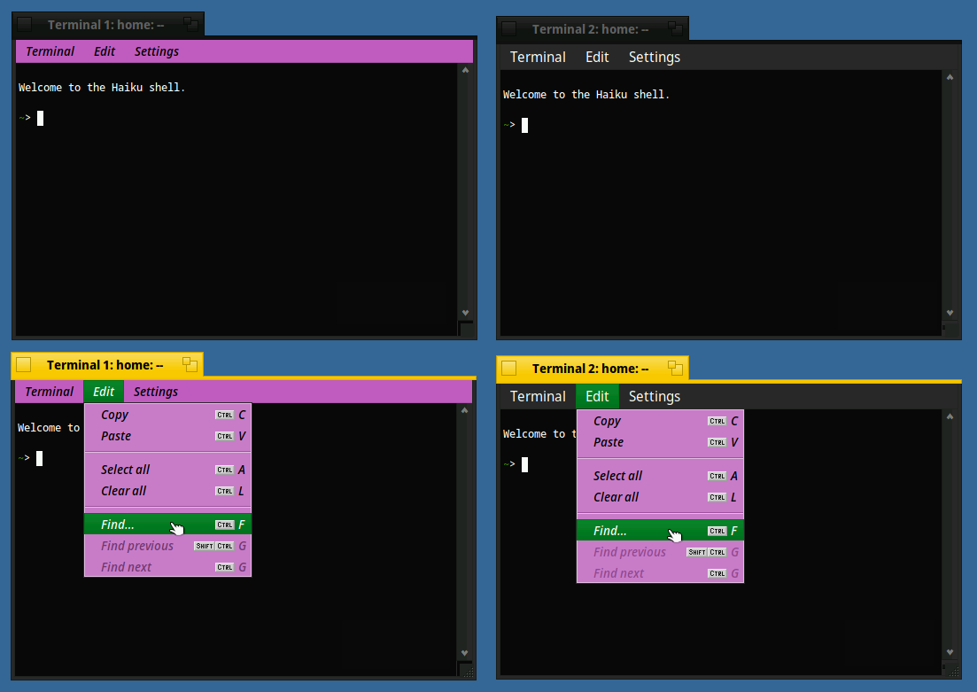
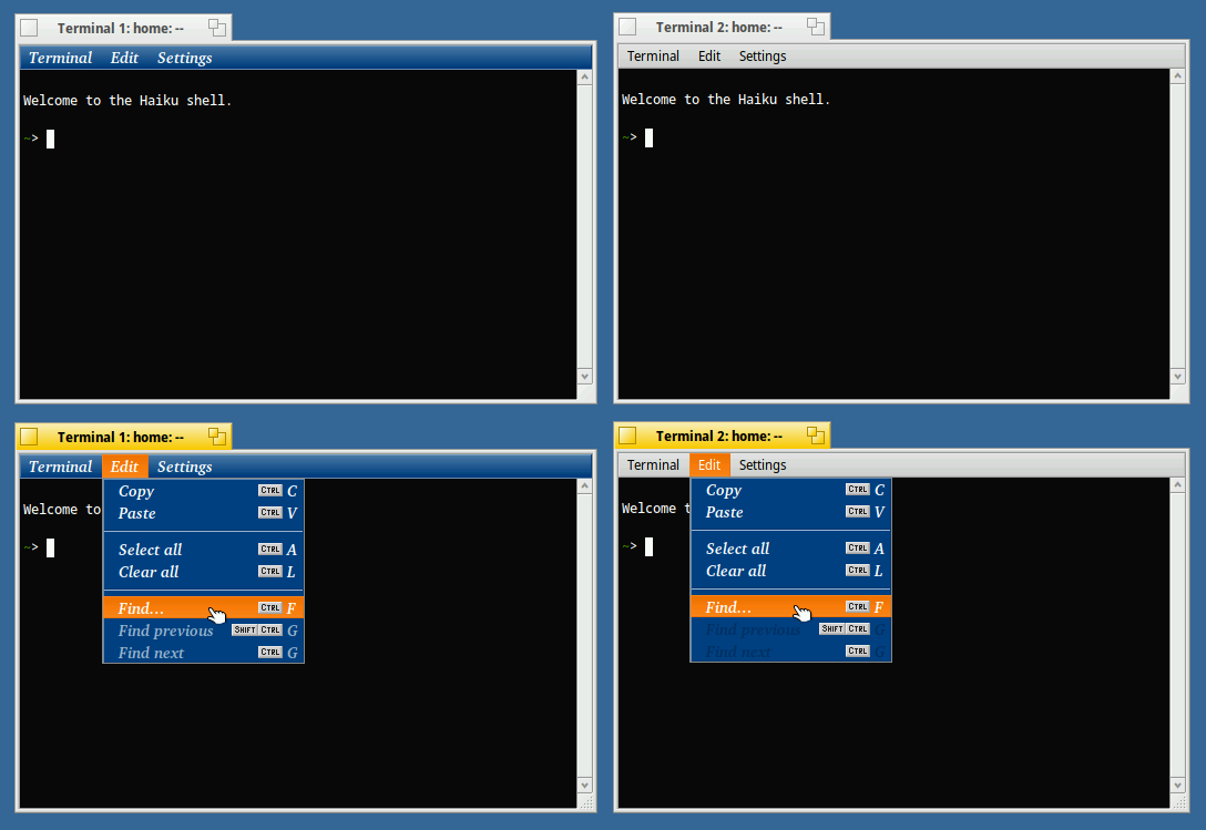
PS. I will add a more telling side-by-side example screenshot tomorrow, stay tuned
Please post screenshots with a proper one then, the flat control look does look more like “modern” OSes but it is particularily bat at making sure you can’t tell controls apart anymore.
In this case I don’t like this, mixing colors from two sets is not a good idea. And I fail to see why you want to make the menu a panel color when it isn’t a panel :g
It’s also less clear now that the open menu belongs to the menubar
I see it the other way around - that the menubar is a fixed part of the active/non-active window, and hence should also use the window’s (aka panel) colours. The actual menu, though, is a not-always-visible popup element, regardless of whether a window menu or a desktop context menu.
(Sidenote: The Deskbar shouldn’t be using menu colours either, but that’s a separate topic.)
 ) as follows: