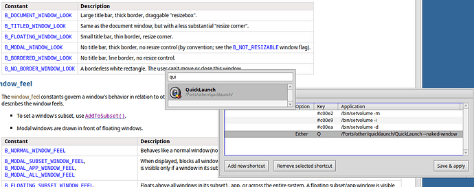
My 2 cents, I’d like to have a borderless window without the two BButtons and a larger text box if I summon Quicklaunch with a global shortcut. This would give a similar look and feel as in MacOS spotlight.
I get the want to have this feel unobtrusive, but for me as a user windows that don’t have a quit button are really wierd. I can kind off understand why this exists in the api, but it is still really wierd.
2 cents also from my side, can we add a small button with three dots (vertical or horizontal ones) to the right of the item row? It would show the item actions menu (“Add/Remove to/from Favorites” etc.) in addition to the right-click. Right-click menu is quite difficult to discover if you don’t know it’s there. Right-click is also impossible to perform on a MacBook trackpad ![]()
Not impossible…
Yay! You’re a life saver!
Thanks for the feedbck everyone!
I don’t think I’ll go that route (for the buttons, see below).
Making QuickLaunch less conspicuous is quite the opposite of what the launcher needs.
Someone recently remarked that when they forgot QL was open, they were frustrated because no app reacted on user input, because QL modally grabbed the focus and all key strokes. This has since been alleviated by making QL “floating” instead “modal”, i.e. you can interact with other apps, drag&drop icons in&out of QL etc.
But still, QL is meant to be quickly started, used, and closed again. The shorter it’s open, the better it is at its job. Opening it, being distracted, and “losing” its window among others is the last thing we want. Therefore, being a regular window with borders and bright yellow tab is a good thing IMO.
A wider text box doesn’t serve a usability purpose:
- QL being only seconds on screen, its window doesn’t have to be small. Make it (and therefore its text box) as wide as you want.
- You rarely enter more than two letters before the app list is short enough to reach your target with a couple of CursorDowns.
I give you the aethetical aspect of it, see below.
Generally, I’d say that right-clicking for context menus is deeply ingrained in Haiku’s UX. You can expect a context menu on pretty much any object that lends itself to manipulation, on list items for sure.
However, as I was implying above, “wasting” space isn’t an issue for QL’s use case, contrary to apps presenting lots of info or providing a working area.
So, for aesthetical reasons and because they are more prominently presented than actually used, I think I’ll remove the Setup and Help buttons and move them into a regular menu bar (with the possible disadvantage that even fewer people will be tempted to click on Help to learn more about the features and useful tricks about the app. OTOH, those that did were probably deterred by all the paragraphs of text anyway… ![]() ).
).
Adding a menu bar has the additional advantage of making all context menu items and their keyboard shortcuts more discoverable and accessible without a right-click.
Maybe some items of the current Setup window should even be moved into the main menu bar: “Show Deskbar replicant” could move in the “App” menu, "Show app version/path and “Search from start” could be useful when toggleable from the main menu, for example.
It could be optional and if the window loses focus it can be closed straight away.
Please, don’t make me maintain a private fork! ![]()
+1 to this ![]()
What about a public one? ![]()
It’s a joke, of course. I trust @humdinger will not take it seriously.
Smileys we used should give some hint ![]()
looks cool, would it be hard to implement this as a replicant?
Just another quick one on the two buttons (Setup and Help), I think that, semantically speaking, they do not belong to the window but rather to the Deskbar replicant. Their use will likely decrease over time and, generally speaking, they are used less often than the search itself.
I don’t think I want to introduce a setting just to get rid of the window tab+border. Or two, one for tab, one for border…? ![]()
I really don’t think it’s worth it for an app that’s only open for a few seconds. I often don’t even look at it. I know my first favorite is Web+, my last Genio. For those I hit OPT+Spacebar and hit RETURN for Web+, or CursorUp and RETURN for Genio. For other stuff, when I need an app, the name of the app enters my mind… <cue power-zoom to Homer’s head> “KeePassXC”: OPT+Spacebar, “kee” and RETURN.
Very quickly you know how much you need to type to get a specific app: “ap” = Appearance, “th” = ThemeManager, “web” = Web (Epiphany), “mo” = “Monsterz”, “e” = Email.. etc.
For stuff that I not commonly open, I pretty much only look at the icons/names that pop up when I enter the first two or three letters. It never matters if the window has a border or a tab.
Borders and tab do become interesting when people “lose” the window while being distracted or they want to move or resize it. No need to make that more difficult.
WRT to closing when losing focus: How would you drag&drop a file into QL?
And aside from that, I’m pretty sure it’d be annoying more often that helpful. If a user started QL by mistake, hitting ESC or ALT+Q is just as quick.
Probably not difficult. But isn’t that quite inconvenient? Instead of using an instantaneous quick keyboard shortcut, I’d first have to move aside all the windows obscuring the replicant…
If you prefer the mouse to a keyboard shortcut, there’s an optional replicant in the Deskbar tray. Though, sooner or later you will have to move your hands to the keyboard to enter a letter of the app name (if it’s not a favorite)…
Agreed. And I already said as much. Not everyone has the replicnt in their Deskbar though. I’ll move Help and Setup to the future menu bar.
It seems we have two targets. On the one hand, the setup mode: get to know the app, move and resize its window, drop files, set favourites, configure settings and otherwise interact with it for anything but launching other apps or opening folders. On the other hand, the quick launch mode where you invoke the app and press a few keys to launch something. This is the real usage of the app, and the mode one will mostly use after a bit of time.
You’d say the perfect GUI for launch mode would be no GUI at all, but then the only real requirement is that you can type away and press enter without any other interaction and the least possible delay, so the GUI doesn’t really matter and the current one fits both targets. After some time of use,
That said:

Patch, but you’ll have to clean up, add error handling and… well, throw it all away and rewrite it maybe salvaging one line or two. And then convince everyone, particularly the one that will have to keep the broken pieces, it’s worth it.
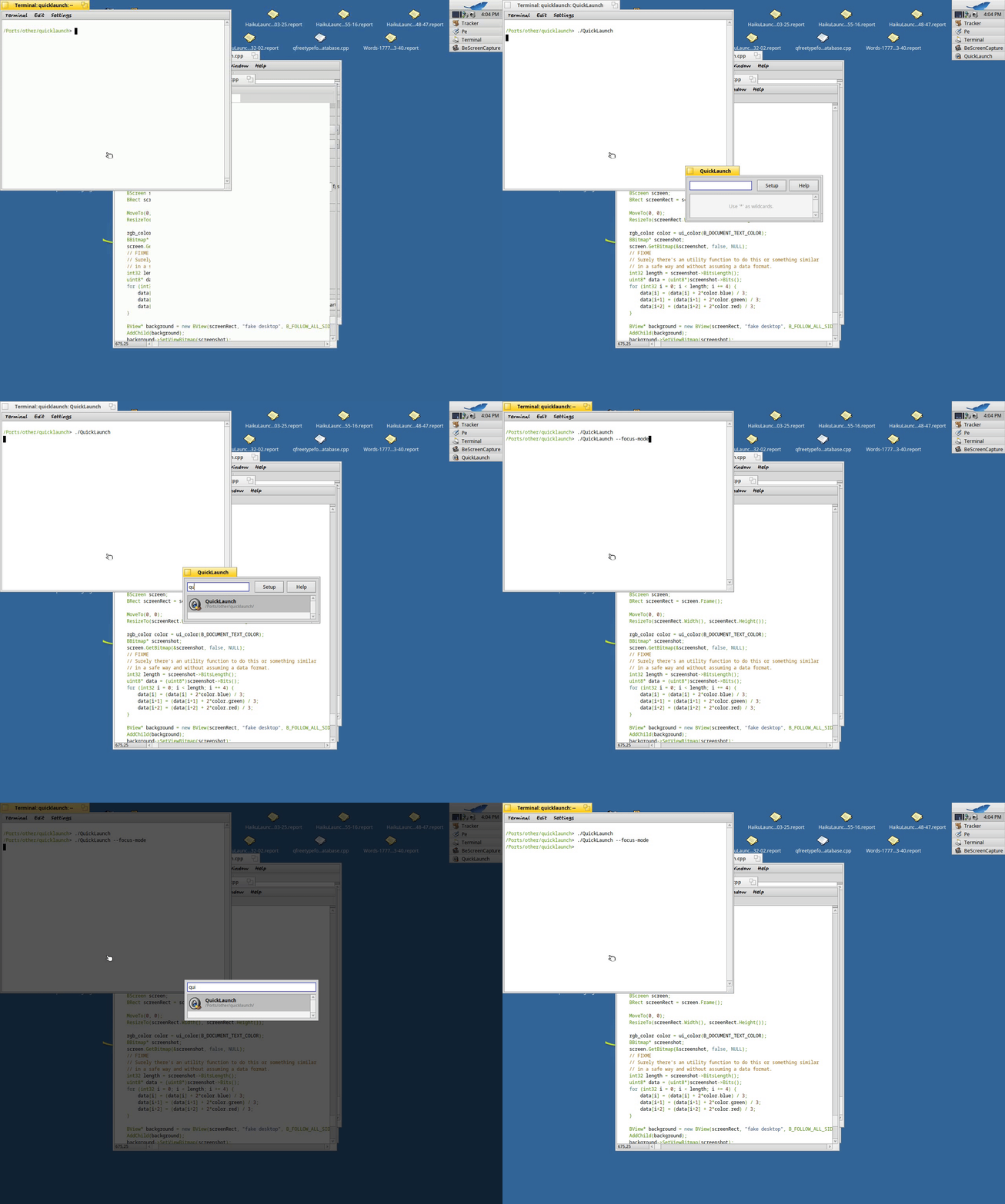
I don’t know how one can forget that QuickLaunch is open, specially when it was a modal window, but then I also don’t know why it has the shift+return option, and of course the situation can be improved. Until someone tackles #19189 (Modal windows should dim / gray out the background or something) – Haiku, we can cheat by covering the whole screen and using a modified screenshot as its background. At least for desktop-modal windows, and just for shouting out that you have such a window, not for other problems a modal window brings.
I appreciate you taking the time to explore what’s possible. But I keep thinking this is looking for solutions of non-existing problems. I don’t think it’s worth introducing two modes, “modal” that prevents any interaction with anything else, and “floating” that doesn’t.
I imagine that there are more times someone finds themselves in the wrong mode, than someone “loses” a QL window and wishing it were modal.
You guys are making extensive use of QL. I just have the repliquant in deskbar to avoid scrolling the menu when I launch something starting by a letter of the alphabet’s end.
