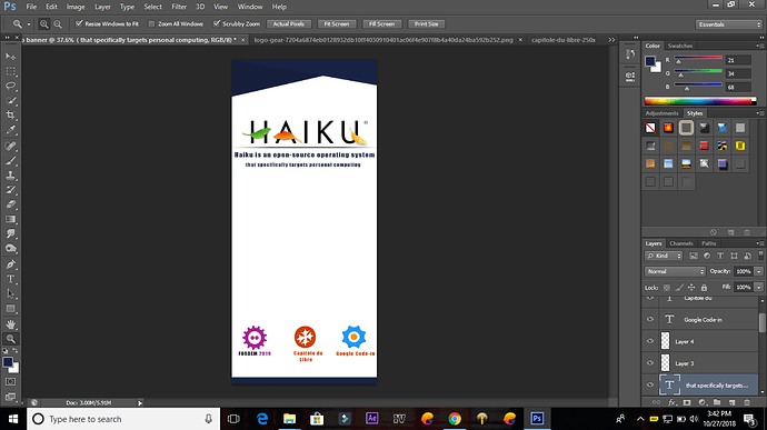
Suggest me Following:
-Background Color
-Font Name
-Content that banner Contain
-TAG/Moto Of Haiku
Etc…
Hi,
I guess you are working on the Google Code-In task about this? Great! I would very much like to finally print and use the Kakemono!
Have you looked at our logo artwork and usage guidelines? (on haiku-inc website).
Usually we have 3 ways to use the logo:
- White logo, either on black (as in boot screen) or blue (as on the desktop) background
- Black logo, on white (as in AboutHaiku)
Fonts used in Haiku were DejaVu Sans (with the logo itself being a tweaked Futura), and has now switched to Noto. It makes sense to stick to these unless you have a reason to go with something else.
On the content: this is the difficult question. You can go either with something only for long-distance visibility (just a big logo to let people know where they should go for Haiku things), or something with more details.
The Kakemono will likely be used at open source conference and events such as FOSDEM, Capitole du Libre, etc. Maybe review what other projects use (Wikimedia, Debian, …) and see what would make sense for us.
A starting point for text may be the headlines of the website. This was written long ago and maybe we should update it.
@TheClue, maybe you have an opinion on this already?
Hi @harshitchaurasia, nice too meet you and tnx for your interest 
In addition on what @PulkoMandy has said I’m going to add something about the general look and feel. But pls consider the followings just has hints, not as REQs.
Pls bear in mind that a Kakemono should be catchy, remarkable and unambigious at first. Also, it must have clearly visible the payoff of Haiku and its positive elements among others and, ofc, a proper logo placement. These elements could be summarized in:
-
Haiku is innovative and designed to make developers’ (and skilled users) life easier: it’s a pleasure to develop under it for both the UX and the internals elements (API, etc.). Our keywords: fun, being smart, being open minded, well designed, well organized, cohesion, cooperation among the community of users.
-
Haiku is fast and runs smoothly on old computers, have no nags, no ads and doesn’t force you to update your hardware or buy expensive one, like Apple. Our keywords: being ethic, supportive, empathic. As a side note, Haiku is green and pursue a low-emission, low-energy consumption, sustainable, way to computing.
-
Haiku is easier to use than Linux.
Now about the ahestetics
Haiku has several iconic elements with traditional japaneese, philosophical, reminds. Other iconic elements possibly to reuse: ofc the logo, the boot sequence icons, the floating leaf. Our keywords: autumn, paceful, nature, acting good, pacefulness, immagination, spirituality. Think of Miyazaki ahestetics, here. These elements could be present here, but they should not overweight the design (think about the main purposes, above). Expecially, don’t allow that a photo or illustration makes the user non focusing on the real payoff of the product. Feel free to use Pinterest for inspiration. Using a clear, not overcrowded color scheme often helps.
VERY IMPORTANT: USE ONLY SHUTTERSTOCK FOR IMAGES OR ILLUSTRATIONS (EXAMPLE)
You don’t need and you have not to buy the files from there. Just download the previews and use them in your design. Then add a note to your submission with the link to all the resources you need for us to buy the full-res pictures)
You may find our creative assets here and how to use. As stated before, the logo at least must be used
About the payoff/tag, You can freely use the existing ones (1- the one on the website 2- “personal computing is fun again” - feel free to propose variations on 2- if you like) or to create your ones. The TAG lines are not part of the assigned task when you provide the original source files (PSD, SVG, …)
Additionally if you would like to push yourself to the limits, but bear in mind that it’s not mandatory for the task, you can provide your design in CMYK color space. The external links on the Wikipedia page are extremely useful to learn.
Actually, it would be better to use resources distributed under a creative common license, if possible.
Thanks to all of you i understand all the things
sir wait 1 day i will definitely impress with my creativity
Thanks
This is ok, but if this makes you wasting all your time searching for CC resources, asking for permissions to authors and so when they request, don’t be afraid to use Shutterstock (@PulkoMandy I’ve an extended plan on Shutterstock and btw illustrations can always be replaced later ![]() )
)
Perhaps unsplash.com for distributable “stock” images? https://unsplash.com/license
 the resolution…
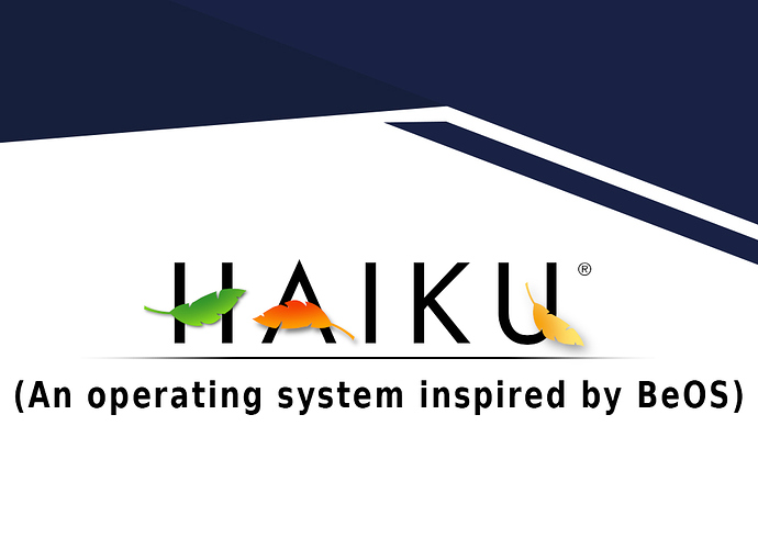
I would say that the copy needs some retouching. It shouldn’t be a whole descriptive sentence, in my opinion, it should be simplified.
BeOS used a tagline “The Media OS”, or something like that. That’s the kind of phrase it needs. Not sure if Haiku has any similar text already…
Hi,
- On the graphical design: it’s nice and clean, but there is a lot of empty space. What to do with it?
- On the content: the URL of the website, and a qrcode pointing to it, may be a good idea.
- On the icons at the bottom: ok, these are events we take part in, but they are not what defines Haiku.
Maybe you should try to have an icon for each of TheClue key arguments (innovation for developers, fast/runs on old computers, easy to use) with a short text next to them? This would keep the graphical aspect of the Kakemono (we don’t want a wall of text here) and at the same time convey enough information for people to immediately see “oh, so that’s what Haiku is all about”.
The URL is essential.
I would eventually wipe out the QR code if this will end up overcrowding the design. Researches say that less and less ppl use QR nowdays. And Haiku website is only partially responsive.
Pls bear in mind that the majority of ppl looking at the banner will eventually lands on the website from a google search. The best way for Haiku to show up in higher prositions on the Google results page is atm with the following query “haiku operating system” (best one) or the more compact form “Haiku” (easier to type but not guarantee to “work” with some languages).
Thus, the copy of the banner should be made to involve the users using these exact keywords in their google researches.
It has not, but we have some candidates. I would use “computing is fun again” for the moment. It’s only a WIP, but better than nothing. And we can change later before printing the banner.
Yes, I can Understand @PulkoMandy thoughts but it is my initial design.
Tomorrow i will submit it with complete design.
Thanks
I think you should not use brackets in the slogan.
Maybe using Haiku icons as the bullets can improve the looks, or maybe not. Just a suggestion for you to consider. Also the yellow tab is a distinctive element of Haiku’s GUI.
In the final design, consider omitting the title “Features”, if it allows for a better layout, as it can be implicit.
Regarding the topics, I would remove the “integrated” word to make it a bit shorter. I would add “Always fast and responsive”, “Lightweight: very low requirements”.
Maybe some reference to a nice C++ programming API and/or good documentation, if it’s intended to a developers audience, but I would let that to someone who actually know about it 

