These days we are witnessing an important moment in Haiku’s life, the release of R1Beta1.
Before the release, I came up with something that did not have enough time to finish prior to the release:
Actually, the idea was talking to the devs, and release the teaser prior to the beta, but… timing… Anyway.
Now I saw that R1Beta2 is due for October 1st 2019. I think, my personal opinion, that matching Haiku releases with the arrival of autumn is a good marketing approach. Leaves coming down to earth, so does Haiku. This on the northern hemisphere. It also makes sense on the southern hemisphere, as when autumn starts on the northern, spring comes on the southern, leaves start to grow on the southern, which also leads to good teaser approaches (I’ve already thought of some too).
I don’t pretend to do any evangelism, I stopped doing that long ago (live and let live), but promoting Haiku outside is also important in order to reach a broader audience. Yes, stability first, I know… But we all, devs and the comunity, are getting there.
I wish I could have done the teaser on Haiku and add “made with Haiku” at the bottom, but I guess I’ll have to wait and work harder on the tasks I set on my task list.
Hope I can finish the next idea before the next event.
That is funny, you are so polite
It’s not a WIP. I already released that on Sept, 29th on youtube, and twitter. I read that the release was going to be delayed a couple of days, so I started with it, but then on Sept 28th R1Beta1 was released, therefore, no time to wait. Anyway, I don’t have so many followers and presume all the views are from people from this comunity…
Next one will be better, hopefully.
The idea was just to pull out some small marketing ideas to “Promote” Haiku, not to evangelize. Let others to know that there is another OS option out there, and let people chose, and the “Motto” needs more thinking, but I just have fun “playing around” with Haiku, as back in the 90’s with all the OSes available at that time (Amiga, OS2, Win, BeOS, Mac, Solaris, Slackware, HP/UX…).
Yep @janus2, that was also an idea, but not enough time to implement it “on time”
This is absolutely a personal opinion, so take it as that:
I think that Haiku needs some improvement in order to gain a more uniform branding:
From my point of view, and in order to improve any marketing campaigns and merchandising, I would stuck with the Haiku Leaf, without any gradient. Just plain solid color. Same for the HAIKU name logo. I rather design a font than add ornaments to a font.
For the merchandising and branding, it is easier to identify single coloured logos, and this results in cheaper merchandising, using one colour for prints on any media is cheaper than multicoloured, at least around where I am. And adding the name with three leaves each with its own colours…
I would like to see the same “brand identifier” from the Haiku website, twitter account, etc…
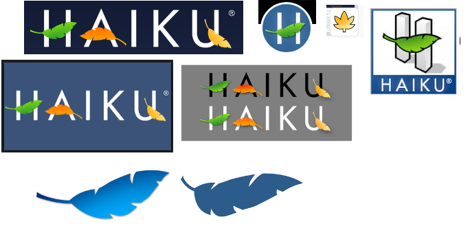
There is only one Haiku logo. It’s the word HAIKU in a slightly modified uppercase Futura font, with green,orange and yellow leaves. There exist two variants, with black or white text, for use on light or dark backgrounds.
Anything else is not the Haiku logo, and should not be used as such. I don’t think anyone from the official development team does, but please point out places I have missed :o)
The other things are:
The Haiku DeskBar leaf (blue with gradient): to be used only for the DeskBar leaf menu
The Haiku3D icon: to be used only for the Haiku3D application. Unfortunately its square aspect ratio made it quite popular
The maple leaf: I thinkj still used as a favicon in some places, as we didn’t have a version of the Haiku logo that would fit
Just the H from the official logo: when you need something with a square aspect ratio, there isn’t a lot of choice other than this, unfortunately. Used by our current Twitter account, I think.
On twitter, spanish Haiku account uses the 3D logo, the old haiku_os account uses the People icon (as it was created by our “social network” team); Haiku Italia uses the people icon as well, HaikuUnofficial does use the correct logo (this one has a single tweet from 2014…)
Yes, the “3D” one should be phased out wherever possible in favor of the one with just the “H”. The other social media accounts the Inc. does not manage have not responded to my messages…
I actually favoured the 3D logo over the new one on twitter, github, etc and was sort of slightly disappointed on such a decision to switch immediately without some sort of vote, but whats done is done.
On the other hand, I think such a change makes sense anyway since on several websites, avatars usually have a circle aspect ratio which would definitely look out of place for the 3D Haiku logo with the wordmark, even if it was cropped.
Everything else about the branding, leaves, etc seems to be fine with me.
If you think the 3D logo is better, you could push for it to become official. But until now, it never was, and still isn’t. And we have some rules to follow for trademark protection, so we can’t just change our visual identity that easily, there is some paperwork and associated costs to register the trademarks. There currently isn’t a trademark for just the H with green leaf, 3D or not.