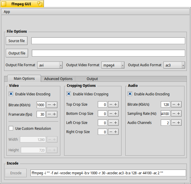
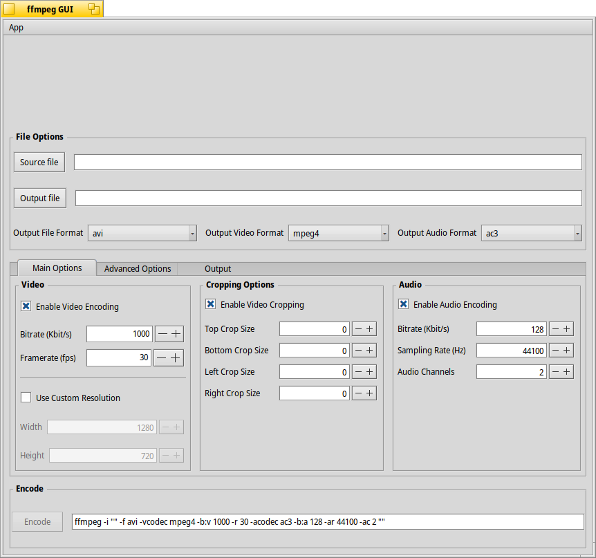
The layout was working fine (can be seen in the master branch) until I added the menu bar. It gets far too much space in the layout. I can still make it stick on top with the alignment but that doesn’t fix the problem .
Would be great if someone with in-depth knowledge of the layout API could take a look at the code and give me some clues how to fix this.
I’m not familiar with layout at all, but, in haiku Depot, there is ALE or Auckland Layout Editor, maybe try creating the same elements and compare the output.
Can you post a screenshot of the layout problem? Most likely you need to AddGlue() somewhere in order to push the content into the right position. You may also need to set spacing if you don’t want the default spacing.
I wouldn’t say I have “in depth” knowledge of the layout API but I have certainly have struggled my way through a number of challenges on ArtPaint so I’ll look for the screenshots tomorrow and see if I have any suggestions.
Usually each object you add to a layout has a weight of 1. If there are no other constraints, the available space will be shared equally between them.
So you have several solutions:
Specify the weight explicitly for some controls. For a menu bar, you would set it to 0, meaning this group would take as little space as possible, which is usually what you want for a menu bar.
Add some extra thing to take up the available space. This is what jscipione suggests: a “glue” is an empty space which will try to be as large as possible and use up all the empty space. If you don’t have any “glue” in your layout, and all other widgets ask to get sizes that are smaller than the window size, the layout system cannot know where to use all the extra space and it is spread evenly accross all widgets
Finally, the insets and spacing: each group layout has “insets” (around the whole layout) and “spacing” (between the widgets). This adds a few pixels of empty space between things and make the UI looks nicer. However, for a menu bar, you usally want it at the window top edge without any spacing, so make sure the spacing for the top level layouts is set to 0 at the top, left and right at least.
I hope this helps understanding better what is going on, and not treating layouts as some incontrollable wizardry where you copypaste random lines of code from forums without much understanding of what they do.
Thanks @PulkoMandy for the detailed explanation (as usual). This confirms most of what I gathered from the Layout API docs and the source code of other apps I looked at. The solution with the weight doesn’t do much good for me in this situation, even if I give the menu bar a weight of 0 it still gets much more space than the actual bar needs. The AddGlue() solution solves the problem with the menu bar, but on window resize the other widgets don’t grow like in the example without menu bar, the glue takes up the extra space (as intended of course).
Maybe I can now specify my intention a bit clearer, what I want is the menu bar (and specifically its layout item not to grow vertically at all. And the other widgets to grow like they did before I added the menu bar. If that’s not possible I go with the AddGlue() solution.
That was exactly my intention why I asked the original question here on the forum in the first place
That’s not possible for me here, I need the widgets laid out vertically, not horizontally.
Yes, that’s what I’d do with this UI, there is just nothing else that can really grow here to take up the extra space so a glue at the end would make sense.