KI: *the Koan Interface

koan

noun ko·an \ˈkō-ˌän\

a paradox to be meditated upon that is used to train Zen Buddhist monks to abandon ultimate dependence on reason and to force them into gaining sudden intuitive enlightenment
*This is an interface concept that will redefine the Haiku desktop experience.

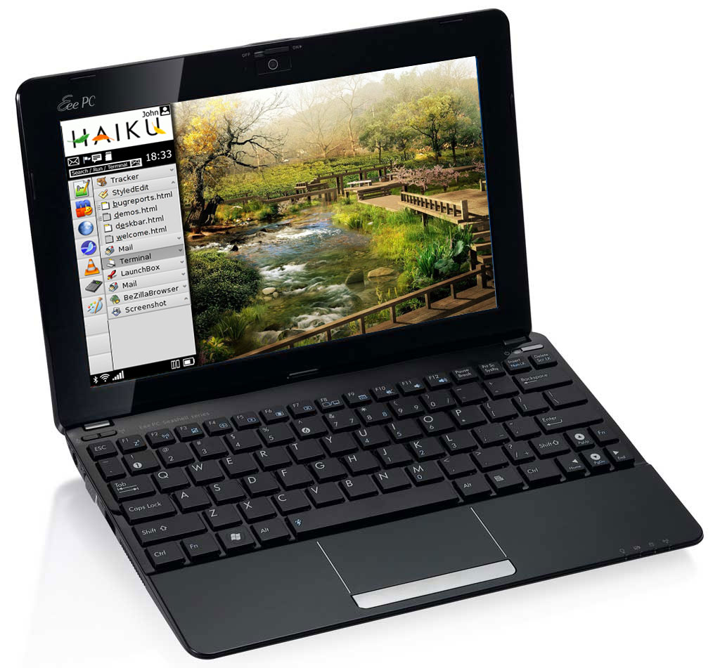
My inspiration was to make Haiku’s GUI be more modern, as well as pertinent to a Netbook form factor.

I think Haiku is perfect for low end systems like netbooks and personal organisers. And as computing’s becoming ever more personal, why not tailor for that experience from the get go?


(Obviously cmd+1…9 would rock the RocketLauncher applications)

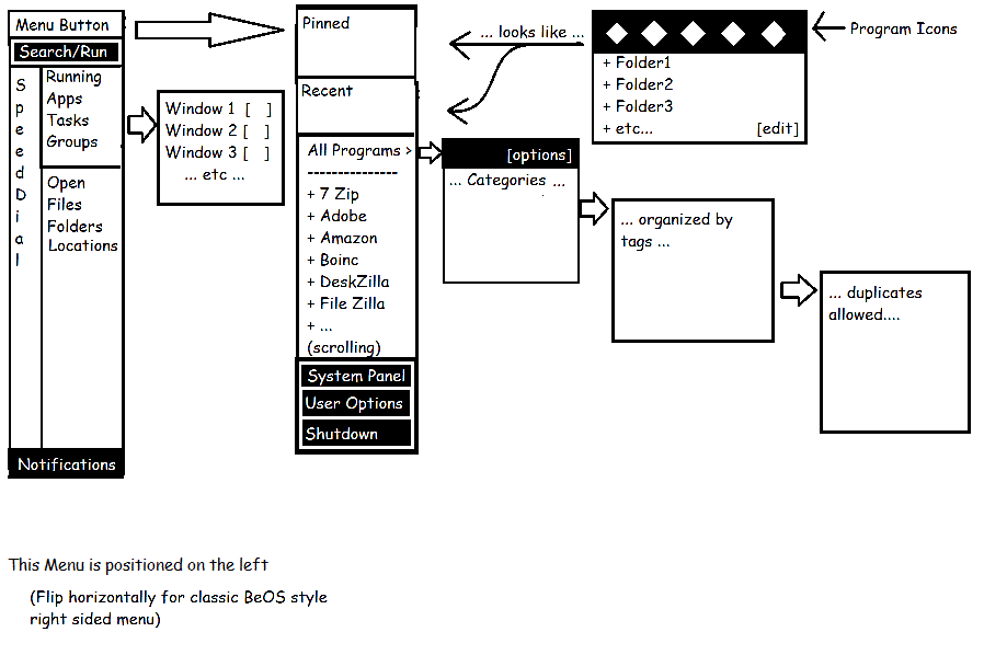
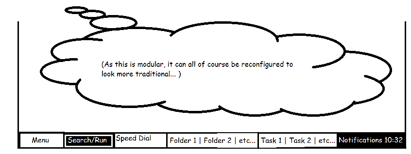
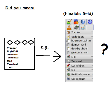
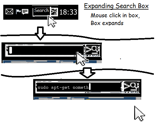
So far, here are some mockups of the new deskbar.

The Modern style of deskbar would autohide on the left… but that’s always down to personal preference

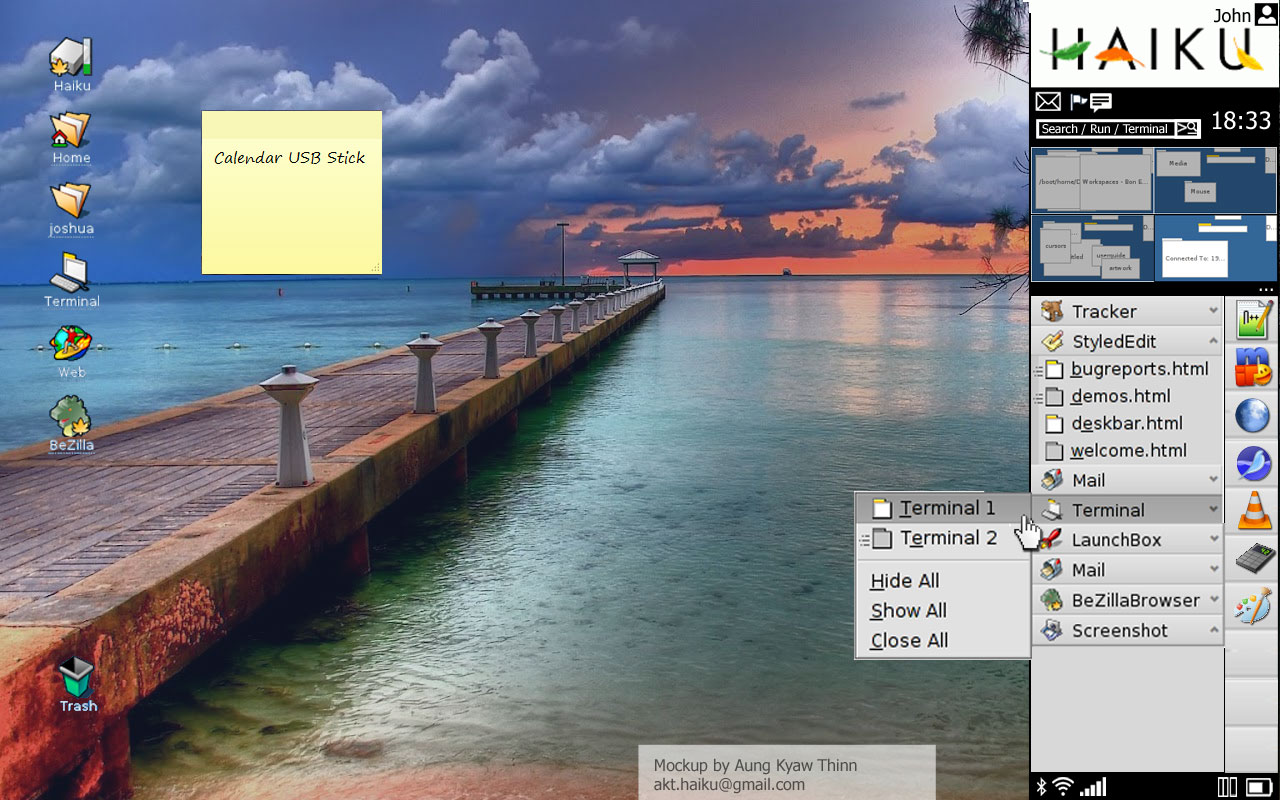
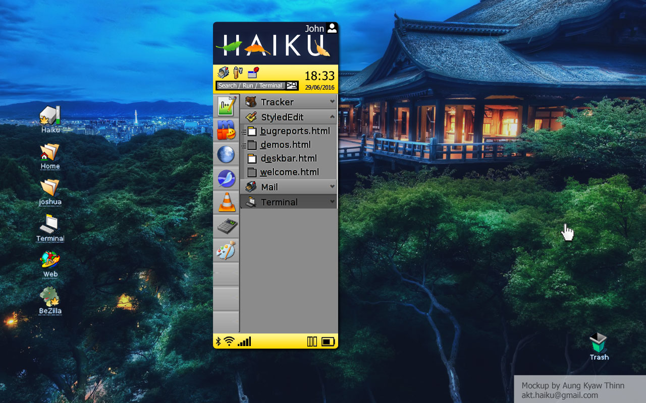
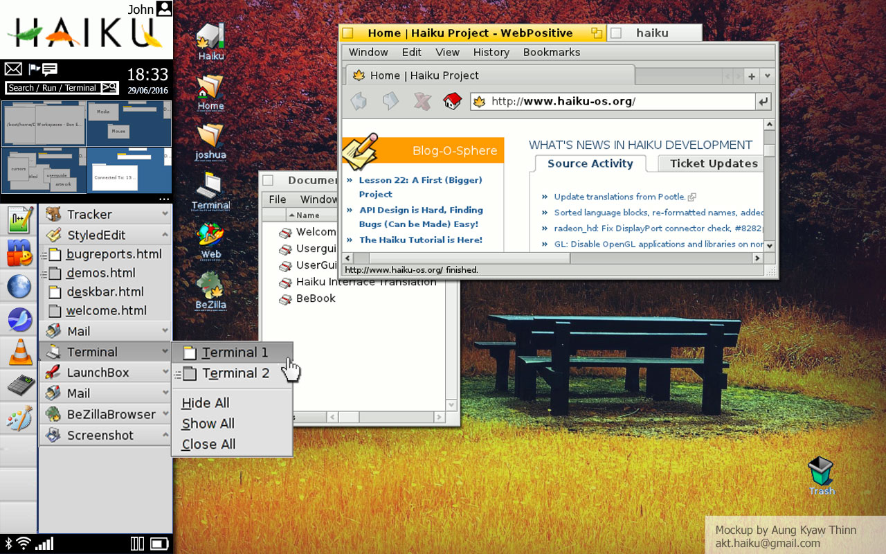
Here’s the Classic position of the sidebar. Notice the Workspaces viewport.

Each element will be snap-in etc with a few extra modules to add extra versatility. You can see clearly that the Tray has been split in to two seperate areas, one for notifications etc, and one strictly for status icons and system monitoring. This keeps the user experience seperate from the system mechanics.

I intend to put a persitent Tracker window, like Window’s Navigation pane in there as well.

Obviously, Haiku being customisable, if you don’t like it you can always turn it off, but i think this would improve mobile workflows to no end.

This Deskbar integrates elements from current Haiku standards and will implement a few changes…

More to come soon!

Not quite sure why the Deskbar needs a redesign; what’s wrong with it, and what makes these new designs worthwhile? Ultrabooks (formerly netbooks) are not as big a market as they once were.

This looks very cool! This is what Haiku is all about. It is a free, open source OS that people can experiment with.

Every time someone adds a new feature to Haiku, an angel gets wings :wink:

Suggestion. Start coding your new Deskbar and we will try it out.

Resources for Haiku-OS are limited and the present programmers are very busy, I am sure they will not object to showing with working code your idea.

Haiku_programmer is right. There is nothing magical about Deskbar, it is just an application. It should be possible to write a drop-in replacement for it, then those who like it will use it.

Make it an option also if it works out. BeOS had optional looks it came with, though very limited, and this is just a small expansion of that idea. I guess. It certainly does look nice to me.

Hi there,

There is not much wrong with the Deskbar at the moment as it works very well as a lightweight interface to get at all the parts that an OS ‘start widget’ needs. The problems are that it is unergonomical in certain situations and seems a bit outdated in some ways.

I like it’s quirkiness however, and that is in no way meant as an insult. The idea is to take how it is designed at the moment, and build on it, and turn it into something special. At least that is the idea with this component. The strength of Haiku’s Deskbar is that it is modular and can be reconfigurable. This one will be too.

I have a few ideas up my sleeve that I haven’t been able to illustrate as yet. I’m concentrating on designing for the whole Haiku Interface at the moment but when i have time I will think of looking into programming it, though I must admit that I have very little programming experience at the moment.

Sorry, I can’t react to this in another ways. It hurts me ― as designer, as developer, as a human in the end.
My eyes are bleeding from this half-metro 3/4-haiku 1/4-smthanother “interface” (sorry, good word).

Why, why everyone so much hates my eyes?

Haahahaa"! yeah… it’s just a mockup… badly made but whatever… lol.you know what i mean… would be better if it was completely reskinned… maybe i should have just stuck to a simple black and white wireframe :stuck_out_tongue:

Following on… I have started a OneNote Notebook for my project / idea…
https://onedrive.live.com/edit.aspx?cid=56e2f20d85275056&page=view&resid=56E2F20D85275056!1579&parId=56E2F20D85275056!1575&app=OneNote

After reading the responses to my article/post/rantGoing Native and checking out some of the RFC “Glass Elevator” (which is really cool, by the way…) topic on the desk bar, I finally drew a diagram of what I’ve been thinking about with a few improvements:

Image and video hosting by TinyPic

  • This diagram only outlines a few of the features I’m proposing so far.


Main Features

  • less obfuscation/nesting with speed dials
  • Clear difference between Open Folders and Taskbar Entries. I mean why seperate Open Folders and Tasks? Using programs and navigation are two completely different tasks. it doesn't make sense to mix them up.
  • A potential solution to organization in the program list

KOAN Deskbar Outline

Menu Button

  • Show the user name and OS icon/graphic
  • optional: show the 2nd tier menu over the existing deskbar instead of a menu popup. <- (Choose how in system panel)

Speed Dial

  • Customisable Drag and drop favourite programs
  • cmd+# opens synonymous program (like in Windows 7) (or Show/Hide Persistant Applications <- More on this Later...)

Applications Taskbar

  • option 1: HIDE ACTIVE TASKS:
    Where screen space is at a premium or you just don't like seeing every running task open at the same time.
    Click to popout task list showing all running tasks (with optional previews of course)
  • option 2: SHOW ACTIVE TASKS:
    Works like the Traditional Haiku/BeOS Deskbar showing active tasks under the Header of the Program
  • 'Hybrids': - Grouped Programs
    (stacked/tabbed combinations of programs that may or may not include a file directory tab) are shown here under a custom icon and can be saved as a 'Hybrid'. * Maybe another area in the Start Menu should include saved 'Hybrids'.
  • when space runs out, it overflows the File/Folder pane. When all that available space runs out then it scrolls.

Folder Pane

  • option 1: Lists open Folders as a list
  • option 2: 1 Folder Icon, Click on it to expand list of open File Locations
  • Libraries, Main Folders/Locations, Favourites are saved here also. Diagram coming soon.

Inside the Deskbar (Opening Up)

Pinned Area

  • Programs on the top in a list, also allows custom pinned folders as another location to store favourite folders that you don't always want on display.
  • [edit] allows you to change various options, maybe set a background or whatever.
  • Drag and drop here might be the best way but the edit button allows more functionality. tbc.

Recent Area

  • Similar to the Pinned Area
Hybrids (Missing)
  • This would show saved Hybrids. <- tbc

All Programs

  • [options] in header of the sub menu allows different sorting options (see below) to be applied and extended functionality such as 'display as grid' like in Gnome3/Ubuntu(for future Tablet Users.)
  • Clicking on the arrow next to the header lets you search by keyword categories.
  • Duplicates are allowed to allow easy access to progams that may provide multiple functions.
  • Also if you don't know what various programs do, due to abstract names, then you can use this function to find a program that does what you want it to. (* Maybe the software repository when designed could do the same thing)
  • Standard manufacturer folders with programs in them (like in MS Windows) are also available, as this provides a nice way to see suites of programs that are interelated. <- for some reason i don't like having to split up programs in the same suite by function, cos they all have nice icons that look nice together.
  • Obviously this area would scroll, and it would be up to the user whether he wants to have the Programs list display programs via category, or manufacturer ( as is the default in Windows).

System Panel

  • The control panel

User Options

  • All that account stuff

Shutdown

  • Show the boot options

…and with it being extensible and customisable…
Image and video hosting by TinyPic


(…omg the forum editor is such a pain in the butt…)


That’s all for now…

This really caught my interest! As I had mentioned in another post, we have the same ideas for the future of the Deskbar. I was actively working on a subproject called the ‘Deskette’ (pun on diskette) back when I was developing Poem, and it had a similar set of goals - it would have allowed bookmarking (or ‘docking’) items, would have had a theme-defined menu button, (and an applet section for brightness, connections, volume, sysload, mail, and power.)

All this said, if you are looking for open advice or feedback on your current concept, first, good job. This looks like it actually could be a welcome alternative to the current R5-style Deskbar, and shows a good amount of effort. I also really love the name of the project.

However, 3 honest suggestions I’d give if you wanted to make your design more visually pleasing (and this is nothing more than my opinion!) would be to remove the docked workspaces view, (like in the first photo); maybe add a toggle button for it? Second, I’d join the divided clock and applets on either the top or bottom side, as it crunches down the search box widget and may confuse your users. Third, I would either a) remove the application list and merge it with the vertical column of buttons, or b) remove the vertical column of buttons altogether and list docked items above running applications in the list. One extra thing - (and it may just be the way I’m seeing it), but that looks like it’d be a challenge to write, given the number of submenus I think I’m seeing and the element layout! I mention that last part if you’re thinking of building this for the community.

But anyway, there’s my opinion or feedback on Koan, and I wish you the best of luck with this! :slight_smile:

Thanks, Yeah, The Workspaces Viewport, as with all the other parts will most likely be collapsable. Also, I plpan to make it so that developers can add different viewports into it, like a little MFD for your start menu. you could use it for webcam, sywstem monitor, analogue clock or whatever, but ultimately if the users doesn’t like it and is trying to go for the slimline approach, then he can of course turn it off.

I’m not sure about your third suggestion however; with everything being modular, the user can remove the speed dial/docklet and just use it like rocketLaunch .

Image and video hosting by TinyPic

I quite like having it on the side personally, but there’s no reason not to allow people to do that, It’s just easier to see which button correspondes to which number on your keyboard when you’re using it for speed dial tasks, though i do agree they can become redundant if they are only there for that use. <-M aybe to solve tat just give them extra functionality like the right click in windows 7 to see all your recent documents and extra play/pause buttons etc

Image and video hosting by TinyPic

Another argument of having the Speed Dial on the left is that it works quite well for tablet and touchscreen displays. - you don’t want to be pressing buttons all the way in the middle of the screen when you can be just using them there. Plus it can autohide but still give you access to the stuff that you need to be using all the time - taskbars and folder bars/tray etc

As for making the Run/Search bar takeover the space of the notifications and combining them back with the status, That’s a good idea, although you could just have the search bar stretch and open wider, hiding the notifications and clock, only when it was being used.

Image and video hosting by TinyPic

As for combinging the styatus and notifications, I split them primariliy for the use of some programs which always end up leaving entries within the system tray. I mean they’re not really statuses, and sometimes they bring a lot of functionality. They are more like email notifications in the way that you want to click on them to be able to see what’s going on or do something, or change something.

Status’s only show you whether the battery’s run out, what your mobile signal is like ,and maybe the wifi. A good example would be Deskpins which turns your cursor into a pin when you click it, or if someone wrote a pen applet , then you’d be able to write on the screen, and this would be your tool set…

Though I do understand what you’re saying because, how do you seperate, a wifi switch or bluetooth switch , which is technically a tool/functionality, when it’s icon is the status symbol itself… I may take your advice on this one, but i do like the idea of a tool pallette in the Deskbar ( to do who knows what? a magnifying glass ? deskpins? Post its? Pen tool?)

In conclusion…
…Yeah- i’ve not really thought about writing it as yet… haven’t got a clue how to code for Haiku as of yet… Gonna think of all that after i get my designs all writen down and documented.