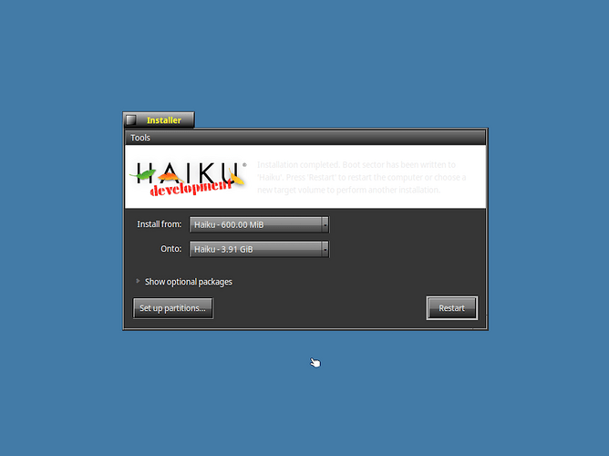
Hey Haikuers, one quick thing I happened to notice when installing Haiku in a manual dark mode (changed all the UI colors to dark grays and black with light gray text), the Installer caption text follows it, but then leaves the top piece of the installer white:
So my basic idea is if it’s because the artwork has a white background, then can the artwork be transparent like a PNG with a fully transparent alpha or a SVG? Or, if it’s just a default baked into it (haven’t looked at the source in a while so idk), but could the installer text follow the document or panel background colors? I feel like if Haiku quickly patched this to do one or both of these, the Installer would look better in any theme (because it’s not only in live boot in its default colors that people run it, or they might save the dark mode to the live USB so every system keeps the settings and so on like I did here). But anyways, just a little bit of an idea that I thought would be useful for the Haiku Installer.
