I’d found the Gonx concept for BeOS (apparently it was supposed to be an ‘R7’ concept, as the concept mentions “an other beos r7 nickname :-o” in one of the screenshots). Please note, this idea is NOT mine, but had appeared on a French website long before. Far as I know, Gonx is merely artwork of something the author had imagined, and no code was committed to it (if anyone knows, and I’m wrong… let me know).
Note: I managed to find an archived copy of original website on the Internet Archive. Gonx was featured on “contito!” and a link to the site (thanks to the Archive) is here: https://web.archive.org/web/20141228160547/http://cotito.free.fr/projects/gonx+index.html
But anyway, I’m posting about this here because there were a lot of mesmerizingly cool things about this that I have not seen in the actual BeOS (or in any Be fork or related desktop modeled after the BeOS (like the customized Xfce on Zeven OS).
And again, Gonx is NOT my work!
Thoughts…
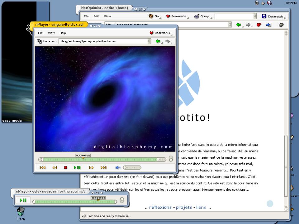
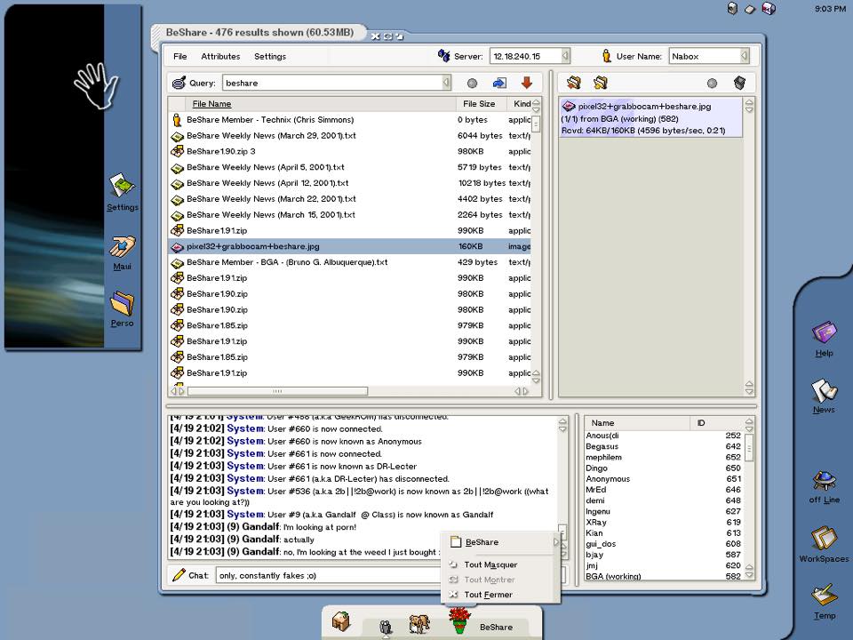
1. NetOptimist has query support.
Next to Bookmarks and a drop-down menu for Go, NetOptimist has a Query box. There is of course the unified search box in Chrome (I think called the Omnibox?), the ‘awesome bar’ in Firefox, and more recently, the same feature in Safari which all search through bookmarks, web search results, and browser history.
And at least, from Firefox, I know that you can tag bookmarks, so it comes very close to achieving this idea. But what none of them do is actually give the bookmarks metadata – imagine if you could not only sort bookmarks into folders and tag them, but you could instantly search for them with something like Spotlight built into the bookmarks folder by metadata, like “show me results related to fishing sorted by most recent”. Not only would the browser show results matching fishing, but it would parse the request into parts, looking for boats, fishing stores/shops, or other results matching the criteria, and of course sort it by date.
2. nPlayer has bookmark(s) support
Distinct from file history or playlists, this idea would be really cool, as it would allow the media player to keep a list of tagged files from various sources, including the Web, in one location. Paired with the idea of having a location bar and nav buttons in the player, this would definitely be an interesting feature for the modern age with Internet radio. Again, I have yet to see this on BeOS/Haiku, although an equivalent feature is in Apple Music, Spotify, etc.
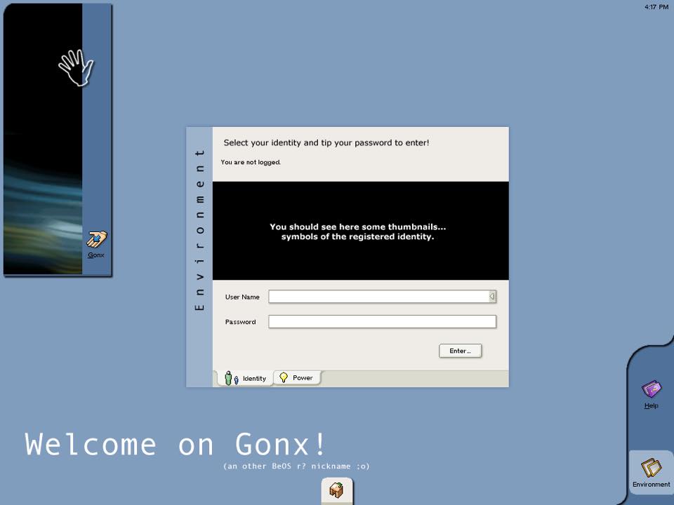
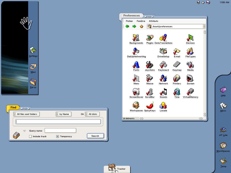
3. Built in Help
Of course, the obvious thing here is the support for multiple environments/profiles or ‘users’, which is ubiquitous to every modern OS, and I know is something Haiku is working on. But my focus when I see this screenshot is the nice link to Help in the bottom right corner. This is something sorely needed in Haiku, and is a nice touch in the Gonx concept.
4. Remote connections
One thing that the Mac can do in the Finder (10.0+) is connect to remote resources, including FTP shares. A similar feature also exists in Konqueror and as ‘map network drive’ in Windows’ File Explorer. In addition, NT could (and still can) also connect to network clients as well. This is definitely something worth exploring for Haiku, most likely on the Nightlies on the long road to R2 after the glorious day R1 has at last been shipped.
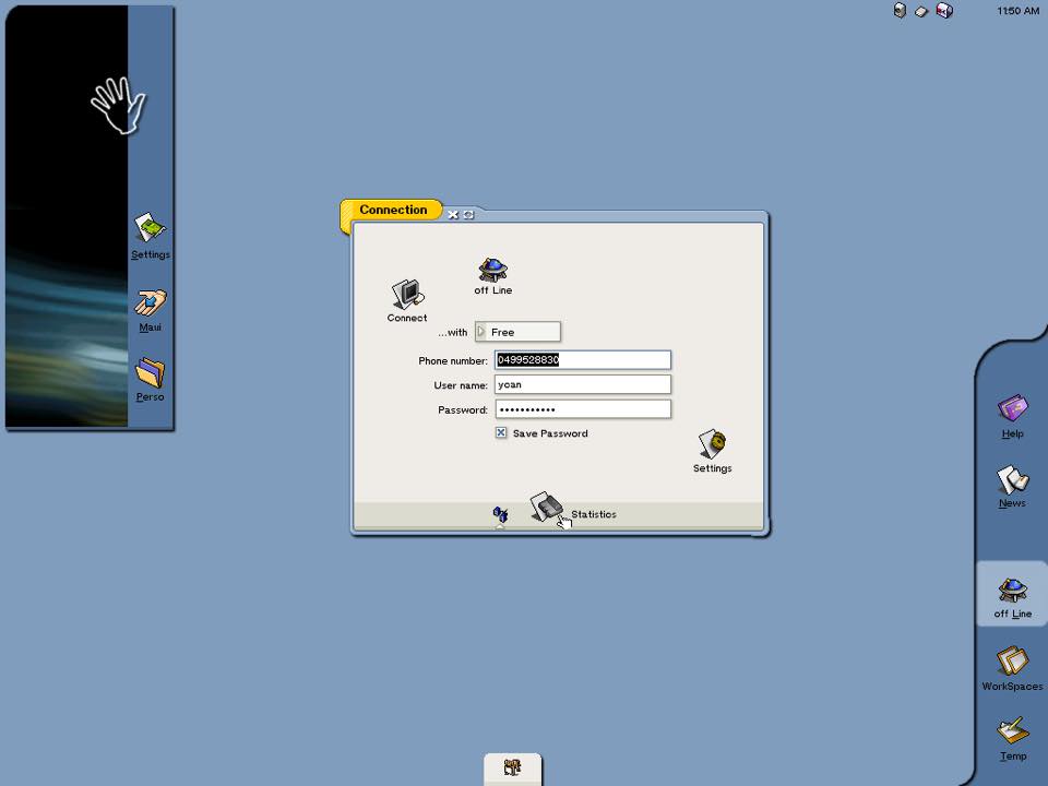
5. Quick access controls
The Deskbar is an awesome little tool, but I noticed that Gonx divided it up into basically what DockBert is today, desktop applets and the clock in the top right corner like the Mac, a movable palette with Settings, the home folder, and an exit to Maui on it, and on the right side in a sidebar of sorts, Help, News, an Offline switch, Workspaces, and a Temp area.
While the floating launcher has become LaunchBox, and Workspaces can be dragged out as a replicant, Haiku doesn’t have a quick on/off switch for ‘airplane mode’ (or for determining system-wide away status). And while having News and Temp always pinned would be annoying, the idea of the offline/online button, Help, and Workspaces would be worth consideration.
Modern examples of what Gonx got right appear in iOS, macOS Yosemite and higher, Gnome 3, and in Windows 10, where each has an area for quick controls.
6. Tweaks for the Deskbar
(Obviously, there’s not much for me to say in terms of file sharing, which I do see is the main focus of this screenshot, as there are clients available via the Depot/repos that handle this task well, far as I know).
But what I did want to point out here is the conceptualized Deskbar on the bottom edge, which sports a menu with equivalents to zoom (or maximize), hide (or minimize) and close controls and a label that appears on hover.
Running applications have an indicator under them like the Dock on macOS, and I personally see where little improvements like this would make the Deskbar more intuitive. Maybe since DockBert already does this… maybe add it as an official add-on to Haiku?
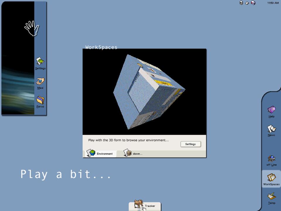
7. Multiple desktops
As a guy who tries his personal best to have fun looking at UX, I would concede a 3D desktop cube is a novelty at best, and I can truly say this as I used to spend hours having fun with Compiz/Beryl. The various effects make a nice toy, but a lot of the plugins, like wobbly windows and cover flow tab switching are eye candy at best. Even macOS, which had the 3D login cube effect, removed it.
But I do think Gonx was ahead of its time here, as there does need to be something higher than a desktop switching widget to effectively manage the desktop. BeOS was an early pioneer of this, with an intuitive way for switching between workspaces with a fluidity X didn’t quite have, and even supported switching color depth in between them – which Haiku can do, but the thing is, it’s stayed this way while others have adopted ways to move forward.
As real time examples of how workspaces have evolved, Gnome Shell, the modern Mac/iOS, and Windows 10 all have workspace views where multiple desktops and applications are displayed over the application windows like a birds-eye view of it. I’d almost suggest that maybe in R2 or R3, Haiku could adopt a more dynamic workspace manager.
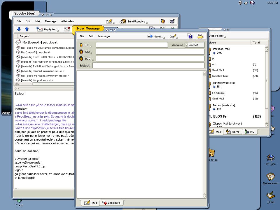
8. Unified toolbars
One thing that Gnome 3 and the Mac have both begun to do is to unify the toolbars in applications, and although the title tabs on the apps below remain separate, Gonx definitely had an early idea of saving vertical space by bringing the menus and buttons together where it made sense to do so.
(Notice the background window with a passel of buttons has most of them on the bottom, whereas the foreground window has them on the top with the menus).
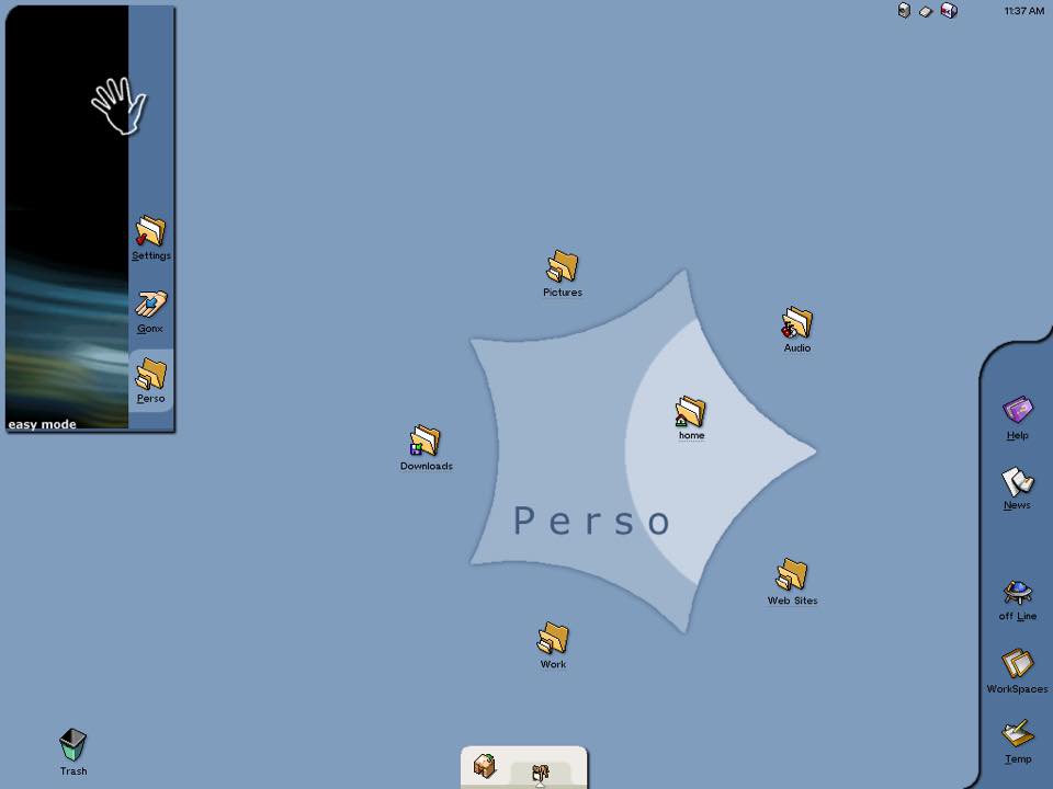
9. Pop out home folder
Similar to the unified buttons idea, Gonx actually had something interesting going on here. It appears to be similar to the circular menus I remember mice in the late 90’s had as a plugin, or the early form of what would later become Stacks on the Mac in Leopard, (which was recently enhanced in Mojave), and is something that I truly believe would be beneficial to Haiku in something similar to this.
I mention all of these because this was the last concept done back in the OpenBeOS days by the looks of it. It definitely has the experimental title tabs of Dano and Zeta, and so I imagine was something done around that time.
I’m not saying the idea of Gonx was perfect, as there are areas in here (like the three buttons being squeezed together) that I see probably could use continued refinement. But what I am saying is that the seed of the idea is there in a lot of the creator’s work, and it’s definitely something worth Haiku’s time to maybe use as design inspiration for Release 2 when the day comes…
Anyway, just thought I’d offer my thoughts on these, and if nothing else, maybe they’ll actually make it in someday in the future. Hopefully the original author won’t mind me pasting these in and commenting on his work…
