Haiku UI Mockup

all this fascination with rounded corners. i don’t get it…

i like my books and letter and documents to be printed on paper with CORNERS.
my LCD-screen and desktop have NO round corners. I had rounded corners when I used CRT monitor. It sucked.

i like rounded corners when i buy a CHILDRENS books.

this looks like Bluecurve theme from old Redhat, only in yellow. Bluecurve sucks.

please stop the rounded-corners-madness.

please.

It’s a double-edged sword.

Round corners can create an updated feel precisely because PC pixel arrangements are square. For example, achieving seamless curves consumes more resources, demands clever anti-aliasing, and is generally all about breaking the constraints of PC architecture.

The weakness is that all curves need to be world-best because if users perceive the square pixels then the GUI immediately looks outdated (my emphasis). User perception is driven by their expectation rather than their ability. Competition between all vendors means that curves are always improving. It will be a challenge to beat Microsoft and Apple in this respect, and rewarding too.

On corners:

High resolutions make pixel arrangement look smaller and the old BeOS window borders are looking stretched. That is OK because the human brain automatically generates continuing lines. However, in order for the brain to produce its imagined lines effortlessly, the brain requires a starting point and direction. I see you have darkened the outermost pixels and this helps a lot, provided the user does not select a dark desktop image!

The natural starting points are the window corners. Consequently, I would like to see some innovation in the design of window corners. Microsoft, for example, use a combination of highlighting and shadow throughout the full length of the borders to achieve visual recognition. I do not advocate copying but I do feel that something new is needed to emphasise the corners.

On something else:

Horizontal spacing between the buttons (menu items) could clarify their atomicity and help prevent a tired human brain from accidentally scanning over the menu option that it is actually looking for.

On colours:

Colours can add to the work and perhaps more importantly, biological brains ‘add colours’ only after rendering geometric forms.

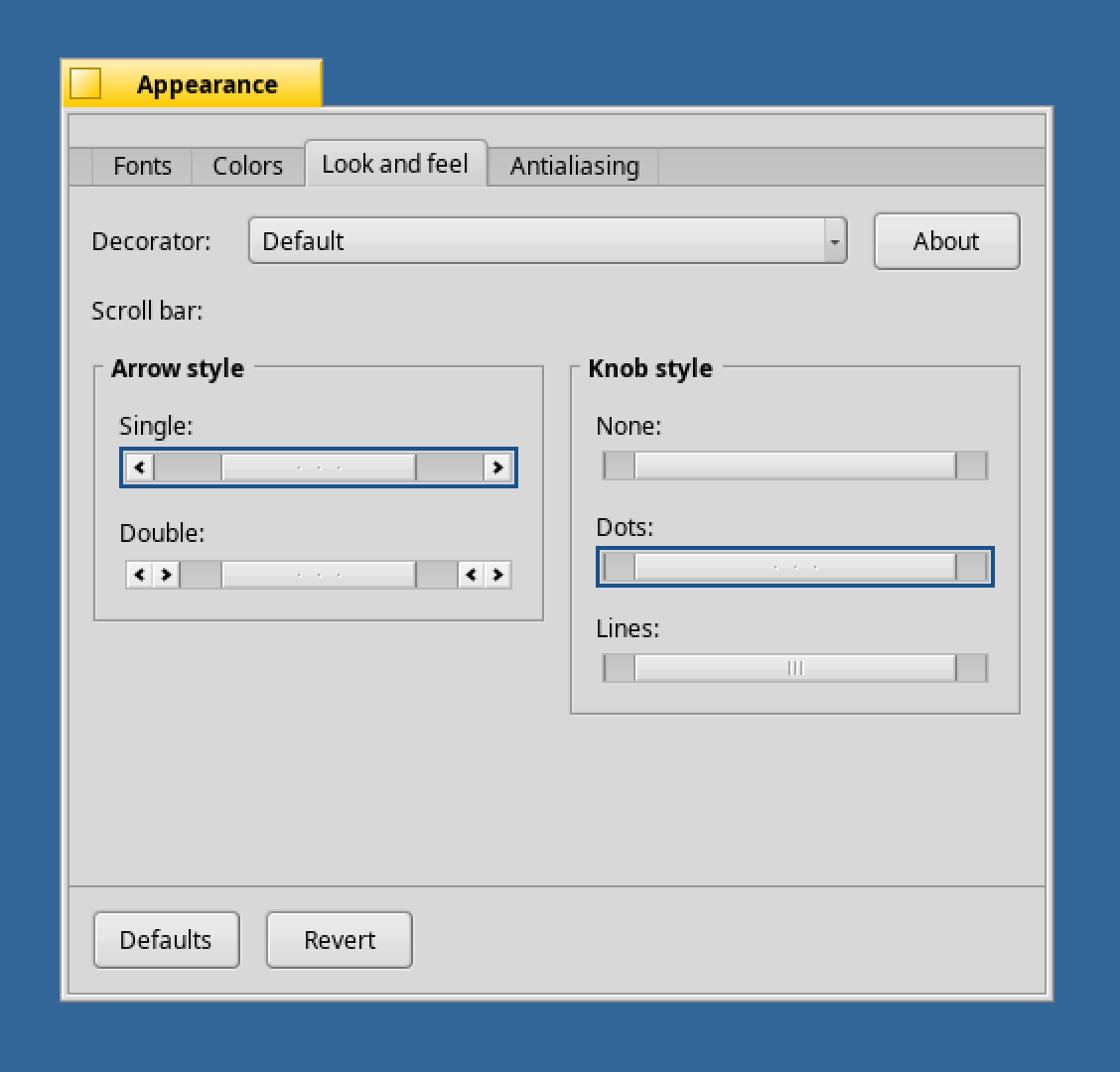
However, colour can make distinction between areas and that is why we highlight menu items. Why not use mouse over highlighting for scroll bar? I tentatively suggest trying this because the effect could add to the sense of functionality, without detracting from the minimalist appearance that some others have asked for. Note that adding outlines to the knobs on scrollbars is not minimalism :wink:

On something amazing:

Haiku inherits BeOS tab-like forms and these remain nice. There have been some major inovations in tab design since BeOS R5 was released. For example, please take a look at the expanding tabs used in Opera web browser and tell me what you think :slight_smile:

Hey guys, original poster here. Figured I’d drop in and see how things were going.

To answer some questions:

- Why did you put the scroll arrows together (OS X style)?
Because at least in my head, it makes more sense as far as efficiency goes. Assuming the user doesn’t have a scroll wheel on his mouse (why else would he be using the arrows) isn’t it a bit of an inconvenience for the user to have to bob their cursor up and down over 75% or more of their screen’s height time and time again during the course of browsing a document? I would certainly say so. Simply moving the cursor a few pixels up or down is much more efficient.

- Why the drop shadows?
Simply put, when used correctly, drop shadows give a very obvious and natural cue as to the strata level of a window or UI element. It’s a godsend when working with a window manager that’s not centered around maximizing all your windows (a good contrast of this is seen between Windows and Mac OS). It allows the user to pick the active window, nearly regardless of its size, out of a huge pile of other windows in an instant instead of it blending in and making the user actively look for what they need. As mentioned before, they also have a bonus modernizing effect.

- Rounded corners are silly!
Depends on who you ask. Personally, I find that they have a nice way of softening what may appear harsh (especially to new users). Additionally, they give a more modern look (when used correctly) while still working very nicely with a minimalist feel. I find that larger corners lend to oversoftening or “playfulness” of what they’re applied to while making them too small lends a feel that’s almost harder than plain sharp corners. A good middleground of 3/4-5/6px tends to work best in most situations.

When you scroll by dragging the bar, you normally move away from at least one arrow and towards another.

For example: assuming we have a standard layout (ala Windows, BeOS, RISC, Amiga, etc.), when you drag the bar downwards you will typically move towards the downwards arrow. The arrows offer a fine adjustment and this especially noticeable when scrolling through large documents. Consequently, when you have dragged ‘nearly enough’, the corresponding arrow is the next closest GUI object.

That could be a utilitarian defense for having the arrows separate. However, design is not just about utility and great designs grab attention before the onlooker even knows what the thing does…

I’m not sure where arrows ‘should be’ to achieve the best emotional effect :slight_smile:

Humn… have you considered adding a slight curve to the top and bottom of the adjustable bar inside the scrollbar widget? :slight_smile:

The original mockup is the best until now

Up!

What about a scroll bar that can be enlargened to change the zoom level. I have this on Adobe Audition. To move along, one drags the scroll bar from the centre, and to zoom on the waveform, the edges can be grabbed and moved to enlargen or diminish the size of the scoll bar itself.

I like the last image posted. One thing I’d say would be the top right corner of the menu drop down list should be straight.

I’ve been reading older “Haiku Mock Up” threads in the forum, and like the many posters on this thread, I like this mockup the most. While right now not everything in this mock-up can be implemented in Haiku, I think eventually much could be, and I think this gives Haiku a nice, clean modern look which rivals other systems.

But it has been a while since this was posted, and I’m not sure if the original poster is still around. If so, could you reply here?

If you have moved on that is fine, but if that is the case I intend to recreate this mock-up as best I can (probably in Inkscape as an SVG) so it can be tweaked and used for future Haiku design discussions. On that note if anyone knows what the wallpaper used in this is, that would be great, since I really like it and I think it helps make the design look nice.

I like this as well; it looks a little bit fresher without going into self-indulgent glitz.

Is the Glass Elevator project still kick’n these days?

Haiku have a nice GUI, some Layouting and Fonting need rework. Some Color need a litle tweak.

Other a re Desing the GUI need a GUI Designer!

Hey guys, this is the original poster! I came back thanks to a message from leavengood. I had been checking on this thread once every few months but nobody had posted until now…

I’ll do anything I can to help out, including vectorizing this design. It might come a little more slowly, as I am no longer working on solely my own schedule (I was in between high school and college when this was originally posted!), but it can still be squeezed in.

As for the wallpaper used in this screenshot, well… it’s nice for the mockup, but not really suitable for inclusion with Haiku. You can find it here: http://www.animepaper.net/art/25745/pursuit-of-knowledge

Its colors are perfect for a nice haiku-themed desktop, though.

Thanks so much for starting this post…

firstly, I just wanted to say, your designs are insightful, creative, and will open up a whole new venue for Haiku. I know a lot of developers will bash most posts that suggest a change in the Haiku GUI, but the pictures which you attach are not much of a divergent from the original theme, just an updated, sexy look.

Secondly and please, I don’t want to argue with anyone on this matter, but perhaps Haiku will implement a theme changer, which will feature one or two (and the original) themes for the user to choose from… I for one would not argue with that. Of course such an element will take time to implement, but it’s not impossible - perhaps impractical - but not impossible. People like change, and I don’t think that everyone will want to use the Haiku standard GUI forever. I for one, LOVE the haiku user interface, and I personally don’t think it should NOT change, but I’m not saying a big fat NO to the idea of a few themes and a theme manager for other users to choose from…

Thirdly, I have always been fascinated with GUI design, so I guess I’m just saying, ‘I really like the work you’ve done, keep it up, and I cannot wait to see some more mockups with your user-interface ideas’…

Cheers!

-el.tigre.20

I’m late to the party on this one, but…wow! Love the curved title bar and menus. Curves are great, as long as they’re not overdone.
And, of course, a nice background picture always helps the presentation.

I have implemented rounded corners on buttons and menu fields in HaikuControlLook as well as customizable scroll bar knob styles (lamented on earlier in thread). These are simply not turned on right now except the rounded corners are used by the key buttons in the Keymap prefs layout view. If you have a love of scroll bar knobs that can’t denied, demand that they be supplied!

2 Likes

Please make it a setting so that users can choose what they prefer.

2 Likes

I totally agree on this one, rounded corners for buttons & menu fields still look very modern even today, the current buttons look too sharp for my taste and possibly many others, i find the “dano” ones look even nicer because of their smaller size, even MS chose that shape in win7, so making them an option in the appearance preflet is a good compromise for the ya & nay sayers.

1 Like

Yup, I’d really like to have the option to make Haiku look like this:
https://discuss.haiku-os.org/uploads/default/original/2X/6/60313712d09d06eb2ac8bb55a5c3b8aefe4958ca.png

2 Likes

You can go deep in the decorators source :slight_smile: and see what you can do about, it dont see so harder.


It is all on c++
and with this software
https://github.com/HaikuArchives/HaikuThemeManager cause it only affect the colors theme but not a more complex apeareance options then the Zeta themes dont work on haiku :frowning: .

I want you all to know that your Haiku install could look like this right now if the powers that be would allow it. Check out those rounded corners on buttons and menu fields, marvel at those scroll bar knobs:

13 Likes