I just got my PinePhone today. Using it or developing for it looks like a handful! KDE Plasma Mobile still looks like it’s not in a very polished state at all.
It it helps, links to PinePhone schematics and datasheets can be found on its PINE64 Wiki page:
https://wiki.pine64.org/wiki/PinePhone
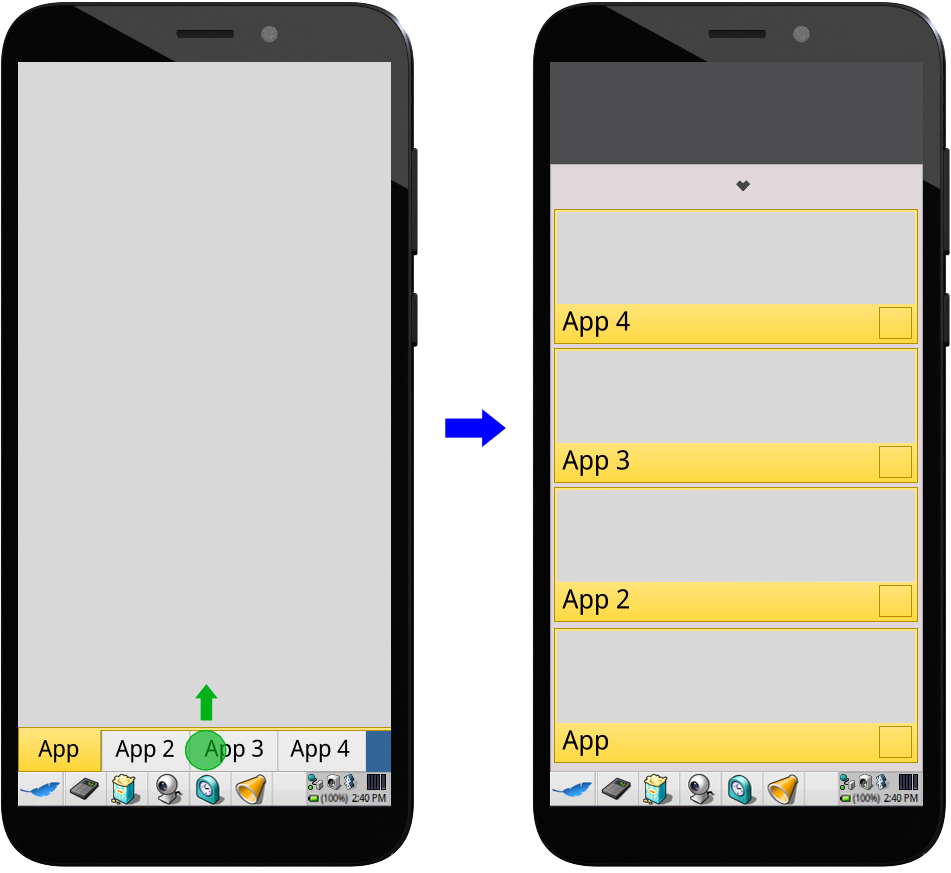
Considering that the mobile mode will only have a relatively small number of apps, this might be a bit of an overkill design perhaps?
Also, how would a user be able to tell running and non-running apps from each other?
Not a fan of the close button being that near to a side and immediately visible whenever an app is running, where it could accidentally get tapped by the user’s palm (especially the part below the thumb) while they’re holding the phone. It’s why in my concepts, only less consequential actions near the sides can be triggered by being tapped.
A close button in contrast, is very consequential.
From a recognizability perspective, if we do not add a close button we should not use the tab metaphore at all.
In your screenshot they are small and hard to tap, and would become quickly unusable with longer application names.
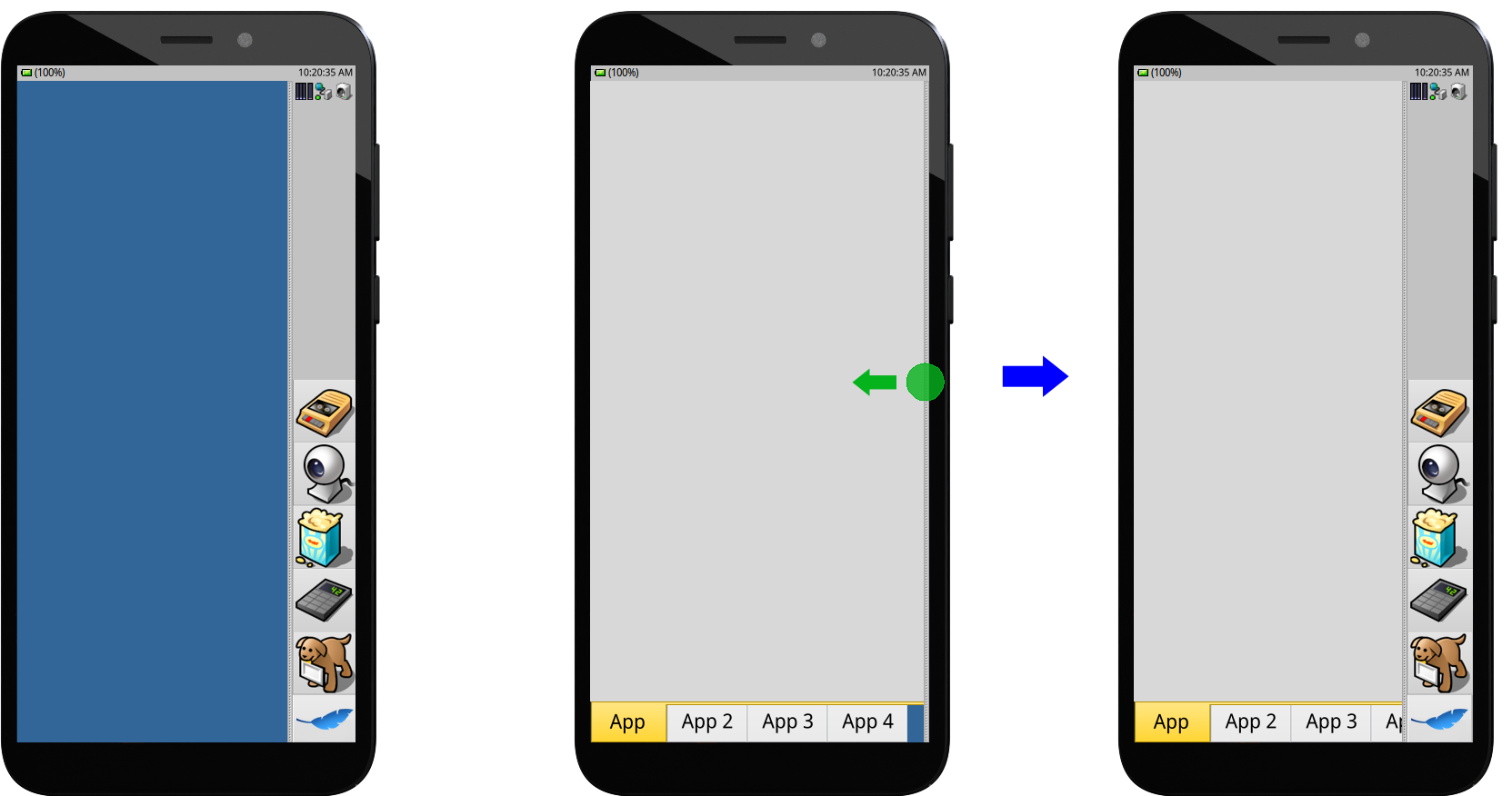
I think this should either be a devider you pull up (as in my concept) or one you slide right to left (as the iOS lower bar does)
Thinking more of this, if the view stack can be ordered sequentially we could use the left to right pull abd right to left pull to switch between views.
The close button is only found in the App Overview and can be scaled as needed in the implementation. This is to avoid it being mistakenly tapped by the palm accidentally touching the screen.
The tab metaphor still remains recognisable even without a close button, especially with the basic app switcher. Additionally with Mobile mode only a select few apps will be used, so closing them isn’t really an essential feature. Even on mobile OSes that don’t intentionally limit their app catalogue like Android and iOS, many people don’t even bother to close their apps.
It does not work like a tab, so we should not make it look lile one.
Tabs do not necessarily have to work the same as on desktop, but they can still serve as a useful visual metaphor for organisation.
A feature I’ve been thinking of for the basic app switcher is the ability to sort app tabs by holding down on one of them, then dragging it. It could be useful for organising running applications.
I think they should, if we implement a UI control where the behaviour does not match we should not copy the visual style.
Edit: as for the app seitcher overview you have I don’t like this for a phone, it could make sense on a tablet.
Personally I want the app switcher to worl much faster, like the deskbar does similarily. window previews aren’t needed. In my design the drahhed up switcher would bring up the application list and lets you switch, regardless of wether they are “running” or not
Maybe I should code a little prototype we couöd argue about?
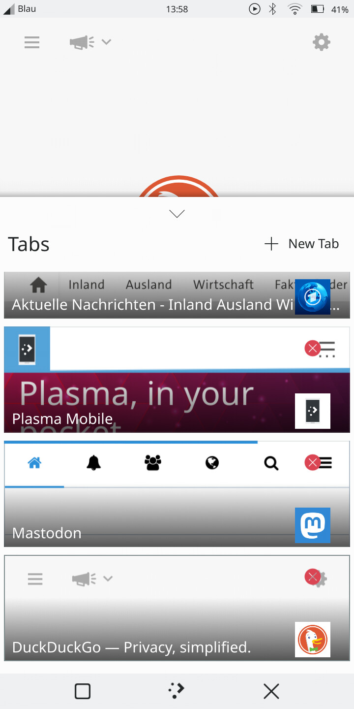
It was the simpler App Overview design I had in mind. Here’s one of the alternate App Overview designs that could potentially be combined with the app drawer list in your concept:
This was based on how the Angelfish web browser does tabs on mobile:
Having working prototypes could certainly help, but both concepts would have to be made so that both can be assessed with UX testing on equal terms.
1 Like
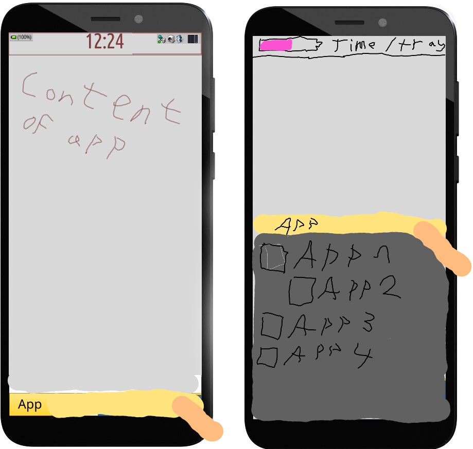
Your screenshot pretty much shows why I don’t think previews are needed, there is no interesting visual information in it. It only distracts from the tab title.
Disagree, previews are visual aids for the user to immediately glance at what an application’s current state is without being limited to just whether it is running and without needing to switch to it.
Your screenshot does not provide this, and neither do previews in mobile OSes generally.
Applications will often appear as “running” with a specific UI state but then reload or start anew once switched to. The only really relevant info is which app it is, which in the screenshot above is way worse to grasp than if it had been a listview for example, the text has bad contrast, the preview is distracting and the tab icon is oddly placed.
Edit: as for removing items, like an applicatioms View i am heavily leaninh towards using the iOS “swipe to left to delete” kind of way rather than having buttons.
The concepts are supposed to just provide a general idea for the design, after all:
But fine:

No, the contrast is fine:
I’m fine with this, but some users may need visual cues on how to close an app. A close button is the easiest way to do this. Got any other alternative solutions in mind?
2 Likes
You seem to have missed that I said “in your screenshot”.
anyhow, the UI is very unconvincing in the screenshot and the mockup does not help me understand the merrits.
It looks like spme kind of split view and is extremely visually noisy, as a User I habe no idea what the clntrols are supposed to be , which ones are active, what I can do there etc.
Accidentally swiping a bit so the delete option becomes visible is very discoverable : )
I didn’t screenshot anything in the post you replied to earlier. Oh wait, did you mean the picture of Angelfish? If so, then I’ll agree to that. Which is why in the alternate App Overview design, the background where the text is on is opaque.
I will agree somewhat on the visual noise, although part of that is due to the way the mockups were created; partly from Haiku screenshots and a mix of the regular Haiku and Flat aesthetics. Many of those are unlikely to be present in the actual implementation, when a single theme is applied universally.
Colours are supposed to guide the user in what is active and what isn’t, such as here:
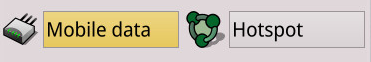
The yellow button is intended to indicate that something is enabled, in this case Mobile data.
Eh, not really on it’s own. You’d have to use a tutorial of sorts or hope that the user figures it out on their own. An initial tutorial in all fairness would be required for both our concepts, though. That’s not entirely a bad thing as some mobile OSes do this or used to after a major UI overhaul. But it is ideal to design the UI in a way so that will be as short as possible.
That’s rather unfortunate, really. However, I do feel similarly about yours.
- With the ballooning size of phone screens and the continued existence of small hands, many folks will have to adjust their grip or uncomfortably extend (or try to) their thumbs in order to reach the status bar, notifications, and quick settings
- Android and iOS have tried to implement one-handed modes that really just push the usable display down; this is an ugly hack for UIs designed without one-handed use in mind including the concept right above these bullet points
- The heavy use of gestures mean that it will take more effort to learn, to retain the knowledge (for certain folks), and those with limited finger dexterity have more difficulties using it; these are general issues with gesture-heavy UIs
Anecdote: My own parents have struggled with recent Android and iOS versions which have become gesture-heavy, eventually needing assistance to enable the navbar and AssistiveTouch on those respective OSes.
- Lack of visual cues means that users will largely have to figure out on their own how to do various actions; this is related to the criticism on the overreliance of gestures in the previous bullet point
- Lack of any sort of running app previews means less visual information at a glance on the last known state of an application, necessitating unnecessary app switching; any information on the state of an application (however late) is still better than none at all
In the end, a more ideal interface design is prolly somewhere in the middle of our concepts. Both have good merits and I am willing to incorporate some elements of your design into a combined one.
It was not intended as anything to use, just as information, that is there are no quick settings there.
The clock at the bottom feels unatural, I think the information above should be always visible generally. But not that there should be anything you can get from there.
On another note we can totally use the power button to bring up a menu, or a switcher or something.
Edit: in your concept with the notifactions and stuff below the “devider” to drag up this is a bit hard to reach imo, because you can no longer swipe from “just below” to up rather you have to swipe from a specific place now.
So it is purely for display purposes, then? If so, then where will a user go to figure out what the current day is and (slightly less essentially) what the current alarms are? Having to go through the app drawer and opening the clock app just for these is rather inconvenient.
Also, where should the quick settings be?
It does yes, but it was placed there to keep it near the Notifications tray and as a visual cue that it is where the Time and Notifications Hub is.
The swipe area could be extended all the way down to the bottom edge to solve this.
I don’t want any concept that violates direct manipulation, either you drag the devider, and it follows your finger. or you don’t, I would say.
Why do you need quick settings? we didn’t even get to that part of the UI design but you seem to implicitly assume that everything we didn’t talk about will be copied from android or?
iOS has a lock screen, with notifications, and a control center. with only controls. Personally most controls there seem pointless for maple. But would be trivial to have on for example the right side of the application list.
Why do you need a time and notification hub?
Alarms beeing in the application for alarms seems exactly where they should be, and this would be very easily accesible by simply swiping the devider up and scrolling to
Time
=> * Alarms & Reminders *
=> Calendar
For example anyway
Edit: could also be a “quick options” view in the list at the top
See if this different layout is more amenable, before I’ll make more mockups of this concept:
Non-interactive status bar on top with a sidebar containing the Notifications tray, dock with favourite apps, and a persistent handle. The sidebar hides whenever there is a running app visible, with the handle remaining at a side to indicate to the user that the can swipe from there to access it. This concept maximises the available screen space, while still remaining fairly intuitive and resistant to accidental edge touches.
I can personally vouch for the resistance of this design to accidental touches while holding the phone, as Ubuntu Touch/UBports has a very similar UI and I haven’t really gotten any mistaken interactions caused by the palm:
With these designs, the user always has to pull back the thumb and the part of the palm that would normally cause accidental touches at the edge.
It might accommodate your ideas better.
Looks all nice, but who wants a grey background on a phone? I think black is here the better grey 
1 Like