It was already fixed when you wrote this ![]()
https://git.haiku-os.org/haiku/commit/?id=05ce14d174e9f6637b317d1805346b7d7631f525
It was already fixed when you wrote this ![]()
https://git.haiku-os.org/haiku/commit/?id=05ce14d174e9f6637b317d1805346b7d7631f525
No, test_app_server is specifically to run an app_server test session inside another existing app_server.
If you want to run two displays, app_server support for that should be completed, or maybe you can just start two independant instances of app_server. That’s assuming you’d want to use app_server at all in your phone system.
Bugs fixed with negative time, cool : D
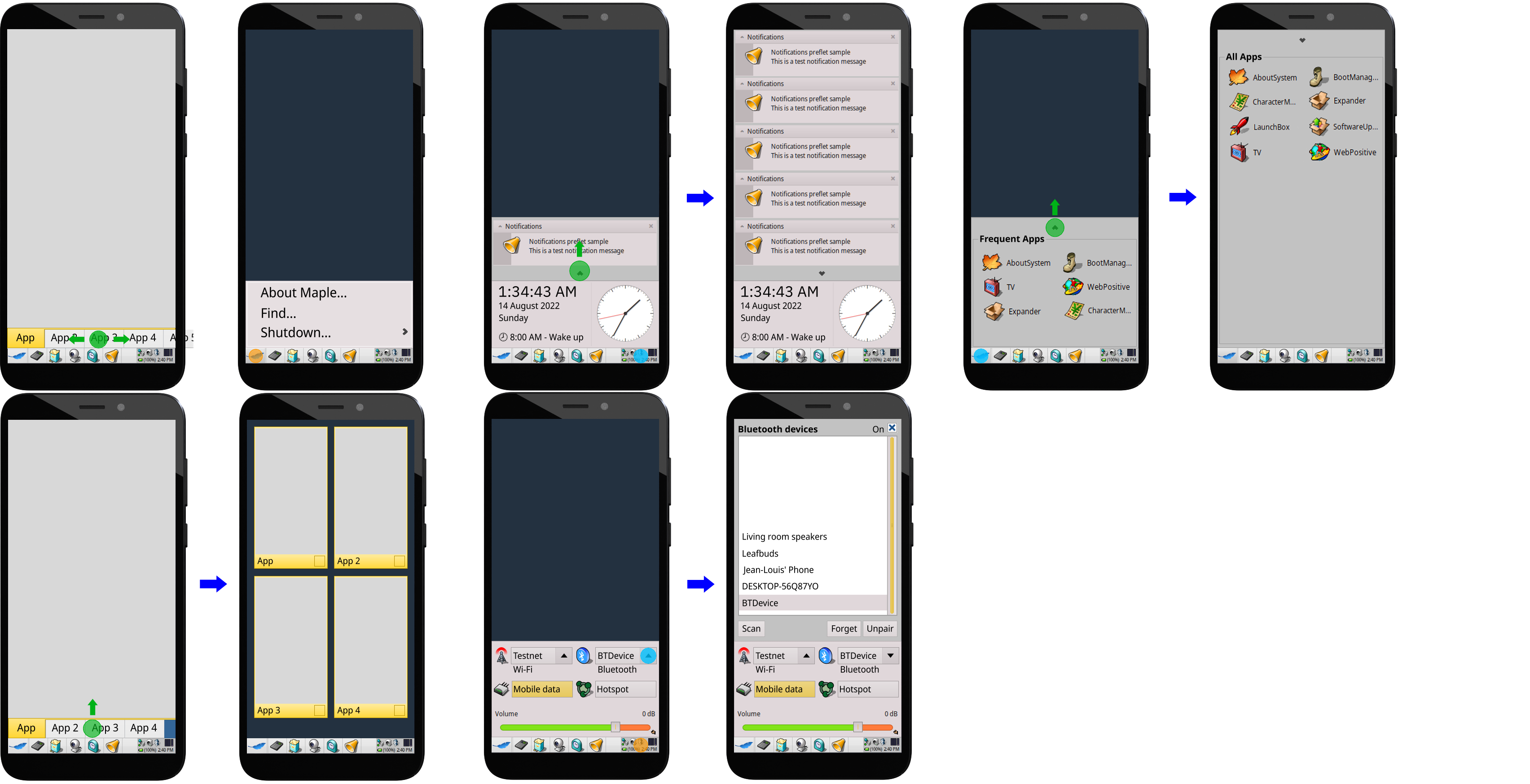
Recent discussions stemming from WebPositive’s hamburger menu code have inspired me to expand upon the initial concept for Maple:
From left to right and top to bottom:
Green circles and arrows are gestures, light blue circles are taps, and orange circles are tap-and-hold actions.
A core design tenet was one-handed accessibility, which meant having most of the UI within the bottom half of the screen. Admittedly, there could still be improvements in this regard.
Still not quite sure yet regarding the Notifications Hub, since Maple’s mobile side is intended to be just for basic phone tasks, Decided on having it instead of notification badges on app icons.
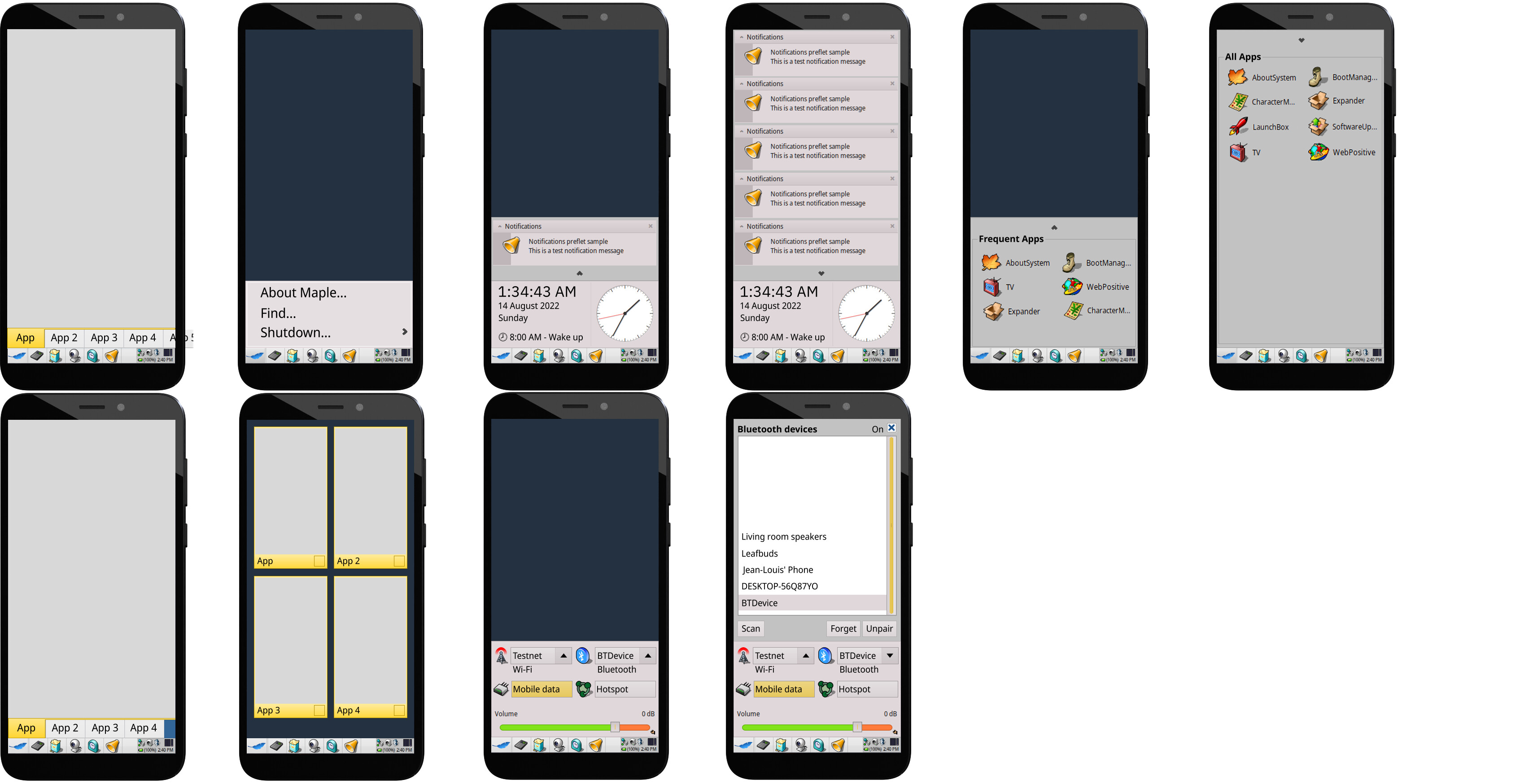
Without UX interactions:
Why are these images so low resolution?
Anyway, I’ll try to draw what I had in mind : )
Some of the art used comes from Haiku screenshots. Might also be due to the compression?
Here are the same images without compression.
With UX interactions:
Without UX interactions:
I actually rather like those!
The layout in picture form confuses me a bit, some sort of an interactive demo would definitely help convince me and maybe others
Don’t think I can quite make that, but I can give the Krita project files to someone who can.
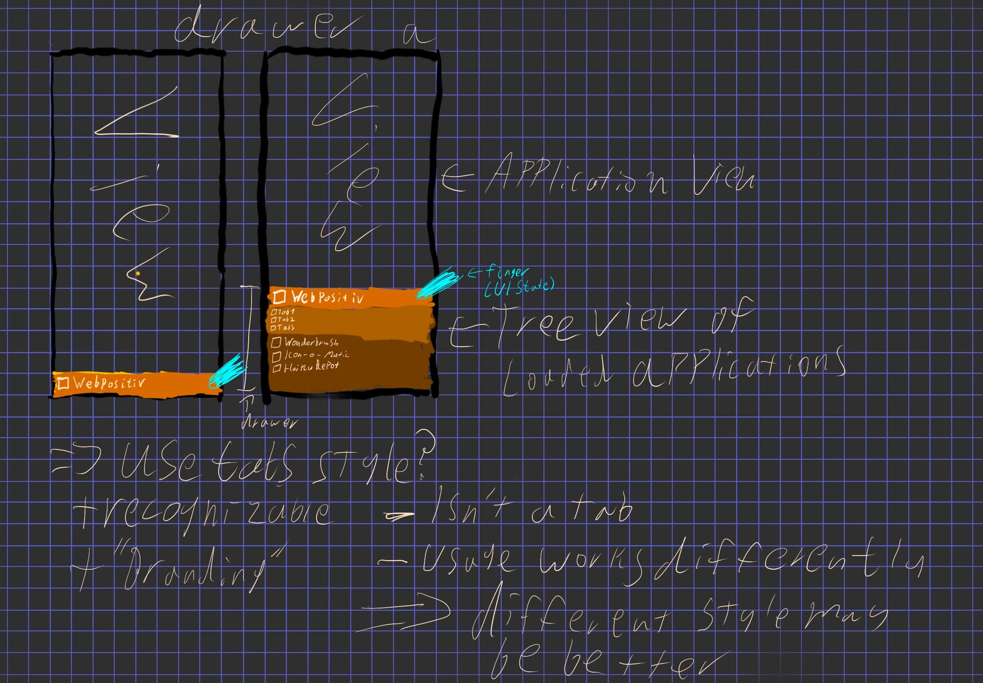
Guide for the picture with UX interactions:
Convince you of what?
This far it’s mostly been win8linux and me brainstorming.
That the UI design is a good idea, sorry if I was asking a bit much but I found it a little difficult to grasp the full idea of using it with just pictures
If the treeview never goes beyond 2 nesting layers, maybe an accordion gadget should be used instead. It’s easier on a touchscreen.
I don’t know what that is : (
Sometimes called an “expando”, the titles appear in a stack until one is selected. Then that title becomes taller, showing its contents. If another title is selected, that one expands and the first one shrinks just to a title. The contents of each title can be links or text like a menu but is much larger.
Not sure I get your description. sounds like a tree view to me?
It’s used for many of the same purposes as treeview gadgets but is more touchscreen friendly. In Google’s Dart Native environment, the Flutter framework supports both.
I think the idea to first design the UI/UX for a potential Phone-Haiku is good.
But I think it might be a good idea to go parallel. You could start analyzing low level hardware (mainly CPU but some other HW aspects, too.) already while the GUI design is still brainstormed. You could even start a third task in parallel: Discussing which subsystems/ecosystems/app-frameworks should be supported early: Android, Java, Javascript, .NET, WASM, HTML5, Docker, Haiku native etc. Of course, they might be supported ALL finally. The question is which one first, and then second…
Greetings
Peter
There are ongoing ARM port efforts already, although none are targeting the PINE-A64/SOPINE which the most likely Maple reference platform (PinePhone) is based on.
Maple (read: Haiku on mobile) is supposed to have two operating modes:
For Mobile mode, there have been a couple suggestions on how to implement it:
The virtual keyboard could just push the app upwards if necessary. It could be dismissed by either swiping down on it or having a close keyboard button within it.