Haiku on Phones

You seem to have missed that I said “in your screenshot”.

anyhow, the UI is very unconvincing in the screenshot and the mockup does not help me understand the merrits.
It looks like spme kind of split view and is extremely visually noisy, as a User I habe no idea what the clntrols are supposed to be , which ones are active, what I can do there etc.

Accidentally swiping a bit so the delete option becomes visible is very discoverable : )

I didn’t screenshot anything in the post you replied to earlier. Oh wait, did you mean the picture of Angelfish? If so, then I’ll agree to that. Which is why in the alternate App Overview design, the background where the text is on is opaque.

I will agree somewhat on the visual noise, although part of that is due to the way the mockups were created; partly from Haiku screenshots and a mix of the regular Haiku and Flat aesthetics. Many of those are unlikely to be present in the actual implementation, when a single theme is applied universally.

Colours are supposed to guide the user in what is active and what isn’t, such as here:
Screenshot_20220819_233846
The yellow button is intended to indicate that something is enabled, in this case Mobile data.

Eh, not really on it’s own. You’d have to use a tutorial of sorts or hope that the user figures it out on their own. An initial tutorial in all fairness would be required for both our concepts, though. That’s not entirely a bad thing as some mobile OSes do this or used to after a major UI overhaul. But it is ideal to design the UI in a way so that will be as short as possible.

That’s rather unfortunate, really. However, I do feel similarly about yours.

  • With the ballooning size of phone screens and the continued existence of small hands, many folks will have to adjust their grip or uncomfortably extend (or try to) their thumbs in order to reach the status bar, notifications, and quick settings
  • Android and iOS have tried to implement one-handed modes that really just push the usable display down; this is an ugly hack for UIs designed without one-handed use in mind including the concept right above these bullet points
  • The heavy use of gestures mean that it will take more effort to learn, to retain the knowledge (for certain folks), and those with limited finger dexterity have more difficulties using it; these are general issues with gesture-heavy UIs

Anecdote: My own parents have struggled with recent Android and iOS versions which have become gesture-heavy, eventually needing assistance to enable the navbar and AssistiveTouch on those respective OSes.

  • Lack of visual cues means that users will largely have to figure out on their own how to do various actions; this is related to the criticism on the overreliance of gestures in the previous bullet point
  • Lack of any sort of running app previews means less visual information at a glance on the last known state of an application, necessitating unnecessary app switching; any information on the state of an application (however late) is still better than none at all

In the end, a more ideal interface design is prolly somewhere in the middle of our concepts. Both have good merits and I am willing to incorporate some elements of your design into a combined one.

It was not intended as anything to use, just as information, that is there are no quick settings there.
The clock at the bottom feels unatural, I think the information above should be always visible generally. But not that there should be anything you can get from there.

On another note we can totally use the power button to bring up a menu, or a switcher or something.

Edit: in your concept with the notifactions and stuff below the “devider” to drag up this is a bit hard to reach imo, because you can no longer swipe from “just below” to up rather you have to swipe from a specific place now.

So it is purely for display purposes, then? If so, then where will a user go to figure out what the current day is and (slightly less essentially) what the current alarms are? Having to go through the app drawer and opening the clock app just for these is rather inconvenient.

Also, where should the quick settings be?

It does yes, but it was placed there to keep it near the Notifications tray and as a visual cue that it is where the Time and Notifications Hub is.

The swipe area could be extended all the way down to the bottom edge to solve this.

I don’t want any concept that violates direct manipulation, either you drag the devider, and it follows your finger. or you don’t, I would say.

Why do you need quick settings? we didn’t even get to that part of the UI design but you seem to implicitly assume that everything we didn’t talk about will be copied from android or?
iOS has a lock screen, with notifications, and a control center. with only controls. Personally most controls there seem pointless for maple. But would be trivial to have on for example the right side of the application list.

Why do you need a time and notification hub?
Alarms beeing in the application for alarms seems exactly where they should be, and this would be very easily accesible by simply swiping the devider up and scrolling to

Time
=> * Alarms & Reminders *
=> Calendar

For example anyway

Edit: could also be a “quick options” view in the list at the top

See if this different layout is more amenable, before I’ll make more mockups of this concept:

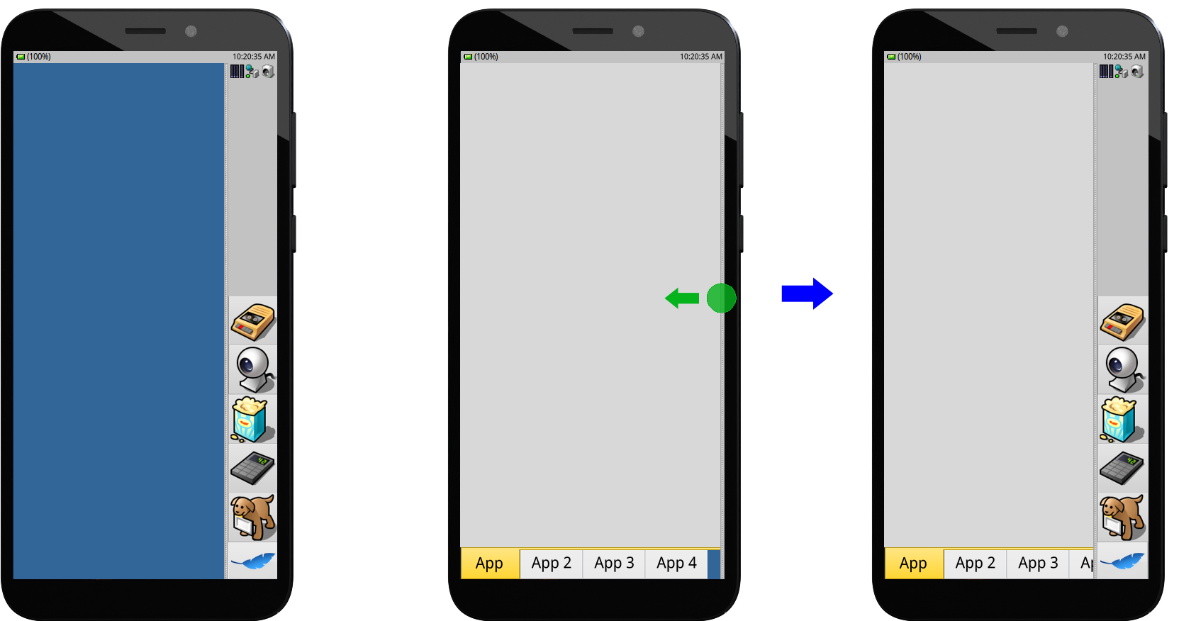
Non-interactive status bar on top with a sidebar containing the Notifications tray, dock with favourite apps, and a persistent handle. The sidebar hides whenever there is a running app visible, with the handle remaining at a side to indicate to the user that the can swipe from there to access it. This concept maximises the available screen space, while still remaining fairly intuitive and resistant to accidental edge touches.

I can personally vouch for the resistance of this design to accidental touches while holding the phone, as Ubuntu Touch/UBports has a very similar UI and I haven’t really gotten any mistaken interactions caused by the palm:

With these designs, the user always has to pull back the thumb and the part of the palm that would normally cause accidental touches at the edge.

It might accommodate your ideas better.

Looks all nice, but who wants a grey background on a phone? I think black is here the better grey :wink:

1 Like

That’s just the placeholder for app content.

Article detailing the process to port and boot a non-Linux OS on the PinePhone:

By any chance, could the info regarding the general Allwinner A64 boot process be potentially useful for the ongoing Haiku ARM ports as well?

1 Like

I believe the ARM ports are at an early stage still so we have more generic issues to be tackled first.

Having said that, if anyone wants to do some bring-up on the A64… contributions are welcome! :wink:

3 Likes

If you’re proposing (in another thread) @SamuraiCrow that Haiku on phones should use another base, then perhaps using Apache NuttX may be more ideal. It is fairly small, well-documented, real-time, a microkernel, and the PinePhone port is being worked on by someone well-acquainted with the hardware including some future drivers planned for it.

Personally though, I’d prefer sticking as close as possible to Haiku.

1 Like

Perhaps Haiku isn’t the best OS for phones but I do like small OSs. My reasoning for wanting to use Genode was outlined in the other thread as well. I do have high hopes for the PinePhone being privacy oriented because it does have a kill-switch in the back cover for each separate subsystem. Using a microkernel would just be the icing on the cake as far as driver isolation goes.

Just to reiterate the core premise:

Haiku is built for desktop, especially the interface. The main appeal (as mentioned by @nephele before):

Good basic phone and a pocketable Haiku installation, the latter being activated when the necessary peripherals are connected.

If all of Haiku is going to be used for a desktop mode, then might as well use parts of it for a distinct mobile mode too.

Parts I’d like to reuse because i sinply like them are stuff like the ALM layouting engine we have, the controllooks(concept), some system designs. But for most parts it may turn out that Maple would use the Haiku variant, and maybe replace them later with more aproriate stuff. Potentially some gets back to Haiku too.

Suppose that makes sense, although maybe it shouldn’t divert too much so that desktop mode remains essentially like regular Haiku.

the desktop mode will need changes, atleast some. but largely unchangef yes. But the mobile mode will likely diverge more

Before we start daydreaming UI, where are the basic fundamentals for a mobile operating system (modem drivers, the ability to make a LTE/5G call, SMS, roaming)? Haiku doesn’t have them, the developers aren’t interested, and forking it to create a mobile OS… is possible? But you’ll most likely give up because forking a large project like Haiku requires not only tons of maintenance but also funding.

One possibility is for example, make a build of Haiku for the PinePhone or Librem or whatever, make the mobile UI and software suite a collection of packages you can install from a repo, and I’m not sure if Haiku has Linux-like kernel modules but somehow add support for modems and stuff along the way, what about that?

2 Likes

Sorry, but why should drivers matter before you even figured out what you want to run on the device? It’s better to start planning out what you want to do before blindly writing drivers. Drivers only do what the userspace wants to have done. If you would never use the accelerometer gor instance you could simply not write a driver.

No, forking does not require funding. It only requires people to have ideas about what to do and then do them, for instance by making a git repo and adding stuff there. forking is not that black and white. does Haiku want maple specific components or code in the sourcetree? probably not. But it is fairly trivial to put it into another sourcetree instead.

Also, a side note: SMS is basically dead, only apple still uses this as the “lowest” standard, everyone else moved on to rcs

1 Like

For Me Haiku is perfect desktop operating system and would be more better when it have more device drivers, i think haiku dont need phone edition, but i agree there are devices like microsoft surface go, 2 in 1 devices tablet with keyboards, touchscreens and more and more, hey i like 2 in 1 i have two old windows 8.1 tablets and i am in love with it, but this devices needs not only touch UI like bigger widgets, but needs work at kernel side like more responsible kernel, in linux you can compile kernel with more responsible sheduler and so (sorry for my bad english), i try not only one but more times to install linux to my tablets but allways i back to windows.

i think better than phones support are 2 in 1 and support for normal notebooks with big touchpads

We’re already sharing drivers with BSD. Who will we share drivers with on the PinePhone or whatever else? It seems BSD doesn’t support any phones. Android drivers are closed-source binary blobs and most Android phones are locked to one carrier in the U.S.

The only reason I would add a custom OS to my PinePhone is if it’s more secure than the locked Android 10 smartphone I currently use. A media-oriented OS like Haiku might work on the desktop but I’m not so sure that that programming paradigm lends itself to mobile use. Mobile phones are primarily internet appliances first and computing devices only as a distant second.