HAIKU needs a MASCOT

From the OpenBeOS/Haiku’s past :sunglasses::

4 Likes

What was Walter, exactly? He looks like an eel of sorts… although he could easily be something else.

The fluorescent barbel is missing, but I’d say Walter is a dragonfish: https://en.wikipedia.org/wiki/Stomiidae

1 Like

This rang a bell from long buried memories.

I`m do not think that “Walter” would be a good choice as there was quite a strong opposition to having it as the new name for OpenBeOS. The discussions about renaming OpenBeOS can still be found on the web…

While I concur that there is always need for a rallying symbol, I do not think that a mascot is the most appropriate one in this case.

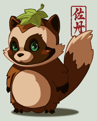
+1 to what really needs Haiku, we need to put more hands to see real progress to fullfill the goal of the project and beyond. But like ak1 pointed out, a good projected image and a approachable identity around the project take most of the good visibility to attract more people to the project. A moscot would be a good idea on that thought. My two pennies would be around the “Leaf” Idea if it would need an animal I vote for the “Tanuki” from the Japanese Culture as Haiku Poem, and the Leaf/Nature motive.


4 Likes

Around the Parrot’s or feathers idea we must take into account that if Haiku is an open source project dedicated to recreating BeOS would be a good idea to follow the original reason for the mascot that is in the book : “Programming the Be Operating System”

http://www.oreilly.com/openbook/beosprog/book/

I think if Haiku needs any mascot, that mascot must be something original and different or better from other operating systems.
Lets see, Windows has useful piece of building (“window to the world”), Mac has piece of the fruit ( “tasty OS”), Linux has some strange animal… That is it, Haiku must have something else, and that something else must be useful and reflect essence of Haiku and kind of user for Haiku.
So, what is it that essence of the Haiku and what kind of user could use Haiku?

Is that true?

Haiku is fast.
Haiku is sensitive.
Haiku is responsive.
Haiku is convenient.
Haiku is tidy.
Haiku is beautiful.
Haiku is inspiring.

Maybe some of you have some other truths?
Please add some.
Or maybe you do not agree with some of truth above…

2 Likes

… I write this above, and now I think, that Haiku’s mascot must be FLASH.
Some yellow flash on the blue?

Something like that:

I prefer keeping the autumn leaves, they work quite well and are already quite widely recognized. They are clean and simple.
Maybe we could revisit the logo a bit, there already were some iterations and maybe the old version fits better with the current “flat design” trend:


7 Likes

This logo is a symbol of autumn , with all the consequential associations. To my mind, this character is contrary (do not meet essence) to what the Haiku OS are, or what aspire to be.
It is mine opinion.

Never saw it from this angle. I concur that anything associated with autumn might be perceived as “dying” although after winter,comes spring which brings new life.

Thanks for refreshing our collective memory about the origin and evolution of the current Haiku logo.
The autumn leaves are widely recognized. Although the logo could be embellished further, I think this is something best left once R1 has been reached.
Any weird character/symbol in yellow on a blue background would undesirably be associated with YellowTab and the Zeta.experiment.

Yellow and blue are BeOS legacy.

One would add one more connection between the flash and the haiku:
haiku as queues goal is to provoke (flash) a new idea in the mind of reader.

Was anti-Walter for the OS name myself. Dug this up as it is part of the history of Haiku. Name of the replacement for BeOS - very much no. Name of a weird mascot - sure why not!

That being said - Leafs handle the job pretty well. Although the bird off the cover of the O’Reilly “Programming The” BeOS book would be kinda cool.

2 Likes

The yellow tabs of the windows and the light blue of the desktop background.

However, the colors of Be Inc. and the BeOS logos were blue, white, and red - quite different than those used for the user interface.

Does anybody know the origin of the curvy drawing found in the later Be Inc. logo? It somewhat looks like the merging of an ear and an eye. If this is the case, then is this in reference to the slogan “The Multimedia Operating System”?

Or a lightbulb like the Newton of the same era used, and an eye? That’s what I see when I look at the logo.