The current discussion show that we need to think about doing things in haiku.
The application menu should really split into cathegories by default. I know haiku wants to be a rebuild of beos, but we are always left this target behind us including the package management system and 64bit software. Here haiku should split the application menu into:
System
Network (or Internet and network)
Painting
Office
Development
Media (audio, video, recordind)
Micelaneus
Games
…
(This must be set as default folders, because every one have a own name for a cathegory now, this starts again chaos in the menu now)
Zeta do this im the past and it was some of the good things there.
I know this take much work at the packages, because they need to be taken to change the link into the menu, but only this can remove the chaos and overfloating of the menu.
If we do that we can move the desktop applets into applications too. And if we have any time a one window solution for the preferences (i really hoppe so), we can move this folder also under application.
If we want to get one step more, we can add a lokal folder as menusource there the application menu folders are linked (translated).
Muliple user
It would be fine to have multiple user support in haiku, i mean single users on one machine. Here i would prefer a container or protected folder for every users home directory. The home folder mounted then to the system the user loged in by startup. So every user can only look into its own home folder (only the amin can manage all).
If you have a child like me, who use also haiku, and it could be that he use the same computer, it would be better he can not look, write or delete things in other user directories.
I am no big fan of Deskbar groups. Don’t most system use some kind of Luancher instead? I would rather spend some time on LnLauncher (or something new) instead.
Ever since the introduction of the awesome QuickLaunch on Haiku I use it exclusively to start apps and I only open Deskbar when I need to restart Haiku
i agree with @lelldorin …maybe many of us… advanced haiku user not affect with this… but for user that new to haiku… will be happy with leldorin suggestion
The original plan with the package management was that the packages would provide categories, and the DeskBar would be configurable either in “flat” mode or a category system. At the time there was not much packages available so the flat version seemed to make more sense.
However, things have changed in and around Haiku since then. We are probably going to use a type-ahead system to quickly locate entries in the DeskBar (similar to Quicklaunch and Windows since Windows 7). This means there is no real reason to keep a flat mode at all: since you can now easily find things by name, the argument that “I can’t guess which category some software is in, so I don’t know where to look for it” is now void.
So the plan would be:
Move the deskbar entries to subdirectories (out of a fixed list, so it does not get too messy),
Add a search bar/typeahead system to DeskBar menu so one can easily locate things in there.
I find the same generally uncategorized collection of software on my MacOS computer, but with a few subdirectories. That seems ideal to me.
Most of us use very few out items of the available software, we know where to find them, and the closer to the top the better.
Any time a large collection of files can conveniently be put aside in a subdirectory, that makes the top level more pleasant to deal with.
Therefore, the Deskbar should present commonly used software at the top, but it should support subdirectories, both release and user-defined.
The way I read the above, it sounds this is just the opposite of what PulkoMandy’s talking about. Unfortunately. I’m not in on the things that have changed in and around Haiku, but if the UI is still mouse driven, then that’s how I’d ordinarily invoke software, and a two level menu just slows that.
When I’m looking for software I don’t often use, I don’t know the name either, so searching by name isn’t useful. I mean, sure, I will recognize the name when I see it, but it’s very possible that for example I won’t remember a priori that the web server is called “PoorMan”.
Subdirectories are cool, but the release software doesn’t greatly need them at this point. As long as they’re supported, optional software with a ton of entries can put them in a subdirectory.
Never have had any use for Recent Applications. I suppose MacOS doesn’t really have to deal with this dilemma because Applications isn’t a menu, it’s just a directory. Your commonly used applications will be on a dock, where you don’t have to go sifting around to find them. That would be a Launcher, I guess (though I find the term a little annoying in that it implies some kind of “launch” functionality, which on the contrary I would expect is already inherent in the system; a dock is just a special purpose directory.)
If it appears that the current menu layout is going to be unusable due to overpopulation, and there’s going to be some kind of dock to replace it for convenient access to commonly used applications, then I guess however awkward the next generation of menu turns out to be, it’s no big deal, we won’t be going there much. I don’t look forward to trying to sort through categories, but it’s no worse than applications starting with A through G or whatever.
On the other hand, why not put the dock in as the menu, and then have one of the options be a Tracker window with all the applications? Simple, expedient, everything’s either right here (dock/menu) or if not, there (Tracker window.)
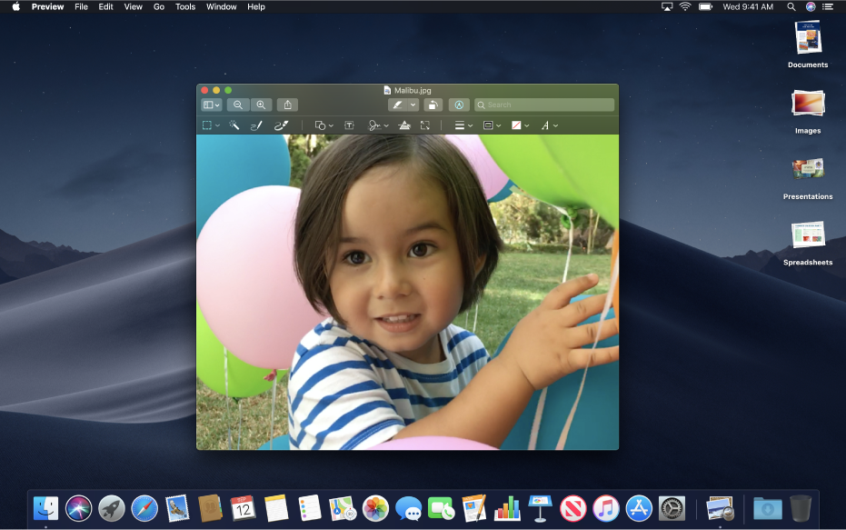
The MacOS desktop is something I would not like to emulate at all:
The Apple Menu is at the top and the Dock is at the bottom. IMO…the Dock is the ugliest invention–it would be visually assaulting and a major distraction for me and possibly to many others as well. Glad I left Apple long ago.
In Haiku, I primarily use the Deskbar Menus and Recent Applications (if I previously used an app sometime that day). I also installed the QuickLauncher, which I use sparingly (not to say I would not increase its use later).
I believe Haiku can please both camps by providing organized meus and/or unstructured list (directory) features where a user can use a preference applet to organize what he/she wants his Haiku to be to satisfy his interaction expectations.
I does not like mac os. The menubar is a good looking gimmick but should be a add-on not the default. I like the beos way of menu structure, but more clean with cathegories. And i think the haiku tracker is cool with the option to place it there i like.
If i want to use mac os, i can buy it now. I want haiku
Someone may have suggested at some time that we emulate the MacOS desktop, but I don’t know anything about that. We’re talking about the Deskbar menu and what should be in it, if the complete set of applications is too long to fit.
all applications, accessed via a menu hierarchy using some categories?
the applications you use regularly
In that second case, the full set of applications would be in an easily accessible directory, which is a presentation that works no matter how many of them there are. It supports hierarchical structure if it’s called for, but I think you’d find that there’s no real advantage to that. Relieved of the need for that structure to work around the limitations of menu presentation, you’d see the category subdirectories as an cumbersome irritation. Not absolutely, there’d likely be some subdirectories, but not as proposed above.
Click the Applications menu itself. It will open in a Tracker window, because it’s nothing more than a directory.
But it could as well be a query for specifically tagged files in packages, which would allow us to have both flat and hierarcqical modes if desired.
It sounds like the majority of users want to customize the Deskbar menus. What makes it difficult to just have a folder structure representing the visible menus, allowing the user to customize that entirely?
If I update a package, is it going to place that Application back to its original location in the Deskbar?