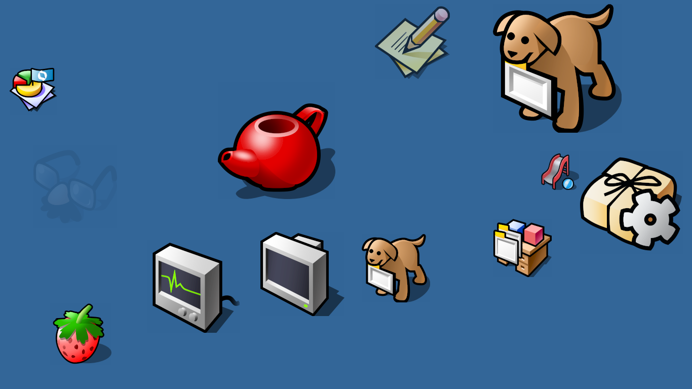
I really love the icons in Haiku. Did a lot of them come from BeOS? Is the designer’s name known? If anyone has info on this I’d love to hear any anecdotes as I fell in love with Haiku because of those icons!![]()
7 Likes
As far I know, most system icons was taken from BeOS.
I don’t know their designer, maybe if search old archives, name will come up?
I checked if icons have any metadata or attributes to them, but it’s seems no.
@zuMi made a lot of Haiku icons
4 Likes
we had a contest eons ago, Stippi’s theme won the competition (btw Stippi is also who designed the native icon format), most of the icons are made by him with the help from other contributors; inspired by the original BeOS icon set (I remember from the Bruce Browne, but I cant find sources) with a modern twist
7 Likes
Gerasim @3dEyes did a lot more, beside porting and writing his own code, he drew a lot of icons
1 Like
2 Likes
I like the Haiku icons very much as well, but I also think icon “images” could be improved or “modernized”. Haiku would have the chance to be first in this game.
It’d be pretty cool, if one could just use a 3D object file as an icon. Not only would it be possible to have a real-time light source; the “icon” could be rotated and parameters could be modified in order to “animate” the icon when hovering the mouse over it or clicking it or selecting several icons, etc..
In addition, an icon file could easily be smaller than a .PNG file - not always though; it depends on how complex it is. I know that Haiku use SVG (Edit: correction: HVIF), which is already ahead of many other desktop implementaitons.
Other icons types are used by ports but, Haiku is using HVIF icons that are even smaller than SVG icons.
2 Likes
Woops, I should have written vector graphics. ![]()
Thanks for the correction, it’ll make it much easier when searching for it.
6 Likes
The Haiku vector icons are already much smaller than a Typical PNG for the same icon; This is also deliberate since this can be stored with the filename in the inode when getting directory contents from the filesystem, you get the icon for the file directly without having to open a new file per indirection.
In any case, there is no advantage for us to use 3d graphics instead…. ![]()
4 Likes
Then shold be rename it as icons does not move, they are really pictures - their name was taken from the religous pictures itself or rather the illustrations from books.
Unfortunately the 3D or moving objects never became the UI elements that progressed scifi writers.
Gibsons’s visions - in his novel trilogy - about 3D UI and virtual reality and neuralink - like online connection find their way only to Japanese manga and anime like Sword Art Online and later Matrix (but there in a different way) not in the present or I can say : the real future.
There were more reasons – lack of really intuitive input devices that would handle the operations easily of 3D objects on a 2D screen.
The themes they wanted to implement data structures and operations on them was really poorly designed.
There were theme desktops at Apple without a 3D way* - however in that time it mimiced the real world without a use case for practical benefits : I think those called today gimmicks.
( * The letterbox for mails, for example, that had shoved a mail arrived, there was a little puppy too. I do not remember its function , moreover the house that was also functional meaning … I was a youngster I saw that in the TV that documentary about Apple’s new improvement then.
That was then the Microsoft’s Clipping helper arrived - that was pseudo 3D and animated too.)
There’s no such gloves with sensors, the bare hand gesturing are hardly interpreting, the voice recognition/interpretation just right now started to work due to improved LLMs.
I had seen only one time in the famomous dino movie, in the second part, when on the dino hatcher island the childrens operated an SGI workstation where the Irix OS or corporation application menu system was a simple 3D version.
1 Like
On the Atari Falcon, one could design desktop icons with a deselected state and a selected state.
So when clicking a Jaz or Zip or other exchangable drive, one could for instance have an icon where it ejected the media. Not extremely useful, but it did add some “life” to the desktop. ![]()
Edit: Since one can manipulate SVG with Javascript (which we couldn’t a while back), it would of course be nice to manipulate a vector graphics image (which wouldn’t be called an image any longer, but ehm, an object) … but to make it easier for the designer of the object, one could keep the 3D source and manipulate parameters there. Some parameters would change many vertices at the same time. Note: A simple .STL would not be sufficient, because it would support only one color; an .OBJ file might be sufficient, but it’d probably be better to have a format, which allows ‘batch’ manipulation.
Haiku does use HVIF instead of SVG and that doesn’t allow manipulation with Javascript.
HVIF is a binary file format that is very compact,while SVG is text-based and that text can be edited with Javascript.
Besides that,I really don’t think it’s a good idea to run a big and resource-heavy Javascript interpreter only for a small image animation toy feature.
1 Like
Of course not and I completely agree, this was only meant as an example.
It should be possible to manipulate HVIF, if it’s a binary format, but that’s not what the idea is about. -It’s about making it easy to create objects that identifies file system items. That it could be made in a way so it can be manipulated by for instance the mouse, is a bonus. HVIF likely already allows you to make some attribute manipulation for selected / deselected states.
I like how the hard disk and USB memory stick icons on the Desktop have thermometer style gauges showing the free space remaining. Also how the Trash can starts out empty but fills up with trash after you’ve used it a while. Good UI!
2 Likes
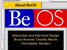
To give credit where credit is due, the iconic (haha) design was created by no other than the famous and visionary frog design.
Gemini has a nice back story and more details:
The collaboration between Jean-Louis Gassée’s Be Inc. and frog design in the early 1990s was pivotal. While many operating systems of that era were moving toward glossy or heavily faux-3D looks, frog design opted for a style that felt clean, “industrial,” and highly functional.
Color Palette: They utilized a specific, muted palette (often referred to as the “BeOS 8-bit palette”) that emphasized grays, blues, and yellows.
Isometric Perspective: The icons used a consistent isometric projection, giving the desktop a sense of physical depth without looking cluttered.
The BeBox: frog design also designed the BeBox hardware, famously featuring the twin “CPU load” LED bars on the front bezel.
Key Designers
While the project was a team effort at frog, Scott Jenson is often credited as a primary interface designer who helped bridge the gap between the visual language and the user experience. The goal was to make the OS feel “lightweight” and “snappy,” mirroring the performance of its multi-threaded kernel.
3 Likes
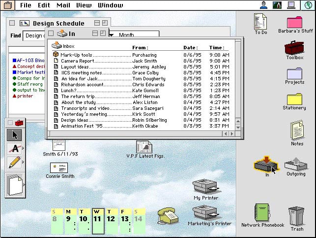
There’s this from R5
And some of Be came from Apple’s unreleased Taligent project. (Notice the tabs )
6 Likes
What do you mean by gemini here? Do you have a URL?
eventually I found it
1 Like