[GSoC 2024] Improving the Tracker Query Window

Heyyy! My name is Calisto Mathias. I’m a First Year Undergraduate student pursuing my Bachelor of Technology (B.Tech) in Information Technology from The National Institute of Technology, Surathkal. In this post, I’d like to discuss about my GSoC proposal idea for the year 2024, take in suggestions on what I could do better, and get to know the community better :slight_smile: Open Source contribution has always blown me away but I’m passionate about it and would really like to contribute into something that I could make a difference - in this case - that’s Haiku :smile: I can’t wait to hear back from all of the community. I have been active for some time now on the IRC channel as well so I would love to get to know and communicate more through that medium as well. Btw, it’s my first time doing Open Source too :melting_face:

The Tracker Query window is like a door to Haiku’s power, but right now, its look and feel in the Find Window are a bit confusing. It’s not so easy to use, especially with all the going back and forth to make searches better. This might discourage people who aren’t tech-savvy. My main plan for GSoC 2024 is to make the Tracker Query window more user-friendly. That’s the core of my GSoC 2024 proposal! :star2:

In the past, there have been many attempts and ideas that have been raised but never really looked into. Two of the most significant ones form a very solid foundational base for a reworking of the window itself. I’m thinking of taking on this challenge as part of my project while also fixing along new bugs that pop up along the way as well as ones that already exist in the application. Some of the changes that I propose are (with reference to Humdinger’s previous ideas) :

  1. Reworking the UI to allow for a favorites menu bar where users can have a few templates stored. Clicking on these would load up the template immediately and reduce their work in filling up the fields and drop-down menus.
  2. Creating and showing live query results on the Tracker’s Find Window. This would allow users to see their queries as they are being typed in for a more easy-to-use application.
  3. Associating search fields with their attribute columns in the results view so that users (who are majorly visually directed) can easily understand how and what their query is doing exactly. This would drastically increase the usability of the application as well as reduce the amount of time spent by users on drafting their queries
  4. Allowing users to save certain specific query templates for easy access in the future without have to refill details repetitively.
  5. Fixing Bugs and adding small other features in the Tracker Application as a whole, wherever possible

Tickets of Reference

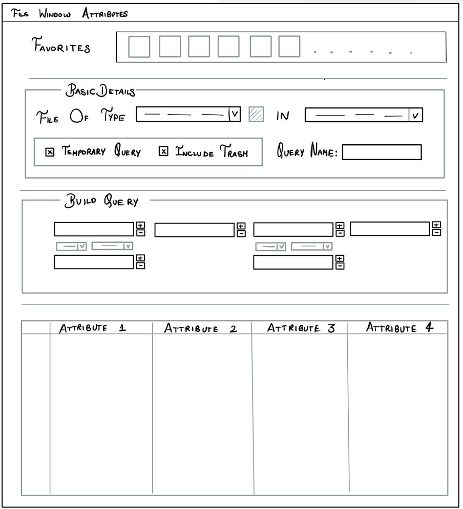
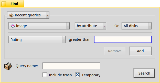
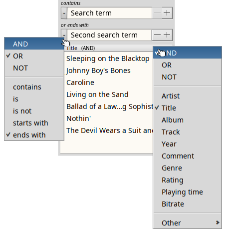
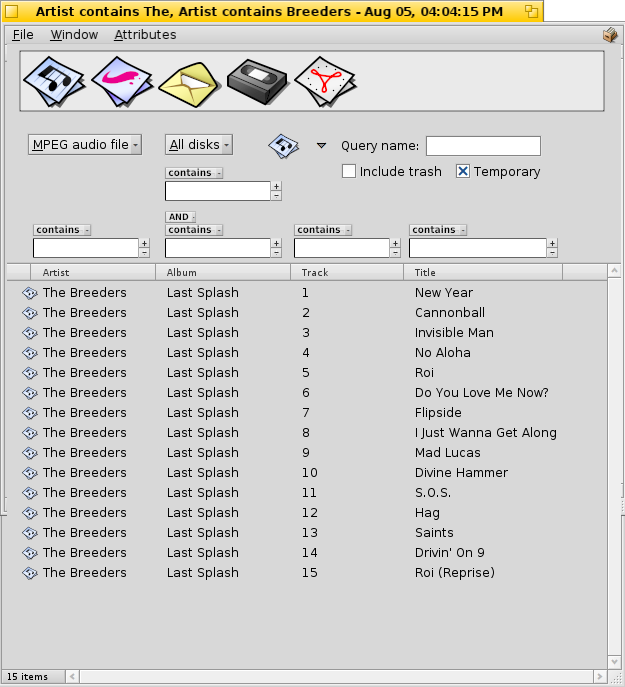
Through my GSoC project, I aim to fix the following two tickets by combining the best features out of both of them and bring forward the best enhancement to the application as possible. You can take a look at them for reference as well, though, I have pasted the UI Mockup created by Humdinger. I plan to make changes to this to make the user interface look more even but would love to hear suggestions on the same.

Haiku Interface Rework Mock-Up (By Humdinger)
Original Proposed Rework of the Tracker Query Window (By Humdinger)

Would this be a good starting point?

15 Likes

Visually messy. I’m not commenting on the workability or usefulness, just the visuals.

6 Likes

Yup I definitely agree. These are mock-ups that were created a while back but I do plan on trying my best to make them look as even and visually appealing as possible. Would this be a good starting point to edit the design from?

One idea that I was thinking of applying was an option to provide two types of query windows. The default would be a simplified look which would have an option (something like a more options button) which would allow the user to expand and have all of these options.

I’m trying to work on a newer version of the previous mock-ups to make the design more even, smooth, and user-friendly. Would love if you went through the one below (though it is still a work in progess :grimacing:)

Was thinking of making something like this? What do you think about this one? I just recently started editing it… so would love to hear what the community thinks about this :star2:

I think a lot would be happy, if you added an icon view to results. Not that they are using queries a lot but IIRC display of so-called grey folders are borrowing a lot of the results display code.

1 Like

An icon view as in a column that show’s the associated file-type’s icon? or do you mean something like a seperate view which can be toggled, which shows files with an icon and their filename below?

Your second one something that can be toggled and that is close of actual icon view in Tracker. It sounds a bit strange because unless attribute is an image, (in your example, it could be album cover) it doesn’t make a lot of sense to present results like that.
To have better idea, click on a blue folder in the menu.

You will find that coming up with a nice and clean GUI is a challenge. :slight_smile:

That’s because it has to provide an extendable number of query fields, each either AND or OR linked and each allowing different search modes (starts/ends with, is, is not).
Plus, as seeing the live results is one of the main goals, the result view should have as much space as possible.

As you picked the general idea I mocked up all these years ago, I’ll give some more thoughts about the issue. Just some food for thought, I’d be delighted if you come up with better solutions!

It makes sense to keep the current workflow. As a reminder, here the current Find window:

find-now

The top part can be kept with few changes:

  • Keep the “Recent queries” with past queries (might be moved into a main menu bar instead to save precious vertical space).
  • Choose a filetype. In my old mockup are pretty big icons, meant for favourite queries, but keeping the current popup “All files and folders” would be better IMO.
    Favourites are probably not really needed, if the Find panel remembers the displayed columns of the the last query of that filetype. Plus, users can always save query or query templates which can be presented in the new menu bar.
  • I’d remove the current “by attribute” pop-up and always be in “attribute” mode, because “by name” is really just another attribute. The “formula” of a query should always be provided in a live updated text field. It’s updated while the user constructs their query. Users can also paste a formular there which will construct the query accordingly.
  • Keep the “On: All disks/etc.” pop-up.

Now comes the new column listview for the live results.
Each column has associated a text field to filter the column’s attribute. Attributes are chosen - as in all Tracker list views - per context menu. The offered attributes depend on the chosen filetype. Add to that an “All” submenu that holds all attributes hierarchical as defined in the FileTypes preferences. That way you can search for another attribute that isn’t specific to the set filetype of this query.

The most challenging is now how to present the means to filter each attribute column.

  • Currently different attribute columns can be AND/OR combined (with limits). I think we can restrict that to AND combining. How often, for example, do you want to look for images with a width > 500 OR a size < 120 KiB?
  • We need a way to search for several terms within the same attribute though, i.e. have several text fields for the same column. Those have to be AND/OR/NOT combinable.
  • Each search field needs to offer qualifiers like “starts/ends with”, “contains”, “is/is not”, “greater/less than”, “before/after” etc.

Maybe some new GUI element needs to be devised to present all this in a clean and space efficient way.

Some things like saving the query and the “include Trash” and “temporary” stuff can be moved into options in a menu bar.

2 Likes

I tried to come up with a nice filter widget. This one is a slight improvement on the one featuring in the old mockup:

filter-widget

Over each displayed column is one (or more) of these filter widgets.
It has a pop-up menu widget on its left. It contains the qualifiers like “starts/end with” or “contains”. When chosen the small italic header changes accordingly.
At the right is also a pop-up widget, this one with a “+”, signaling that’s how you add another filter widget. This menu offers AND, OR, NOT that determines how the two search widgets will get combined. The small italic header will show this, too. The menu also has a “Remove” item to remove the current widget.

filter-widget-2

Hmm… Maybe the “+” for the right pop-up widget isn’t even needed. Clicking it may make it clear from the options available?

1 Like

My ideal search window starts with an empty custom search field. Nothing else. A bit wide, has some modal presence on the screen. Not like the standard tiny text field.

Once you start typing on the text field, the results start to appear below and, they are categorised according to the file types and their relevancies. Not hundreds of entries. Each maximum 10 results per category. If the result you are looking for is not inside the displayed results, an ellipsis on the corner of those categories would take me to a dedicated Tracker window.

This tracker window would have a floating panel next to it with all those criteria selections in order to manipulate the results inside the Tracker window. Floating panel should be compact in nature, preferably utilising a top-to-bottom, unlike the current wide approach, and should use compact widgets whenever possible. It is a helper panel after all.

With this general approach, you have a streamlined experience for finding applications, files etc. and an advanced selection that will help you dig deeper. Also with the use of floating panels, you adhere to the Haiku-style of window management.

2 Likes

If you think about some other cases, I think it can be useful. For example, searching for an email address in the “to”, “cc” or “bcc” attributes in emails, to see messages you sent to someone, no matter if it was disectly to them, or just as a copy.

Independently of the merits of this approach, it would probably require a completely different implementation (not based on queries), and that requires a lot of thinking and design, before we could turn out into a GSoC idea that would work well. GSoC istoo short, and the discussions and design would probably not be done in time for the start of the coding period.

(I could be wrong about the needed work, so, if you want to discuss this further and think about how it could work, please go on. But maybe don’t plan an entire GSoC proposal on it just yet?)

1 Like

Good point. Now we need to add a way to set an attribute column to AND/OR. Another pop-up menu above each column? Or maybe choose that when selecting the atrribute column from the context menu of the column list view header?

Guess @CalistoMathias will have much to experiment to find what’s working best… :slight_smile:

3 Likes

Wow. I’m glad there was so much response to this forum post :slight_smile: . Keeping that in my mind, I think ill segregate this reply so that I can reply to each point that I understood and probably ask clarification on the ones that I didn’t.

So coming to Humdinger’s ideas and thoughts,

Top Section

[1] I do agree on the fact that the top part of the original find window should be kept. From a functional point of view, like you said, the favorites bar doesn’t add much. The only thing it does make is to let user’s visually pair some standard or repetitive queries. Keeping that in mind, I do now think that the dropdown consisting of all the file types would have the same functionality (if not better). It also does take up much of the previous vertical space like you noted :frowning_face:

[2] I think moving the Recent queries into the menu bar does dcrease the window space needed for the application. Maybe we could do something like split the templates, from the previous queries and list them seperately? Something like a “Templates” and “History” on the menu-bar? It would help both current-users as well as new users of Haiku imo.

[3] Removing the name attribute was the exact same thing I was thinking as well. At the end of the day, it is still just a normal attribute. This will anyways be handled in the query listing section and the associated filters so I think removing the option to select between names and attributes saves up quite some space in this section. Taking in all the suggestions that you provided makes the Basic-Details section (will probably be renamed later) a lot shorter, and leaves more space for the new List view!

New List View for Live Results

As the query window already does provide real-time updates, I would like to specify the context of this with respect to my proposal. In this context, by real-time, I mean to imply that the query is automatically executed without explicit intervention from the user. This reduces quite a lot of work between going back-and-forth for refining a query.

Rather than create a seperate drop-down menu for the OR/AND condition that was present in the older ticket, I was thinking something more on the lines of a small pop-up. Whenever a user, clicks the + button in order to create a new combination, it could pop up a small modal, with just those three options and the user could select out of those options. This way, we could save precious screen space as well as present things in a better manner - maybe using a slightly modified verison of the mock-up that you were coming up with (btw its really nice :slight_smile: ) But one thing that I was thinking of changing is to completely isolate the text-inputs from the adding/removing buttons. This would help reduce a cluttered view maybe? Also does the user really need to be able to edit the combination as the query is being built? Wouldn’t it be better that they can set the combination type only when they are adding the extra Query String? If they needed to edit the combination type, they could always remove the query and re-create a new one. I think this is a more intuitive approach imo. It would also make the User Interface look more uniform.

Idea on How to Group/combine Both Inter-attribute Columns as Well as Intra-attribute Columns (Could End Up Being One of the Major Points of Focus in the Project)

As of now, the Query Find Window doesn’t allow user’s to build complexly combined queries. For example, let’s say a,b,c,d are some conditions (could be anything). Using the current query window, it’s not exactly possible to run a query “(a and b) or (c and d)”. This is probably because of the way that the RPN logic has been implemented into the application though I am yet to see that and these are just the observations that I have made from using the application and I may be wrong. I was thinking of adding an additional option of adding in the ability to add groups of queries rather than a single one. We could display it in a similar fashion to the one given in the Mock-Up above. Maybe I could try figuring out a way to apply to this to inter-column combinations as well and that could be a possible solution to that problem?

Do let me know your thoughts on this :slight_smile: If possible and feasible in the time constraint, I could try working on this as much as possible and perfect it, but I’m sure you all would be knowing much more on that then me. But for now that’s all that I was thinking.

1 Like

I’ll also try and upload another new mock-up soon? Maybe that would help simplify what I was getting at :slight_smile:

Agreed.

Correct, the current query result window is “live” when it comes of files dis/appearing when they (no long) meet the query search.
What we both mean WRT the query construction window is that the new column list view at the bottom always reflects the search parameters above. so while the user types in a search term field, the shown files in the list

Possible, but maybe needlessly restrictive.
How about this context menu when the user clicks the right pop-up widget (with the “+” in my mockup above):

Add
  └ AND
  └ OR
Remove
──────────────
✓ contains
  is
  is not
  starts with
  ends with

If you want to add another search term you choose either AND or OR from the “Add” submenu. “Remove” removes the current one (only enabled if it’s not the last search term).
The qualifiers below the separator apply to the current search term.
Both the “AND/OR” and the qualifier appear in the italic header for the search term (in my mockup above).

The above only deals with ‘intra-attribute" combinations (= within the same attribute column).
For the ‘inter-attribute’ (= between columns) AND/OR combination, the context menu of the BColumnListView column label could offer those options. So, additionally to the available attributes, there are the checkmarkable items AND and OR. Whatever is chosen appears in the column label, for example with the audio files’ attribute “Artist” it’d me “Artist (AND)”.

I cannot really imagine how that would look and feel. If you can come up with something that isn’t too complex and clutters the GUI, cool!
OTOH, I imagine the vast majority of queries are simple ones. These have to be streamlined. Complex queries with many attributes and complicated combinations aren’t done often, and I’d imagine it’s more of a poweruser feature. It may be enough for that to use the “Formula” text box and have the poweruser insert brackets there etc. It’d help if the search terms and operators in the formula text box were colour coded.
But that’s a nice-to-have after you perfected the ‘normal’, uncomplex workflow… :slight_smile:

1 Like

Yup this works perfectly well. I think it encompasses everything. So just to clarify that I understood everything correctly, this is for when the user clicks the + pop-up widget → It pops up a modal sort of a window with these options. The user selects the options he wants and then clicks something like a CREATE Button and it adds the query string to the attribute filters. I think that works and makes the application much better to use in general.

This works as well. As you said, the main aim is to streamline the most used queries which are relatively simple and not complex. I think that maybe we could add either checkboxes before the query strings, or maybe even a drop down menu. As you change the selection to either AND/OR, it can show up on the column label so that users can know and see it directly in the BColumnListView itself.

Yup, I could probably keep this for an additional feature if I am able to perfect everything else and streamline it. The only issue is intra-column complex query string building is achievable but there are definitely issues when it comes to inter-attribute complex combinations as you can’t regroup the attributes or continuously change the order in which they are placed. But then again, this is more of a power-user feature so for now I don’t think the focus would be here anyways as it would be a very small sub-set of users who would prefer something like that. Like you said, the formula string option will also be there so I guess we can see about that later, if time permits :slight_smile:

Also what are your views on a small change to the UI Mock-up for the new filter widget that you had come up with that I was thinking about… I was thinking that maybe we can separate the context-menu option from the + icon completely. We can keep the +/- icons to the right of the query string and keep the context-menu option similarly to how you have placed it. Apart from that, rather than have two pop-up widgets/context-menu options, we can combine them into one and use the context-menu that you had provided earlier. It’s use would be instantly understood just by clicking on the dropdown. Making these two changes, there would be a clear separation from adding a query string to the filter and editing its combinations/other details. I think this would make it more user-friendly? What are your views on it?

Yes. I came to the same conclusion. Here’s an updated mockup:

query-mockup

The +/- widgets to the right are straight from a BSpinner. Clicking “-” removes the current search-term-widget (if it’s not the last/only one), “+” adds another search-term-widget with the default “AND” and “contains”.

The left context menu of the mockup shows a click on the left widget.
The left widget lets you change to AND/OR/NOT and the various qualifiers which depend on the kind of attribute (in this example it’s a string attribute).

The right context menu of the mockup shows a click on header row of the BColumnListView.
This context menu lets you choose from the available attributes of that filetype and the “inter-attribute” combo AND/OR/NOT. The “inter”-combo always applies to the column the right of it, I suppose.

The “Other” submenu offers all available attributes, so we can query for any attribute, not just the ones registered under that filetype (see the Filetypes/Query workshop of the User Guide).
Not quite sure how to quickly build and sort the list of all attributes into a hierarchy… You figure it out. :slight_smile:

1 Like

Making a human friendly UI for relational queries is an old problem. It has a solution: Query By Example.

See also how MS Access does it: https://www.youtube.com/watch?app=desktop&v=aV3_74l4bpY

Another UI of this kind is FoxPro query designer: Query Designer and View Designer.

Of course the Tracker query UI should be much simpler, since you don’t need the full power of a relational database. But core ideas behind QBE are valuable.

Yup this one looks perfect. I think it fixes all the issues with keeping the UI really clean and intuitive to use as well :melting_face:

In this I just had a small doubt. So on clicking the header row of the BColumnListView would pop up this context menu which would have the same attribute part of it. The AND/OR/NOT section of it would obviously differ based on which part of the header row that you have clicked (basically on which attribute header) right? Also do we apply some sort of a restriction on the number of attributes that they can go through, as the BColumnListView would only be able to display so much. Also in most cases, i think a query rarely goes beyond 4-5 attributes? Maybe we can find a work-around for this too, but then again like you mentioned earlier, that could possibly be done after this version is perfected.

When it comes to the inter-column combination, wouldn’t there be some sort of a confusion when it comes to how the combination occurs (the thing I mentioned before), where if there are 3 attributes (a,b,c) then [a and (b or c)] would be different from [(a and b) or c] which is what I’m worried about. That would add a certain degree of confusion while using the query. I’m not really sure how to fix this at the moment but I’m sure we could come up with something if needed. This is also the same issue that occurs in the current tracker find window (maybe because of the RPN logic - not sure as I am yet to learn quite a lot :face_with_open_eyes_and_hand_over_mouth: ). I guess that’s also a feature that only comes handy when the queries go beyond a certain complexity which isn’t the case for most queries?