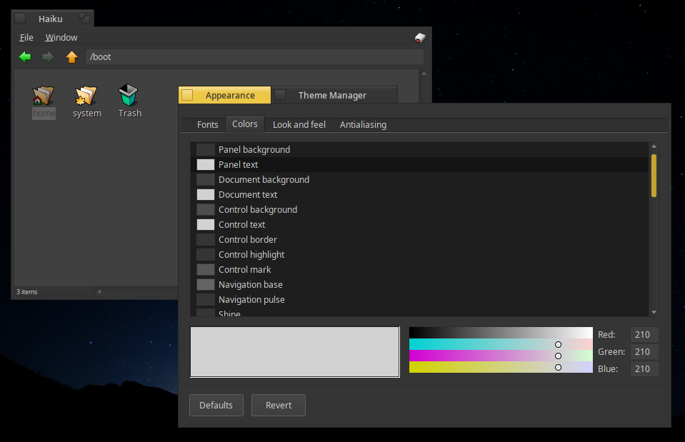
Hello! i made some changes to the controllook; some details were corrected. But im in doubt about making the buttons a bit rounded. What do you think about this?
Hello! i made some changes to the controllook; some details were corrected. But im in doubt about making the buttons a bit rounded. What do you think about this?
As the person who added rounded corner support to BControlLook I’m ok with it/think it looks good. I’d like you to only include the scroll bar knobs you made on the line style but my commit to add the knob styles to Appearance has still not been approved yet so I guess there’s not much you can do about that.
Looks good to me
I like it. It is slight, doesn’t make corners rounded but less sharp. It’s elegant.
I’d do the same thing for tabs. Sad that the selection isn’t rounded either (If I remember well, waddlesplash did some experiments with that…).
It looks very nice!
By the way, the scroll bar colour looks neat, did you consider making it the standard tab colour? It would fit in the flat domain very nicely.
Very nice! I also agree about the rounded buttons 
Very nice, but the corners of the scrollbars should be rounded too
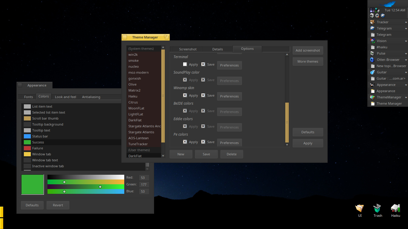
Here is an update with rounded thumbs scrollbars. The style was changed to fusion the scrollar with the buttons.
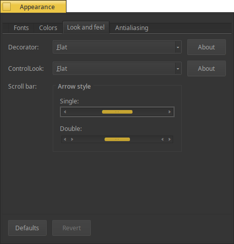
@jscipione you do an excelent work with the rounded support! yes, the selector of know style from appereance settings still missing.
@bitigchi i dont know if is my monitor or what… but i feel the color of the tab and scroll same. Anyway, anybody can change the colors from appereance settings to thei own liking (nothing is hardcoded in the controllook).
@Starcrasher do you have a screenshot of the @waddlesplash work?
Great job!
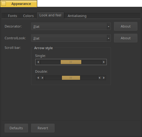
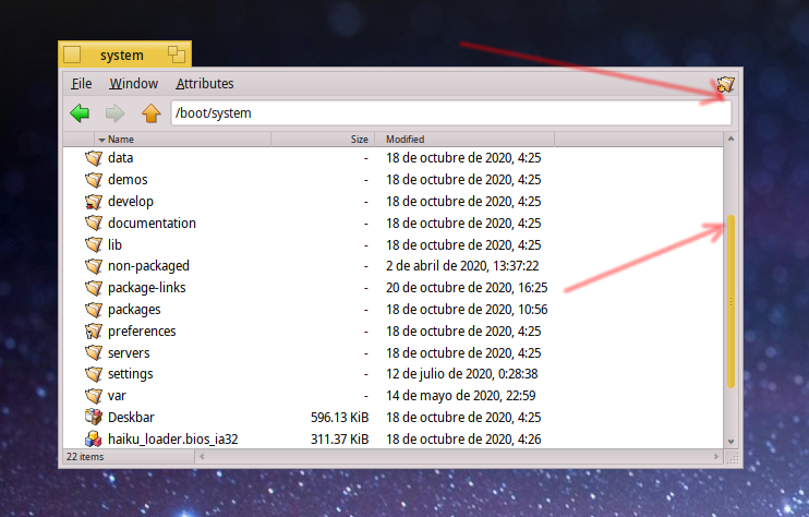
I think that the text colour is too dim. Can we turn it up a bit? Everything looks too dark.
(Plus that extra pixel leaking from the tab title is too disturbing, also I’ve opened a Github issue about the border-content distinction).
Sorry if I’m being too naggy, but I feel like I have to indicate!
hahaha! you are not! I need those comments. I think that my screen is setted too bright.
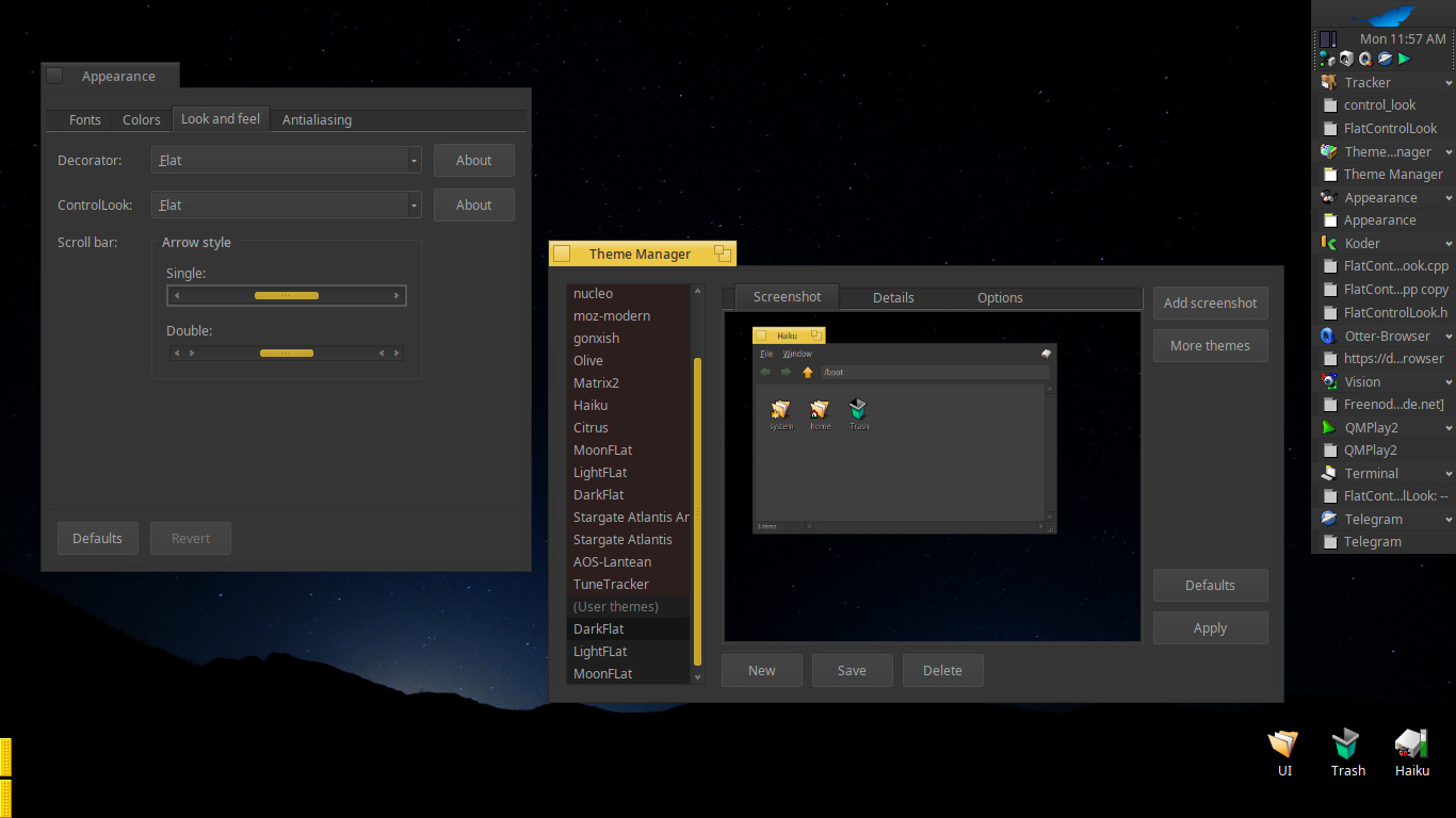
how do you see the next image? better?
Haha I’m glad then. Thank you.
I think something around 240 range would work best for these colours. Part of the problem is, this font weight is too thin for UI interfaces, but unfortunately Haiku does not play well with anything other than Normal Noto Sans Display weight due to bugs in font rendering code  .
.
Also I’d suggest making the inactive tab colour a lighter dark colour to distinguish from the window content. Some lighter grey would work nice I believe.
No, unfortunately. My memory isn’t as reliable as it was so it doesn’t help. 
It was only for menus, making use of menu_item_selected_border value already present in Appearance
It was probably kallisti5 actually who did a derivative work of this https://review.haiku-os.org/c/haiku/+/2472 There are few screenshots in comments but not with the rounded selection.
I think that I found an error with QT port. Somebody knows why qt dont respect the rounded border for scrollbars and textboxes?
Example:
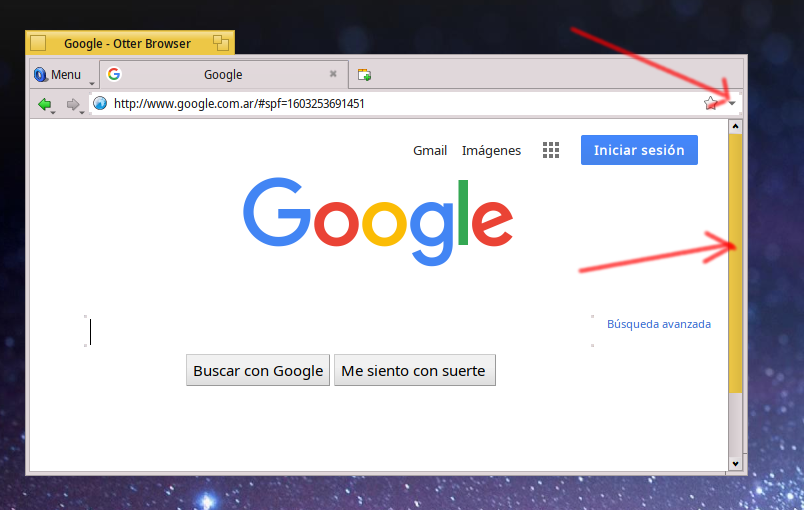
I should report it or is something that i making wrong?
I guess that Qt styles are responsible at least for scrollbars.
Navbar may be handled differently by application style.
From my understanding, Qt apps are using Qt styles. When you chose Haiku style or system style, qthaikustyle does its best to be transparent and mimic Haiku system style but some things have to be mapped or to be rewritten otherwise Qt will apply default Qt rules to them. That’s why, for example, you had troubles with menu and dark themes.
So, I think that you should have a look at qthaikuplugins.