I’ve tried to make it easier to build decorators and control looks but it’s slow going. A bunch of people have created some nice looking decorators and control looks now and it makes me happy to see. I made the TabDecorator class so that it could be subclassed allowing you to build a decorator without having to reimplement stack and tile. Some day I’d also like to make a BarDecorator class that works for full length decorators and works with S&T.
BeControlLook is the only control look I know of that doesn’t inherit from HaikuControlLook but it still needs work. There’s some code that should probably be pushed up the class hierarchy so it doesn’t have to be reimplemented in each decorator but oh well.
Nice job on the decorator it looks good. Dark mode sure has come a long way since a few years back.
Install Haiku Extras for now (Be Controllook), but they all can be installed like any other app. I think there are some other decorators but its in a third party repository.
I think for now the simplest way would be to have them integrated into the main tree and shipped in the extras package like the Be one. But you’ll want to polish the code to pass the review
i think that the best way to make the install is add a package to haikuports. This decor & controllook fit better with the dark colors scheme. Maybe i can put together in only one package an push the recipe to haikuports. But… i dont know if it looks good enough to take that job
Hello All!! Share the decorator and the control lock from my github; right there are the instructions for use. Anyone who wants to contribute is welcome.
I think dark mode is just a matter of taste. In my case I prefer it since I generally use the notebook in a dark room and it allows me to rest my eyes (and of course IMHO gives it a more modern style!).
Also - the theme doesn’t seem to change the font color (it is still black for me instead of white letters like your screenshots). Also the deskbar time/icons are on a gray background (not black like in your screenshots)
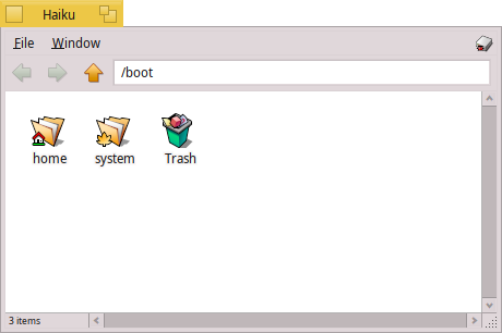
By default, Tracker uses black text on document background colour for list mode and same for icon mode.
With Background app, you can add a picture to folders but you can also change text colour if you check outline icons text. The text will then use panel text colour. (IMHO document text colour would be better, specially if you don’t set a background picture.)
Since this is stored as an attribute, better not do that for individual folders but for default folder. You may have to create a folder named DefaultFolderTemplate in Tracker config folder.
Once you have that set, the trick is to create a folder in icon mode on your desktop and start browsing from there. As long as you stay in this windows, all folders will adopt background settings of starting folder even those in list mode. This include folder background picture. Or, you can also, switch any folder to icon mode then back to list mode.
oky; i will correct that in the instructions. Thanks!!!
Yes; you need to restart “Deskbar” and “tracker” first, sounds like an error in the refresh painting. When i was doing the decorator, i had to restart these services all the time
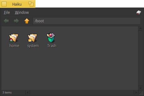
is this a tracker bug? it is right! if i open a folder from other place that not its the “home” icon in the desktop, the letters are painted black. Also, i discover a trick: if you switch to icon view and then return to list view they are grayed out… hmmm it seems that somewhere in the tracker code this is hardcoded. Ticket for this???
Hello @Starcrasher! yes seems to be like you mention. But in my case, wen i open a folder in “icon view mode” the text is white by default… do you think that this is a bug or an a improvement in tracker?
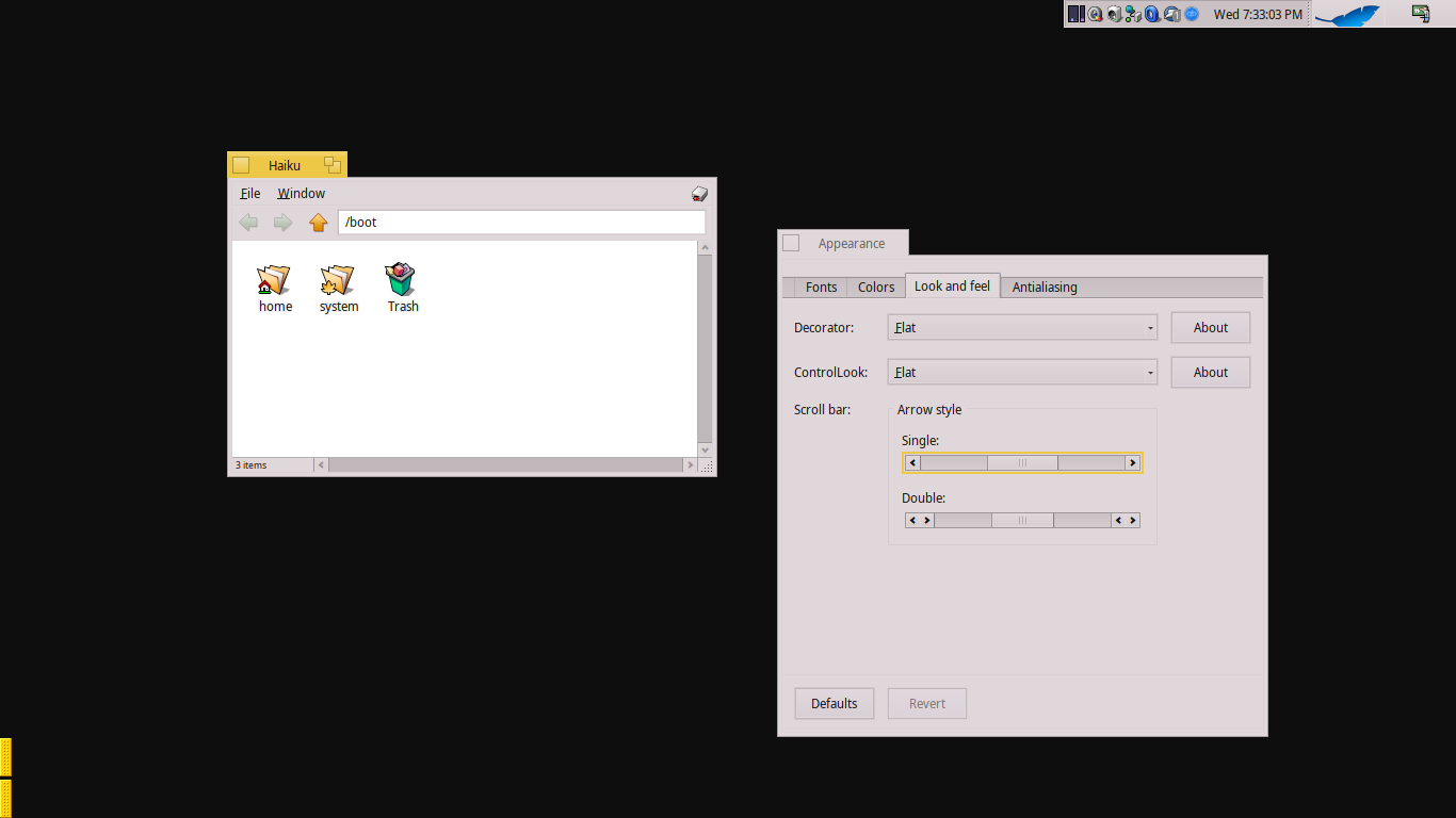
I have written a little guide on how to make a decorator and a controlllok. If any of you see that something is wrong, let me know and I will correct it. Regards!
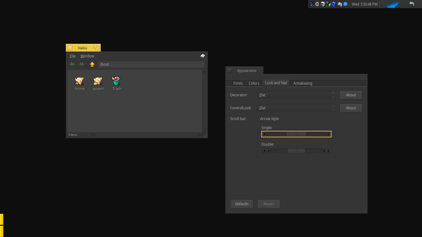
I think the style of drop-down menus and tabs still are not coherent with the general theme. Tabs still have too much depth compared to the other user elements (not flat, round corners), and the Deskbar has that curvy bump style with the slight gradient (hopefully what I say makes sense).
I make some changes… At the moment looks like in the screenshots… but i want to make rounded corners in the yellow tab. If any have an example of how to do that, its apreciated!
Tabs are much better! However window inner lines/borders are less pronounced now, and IMHO they look too flat now. A bit more contrast would be preferable.
Also scrollbar handles are nearly invisible in dark theme; and yellow selection in out-of-focus window looks weird to me. For out-of-focus window, a different tab and selection colour other than black would be great.