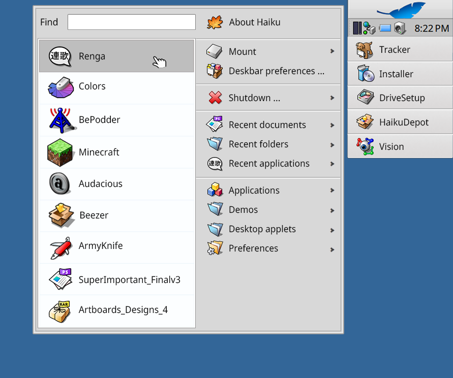
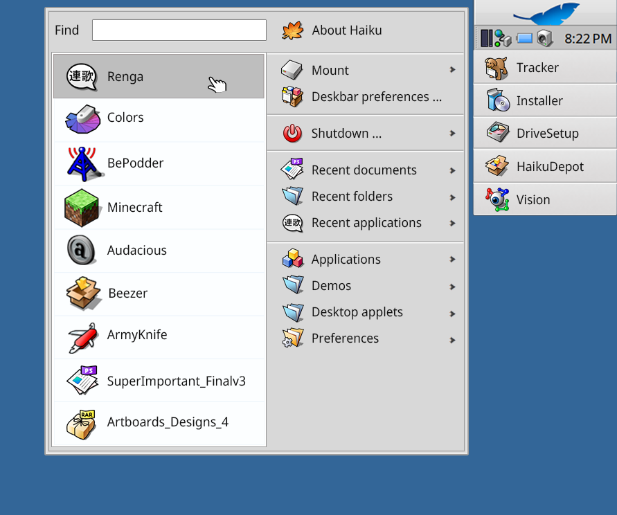
I think we were talking about the Windows XP and 7 versions of the start menu (Waddlesplash posted a screenhsot of that earlier).
I agree that the later versions are going in the wrong direction. Thanks to your writing I hope that is now clear for everyone
Yes, of course we should keep some kind of cascade menus. It is a good way to organize things, even if we don’t make the most use of it currently with very few categories.
I don’t entirely agree with that. I’m not going for 32x32 or larger icons, but the current 16x16 (in default font size) is quite small. And also we have to remember that DeskBar is pretty much the only way we have to lanch apps in the stock install, maybe alongside LaunchBox, and also that the ability to open the DeskBar menu as a Tracker window with large icons was lost.
So, one option here is to restore some easy way to access the application list in Tracker. Another is to improve or replace LaunchBox with some other dock (personally I use LnLauncher for that). And a third is to consider how we could integrate something similar directly inside DeskBar. Not making big icons for all the menus, but only in a few places.
When I do code reviews, I usually do not reply to a code review with “I find your code terrible”. I tell people how they could do things better, I ask when I don’t understand something, and usually this results in a productive discussion, and better code (not necessarily written by the person initially proposing a change).
I don’t see why discussions about design would be any different. People who make a design proposal should take the time to explain what issues they are trying to solve with their changes, and people commenting on the design should explain why they find it bad.
Then we can make progress towards something that works.
I think this thread started very well with Biloberis’ mockups. We have concrete problems:
No way to search for apps in DeskBar by keyboard
Some things are buried in several level of menus that may be better at the top level
Categories in DeskBar are insufficient with all applications in a single huge menu
I think only the second point is controversial here or needs more discussion. The first mockup (GNOME 2 style) surely departs a lot from the current Deskbar. It results in less space for running applications, especially in horizontal deskbar mode (along the top or bottom edge). But it also solves the low discoverability of the leaf menu (people don’t always notice it’s clickable) and the blue leaf that a lot of people seem to hate for some reason. Is that acceptable? Should we keep these things inside the leaf menu instead? What would that look like?
Adding the search menu as was suggested in the very first mockup in this thread seems to be a thing everyone agrees on. We should be discussing how to display or highlight the results of such search efficiently then (since they can be in several submenus).
The third one about categories has already been debated a dozen times, everyone agree there should be more categories at least as an option, and all that’s missing is an implementation.
Just a few changes in the prototype code and in the system theme, it now shows “normal” icons in the toolbar instead of flat ones, favorites and the action strip position have been moved, since in the final product they can be sensitive to the position of the desk bar to decrease mouse movements, as you can see the shutdown function is almost in the same position, favorites are now near the leaf button, while the app list is meant to be navigated especially using keyboard.
I have also reduced the size of the icons, from 48 to 32 px, in my defense I must say that my eyesight has never been great, and as I get older it certainly has not improved, so I need large icons right now, as for the text here at 16 points; obviously it would be as configurable as the classic deskbar is now, the user can decide how big they want the icons, if they want labels, if they want to see recent or not, a minimal version would just have the toolbar, the filtered list and the favorites strip.
That recent list was pretty good, and the search bar right there was helpful, even though Windows has never been great at indexing or finding files. MacOS Tiger had an impressive Spotlight search, though.
I just thought about how the Windows 7 start menu would work in Haiku, and here it is. It combines all recent documents, folders, and files into a single list for quick access
It really irritates me that the arrows are to the right in that design, but roughly your design makes sense to me. It still does not adress categories, but i think that should be a expandable tree view on the left side.
Windows 7 was the last decent version of Windows releases IMHO. I don’t like the icon for Shutdown. Doing the angle thing seems weird but maybe a different icon would do it justice.
Going further in that design, I think deskbar preferences as toplevel option should be removed, and Mount be renamed as Disks, We can then list all Disks in there wether mounted or available to be mounted.
New prototype, moved again the toolbar, it’s restless
Now recents items are in a tree list, so you can drag and drop elements to the favorites to pin them, but in a more compact way.
“Go” folders icon strip is gone, perhaps it deserves a dedicated button in the toolbar to open it with tracker and edit entries?
App list can reuse the tree view with categories, so one can filter them out and seeing how they are managed.
Long description in apps is usually scarce in information, it has just the app’s name and copyright info, perhaps if it has more information, as what the app does and which category it belongs, would it be used to filter out apps better?
Very interesting prototype! Since what everyone do after installing Haiku is installing lnlauncher, integrating some quick launcher in Deskbar is a must, IMHO.
The search bar is also a must-have, since if you have many applications, searching by typing is just much faster than using the mouse
I don’t quite understand that. If it’s a “must” have app, why isn’t it simply bundled? For my Part I’ve never wanted to use a launcher, also since tracker allows you to just put links on the desktop…