I’ve had an idea on how to make Deskbar a bit better mulling around in my head for a while and I wanted to try to mockup the concept.
pictures (bigger):
The idea is basically to split the application bar into it’s own “window” that you can move around to the left, bottom, or right or maybe even top of the screen while having the leaf menu, clock, and replicants in another “window” in the top right corner, and you could move them to a different corner too. Mini-mode would still be possible, the Application bar could get dragged into the leaf menu and you’d get the little green chalkboard guy icon to access the application menu.
One of the benefits of this arrangement would be that when you maximize apps they probably won’t cover your Leaf Menu, clock, and replicants because the window tab wouldn’t extend that far to the right of the screen.
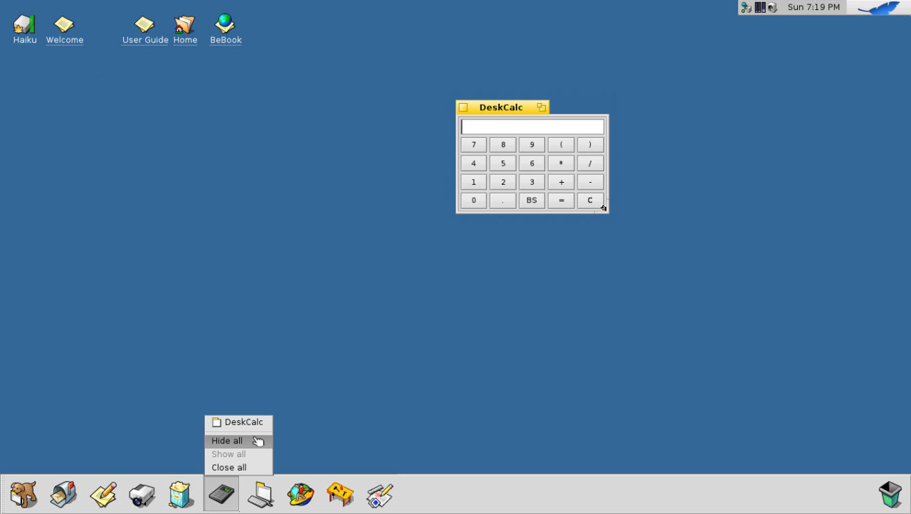
The mockups show the app bar at the bottom, as well as on the right side. There’s a dragger handle you can grab to move it around the screen.
The idea is to have more than just running apps in the app bar, but also to have other app there kind of like how the Windows 7 and 8 Taskbar work. I also put the Trash in the last slot app so it’s easier to drop stuff there ala OS X.
Interesting concept utilizing the LaunchBox app. That’s nice, but I like other concept more. Currently you can already switch app titles off in Deskbar, so why not go full Unity/Superbar there (or NextStep, or going back to the Sharkroots). And yes, maximized windows must align to the Deskbar. The very idea that I should move my cursor to the corner of the screen for Deskbar to show up is silly if enabled by default, but if it doesn’t show up by default it’s even worse. I know some of you are OS X users and generally don’t like maximized windows, but Haiku isn’t OS X and has no top menu with embedded tray and Spotlight.
And, if being totally honest, if I’d ever use additional Dock launcher thing on daily basis, I’d rather look for updated and improved Dockbert (currently it’s a buggy incomplete mess from the Dano/Zeta era). LaunchBox is small and nice, but it lacks the cool factor, IMO. Or maybe I’m just spoiled by the other desktop GUIs.
If leaf menu window were in the top right, so the window tab wouldn’t overlap, and we were to make maximized windows not go over the application bar we could achieve an effect similar to what’s demonstrated in your first screenshot without the handicap of a tiny status tray.
I am not familiar with Unity/Superbar, but, I assume it is Dock-like.
As far as the Dockbert screenshots you posted, I have no clue what’s going on there, but, if the idea is to add some dock-like features to Deskbar my idea might satisfy you partially, although it’s hard to say.
LaunchBox is small and nice, but, it needs to be integrated into Deskbar to really shine.
What if I have lots of Stacked (yellow) app tabs or I use full-blown decorator instead of the default one or BeOS/Haiku variations (PhOS, OBOS, Mac Classic, etc, there were many of them in Dano/Zeta days). Please don’t lock Deskbar to the top right corner just because it was placed like that by default in BeOS 5. Users liked to put Deskbar on top, at the bottom and at every corner of the screen. Maximized windows must not overlap the Deskbar if user enabled such option in Deskbar settings. You can do that with pretty much any Dock and Taskbar application on Linux, Windows and OS X.
What’s the point of doing that if you could implement “pin to Deskbar” feature right in the Deskbar itself, just like in OS X’s Dock, Ubuntu’s Unity or Windows’ taskbar? Making Leaf button + tray and the taskbar separate makes no sense to me, sorry. At least in OS X tray sits in the top right corner next to the clock and Spotlight, while top left corner is occupied by the Apple button and application menu “File | Edit | View …”. If I want the most compact Deskbar, I will switch it to the minimal state (e.g. bottom left in the screenshots).
P.S. Superbar = Windows 7 & 8. Unity = modern Ubuntu distros.
I think it’s an interesting and usable concept, and it would be nice to have it as one of the options. Since deskbar IS the main interface, the ‘window to the soul’ of Haiku it would be nice to have plenty of configuration possibilities for it. Some options could be left hidden if majority views them as being ‘too much’ but just having these options (even hidden, for bigger nerds like me) would be a plus, as it would give everyone the option to make deskbar suit their needs.
I personally would really like deskbar to be like it was in BeOS 5PE, in upper right corner (from top down): menu button, tray, running tasks, and deskbar would be brought to front when mouse is pushed to the corresponding screen corner (in current nighlies it’s a bit weird since deskbar pops up even if the cursor haven’t even been to the corner properly, so it’s somewhat annoying).
What I really would like as an option is to have the BeOS way of showing running tasks - no grouping, no menus to open, no pop-outs - just one task (program, tracker window etc) per button. One button, one click - done. The simplest way works best for me.
I have no problem with splitting up the leaf menu from the deskbar, but please, just please, don’t use just the application icon. I’m one of these strange people who will change the Windows taskbar to small icons a la Vista, because i just prefer it that way, sure, it wastes horizontal space, but that’s hardly relevant unless i’ve got a gazillion apps open.
IMHO the deskbar as-is is quite efficient, if not clunky and sometimes hard to see when there’s many app windows open, but I don’t think this is in any way a solution to the problem.


