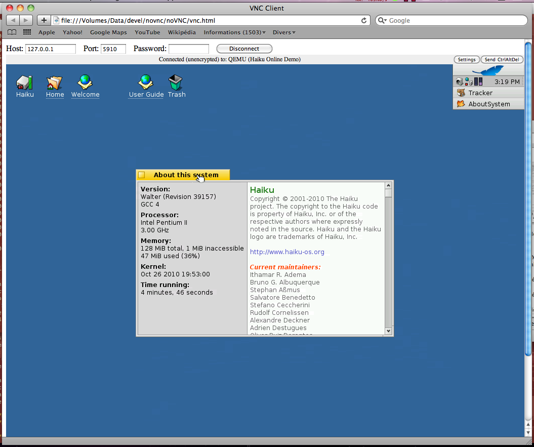
I recently checked out the most recent alpha of Haiku and it was great. Very fast and full of potential however I couldn’t help but notice that it looks precisely the same as the old BeOS and while this isn’t a bad thing I’d hoped for more small details and improvements (many of which I am sure will come on their own). In the interest however of contributing what I have I did a mock-up of some minor improvements to the basic tab shape, which I feel bring the classic BeOS tabbed look into the present.
the mock-up is here: http://img688.imageshack.us/i/haikuos.png/
as you can see the upper left hand corner is rounded resulting in a friendlier feel, while the right side of the tab has been made diagonal for a sense of motion.
Nice to see you’ve based it on a recent Haiku screenshot [/sarcasm]
Seriously, Basing it on that old haiku look-and-feel doesn’t make it look too attractive. Plus, I think the tabs are just fine as they are at the moment.
I recently checked out the most recent alpha of Haiku and it was great. Very fast and full of potential however I couldn’t help but notice that it looks precisely the same as the old BeOS[…]
If “precisely the same” means it still has rectangular windows and yellow tabs, you’re right. If you take a longer look, you’ll see however that there were many refinements since BeOS. Gradients in menu bar and the yellow tab (which BTW is missing in your mockup), slightly glossy buttons and improvements to sliders, radio buttons and checkboxes and more.
as you can see the upper left hand corner is rounded resulting in a friendlier feel, while the right side of the tab has been made diagonal for a sense of motion.
Personally, I don’t see much gained with the diagonal right side of the tab. Even worse, with Stack & Tile such a formed tab wastes precious space or obscures the tab to the right of it. It may be nicer if the right tab side would arc down in a parabola like y=x^2, x<0. Thus it wouldn’t obscure the tab behind too much and still convey some depth.
However, we have to keep in mind that things like true transparency, non-rectangular windows, shadows and similar things have to wait for a compositing app_server. Needed 3D driver support seems to be quite a while off yet.
I have never been big on trying to make GUIs look like physical objects through the use of heavy gradients and the like since they are just not 3d objects they are iconic, interface, elements.
I see that you don’t like the screenshot I used with the example image provided; why don’t you select a better one for me ? I’d be glad to do a new mockup.
