Chlorophyll (phone UI concept!)

Hey everyone! It’s been a while since I’ve posted here and thought I would today! :smiley: I’ve noticed a trend of phone topics like this one and mobile shell ideas (and I did a BeIA inspired one before so I’m no stranger to this!) so if the community doesn’t mind, imho I feel the best guy to design a phone UI concept is someone who grew up with them :wink: and since it’s Dano’s 21st birthday, here’s a concept I’ve been hoping to show you all :slight_smile:

Everything here is what I believe a Be-like interface on the phone could look like which I’ve nicknamed Chlorophyll. Whether this ever makes it into a stable Be/Haiku environment I don’t know, or whether people will love or hate it, but the idea is to have it recorded in history for the world to look at :slightly_smiling_face:

In iOS and also in other mobile systems I’ve used, messed with or explored for fun (like webOS, Firefox OS, the vintage Palm OS, Windows Phone/10 Mobile, and Android distros), we have to start with a lock screen first (idk what the welcome/setup part would look like yet tbh!)

On a larger phone, tablet, or when connected to an external display, the lock screen could look something like this. Replicants/widgets that are actively running could appear here.

And if it is running on a phone, the shell would look like this:

When unlocked, you’ll notice things are a little different than iOS or Android, and we have our running clock replicant in the middle.

A larger home screen would look like this, and for simplicity’s sake, we’ll use the wide version. When a notification appears, it’d take inspiration from the classic webOS and would come up from the bottom in its own area:

Seeing it or closing it leaves the home screen clean and no apps are covered at all or affected, and this is important for this design as we’ll see going on

Swiping from the side or tapping the bumper bar on the right by default (although it can be moved to the left side) would reveal the App Bar, which has the switcher or tile functionality of the Deskbar in desktop Haiku and an alerts/notifications area:

The control zone could be opened anytime with one tap or click to the status area of the UI at the bottom, revealing airplane mode, connection controls (4G/5G tethering, Wifi, and Bluetooth), Notes, Screens (notice there’s no brightness or rotation here, and there’s a reason beyond cleaning up the UI), Capture (which starts a screen capture), Night Light (Haiku probably won’t support flashlights/torches out of the box since most devices will be hobby builds so this is just an app), Accessibility, Camera, and player and power saver widgets. In taking inspiration from BeOS, the left corner has a close button on it :slight_smile:

Power, whether summoned through the Leaf Zone or a dedicated button or shortcut, would look like this, inspired by BeOS:

And now we get to what an applet could look like. An about box might look something like this, and yes, this concept was made with macOS:

And in taking inspiration from webOS, applets would run as cards. The difference, however, is like BeOS, they’d be live. That means you don’t need to switch in and out, applets could be used side by side, as is.

And while dark mode is a universal thing like iOS or Android, any applet can turn off the lights by tapping the title tab:

011-about-dark

But of course, it wouldn’t be Be-inspired at all without using tabs, something no mobile system uses now so it’d be a unique advantage. Each applet would be able to tab by someone tapping the add button then opening the apps view, and then run as a tabbed card. And the fullscreen button on the right would switch into a fullscreen mode.

Applets could work on a phone this way as well, although the ability to see multiple cards only works horizontally:

Inspired by Dano (my favorite of the classic Be series ever), UI elements could take on different colors:

014-colors

And looking through disks would look like this, with support for syncing back to local network/Samba disks instead of something like iCloud (which realistically Haiku couldn’t support on a wide scale rn and local sync would be safer for users). That might look something like this:

Now let’s explore cards some more. On Palm’s webOS, I truly consider Matias Duarte and Dellinger geniuses (again showing my nerdy obsession with Apple/Be/Palm history!) If you’ve played with or used it, you know preflets on the classic webOS can do something iOS and Android can’t, they can be switched between as cards. It’s a brilliant use of the limited screen size their tiny phones had! And because we’re not stuck with previews, brightness and rotation can be switched whenever Screens is there/open.

And finally Respawn is a new idea that would allow applet cards to reopen even when they crashed or the shell needed to restart:

Okay, so that’s cards. You’re probably wondering if there’s a home at all and why the leaf is on top, not the bottom! And it’s because it opens the leaf area, where it’s possible to get to Disks, Find, Settings, and Power. There’s no Be or Leaf menu here because this would be totally touch centric

But mainly, it’s there for opening new applets, whether in tabs or standalone. Blue labelled applets would support replicants, like clock:

Different pages of applets could be switched between like this:

And again similar to Palm webOS, there’s no unified settings but preflets that can be opened and switched between.

And anyways, thanks everyone! Hope you enjoyed seeing the Chlorophyll concept! And that is a peek of what I believe a Be-like phone UI might look like :smiley:

6 Likes

Welcome back :slight_smile:

Interesting, but i do not feel and see any beOS or Haiku style and workaround here.

But i do not like desktop systems in phone style.

It’s taken a while but I’ve done a lot to tweak the original concept and am hoping if the pics don’t take up too much server space, to post revision2 of this concept to everyone :slightly_smiling_face:

A lot more things have been added into this in the past 10 days as well, such as finally having a first run, and since there’s so much to talk about, that’s what I’ll post in its own part:

Part 1/2: First run

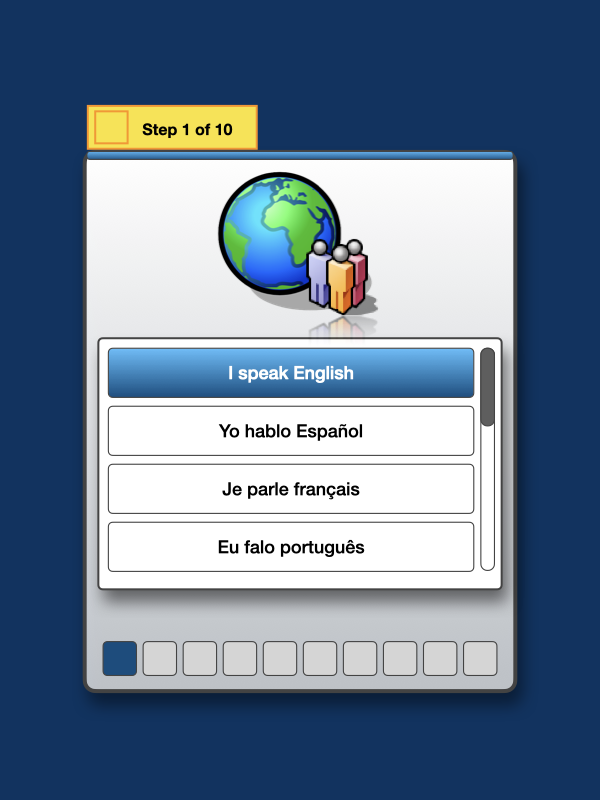
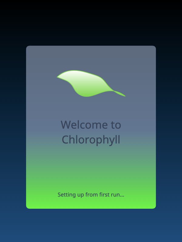
This borrows a lot from the Welcome/First Run ideas that I did back in June, so for those that saw that, this is roughly the same with some improvements to it. First Run starts by showing a quick intro (and I’m not quite sure what the animation should be yet).

After this, the next step would be to select a language. Because I only speak English, only English is in my concept shell so far; the other options are just placeholders at the moment…

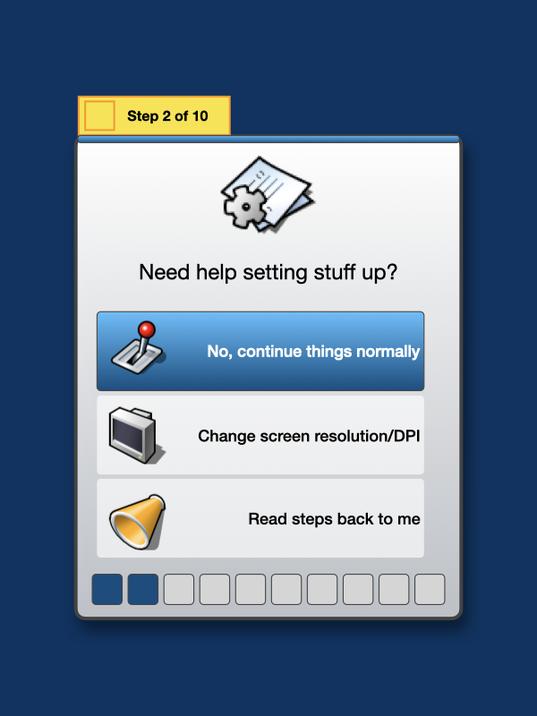
And now that the assistant would have an idea how to localize stuff, the next step is to ask if the screen resolution/DPI needs to be changed, or if someone needs to hear what’s on the screen (using Festival once this goes beyond a concept).

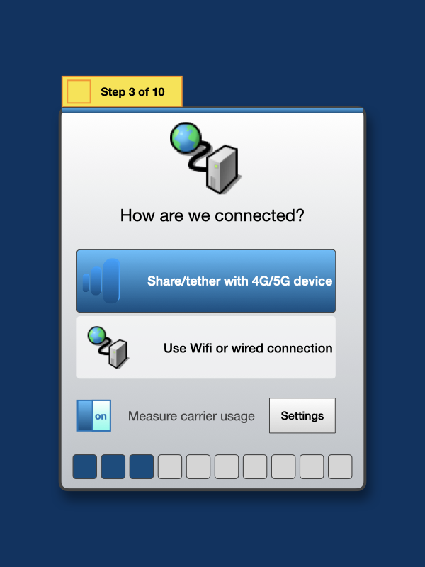
The third major part of First Run now that we would have a working screen and language is to get connected to the Internet; everything I’ve been messing around on has been on macOS and Devuan, which both support iPhone tethering; I’m not sure if Haiku does this yet (although I think I remember reading it supports Android tethering I think)?

Otherwise, the Chlorophyll shell would just connect to a Wifi network (wpa_supplicant) or Ethernet using DHCP when it was actually finished.

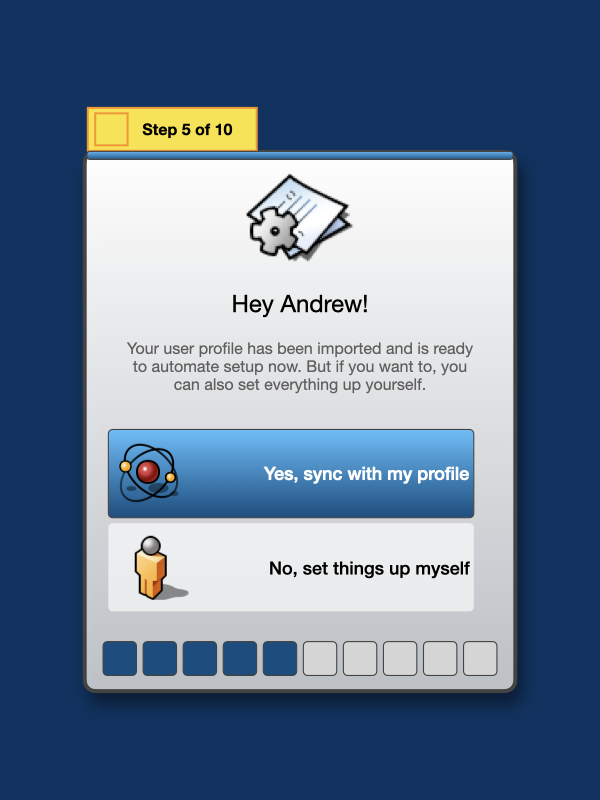
Now, for those who remember the previous setup concept, I imagined syncing profiles with the Haiku forum creds which I realize is just a dream (so that’s been scrapped here). Realistically, we can sync profiles across machines on a network or we can also import settings from a USB drive or something.

From there, if the import is successful (and I imagine that it would be really quick, since it’d just grab preferences files, not home/user data), the idea is to sync with a profile and skip the rest of everything!

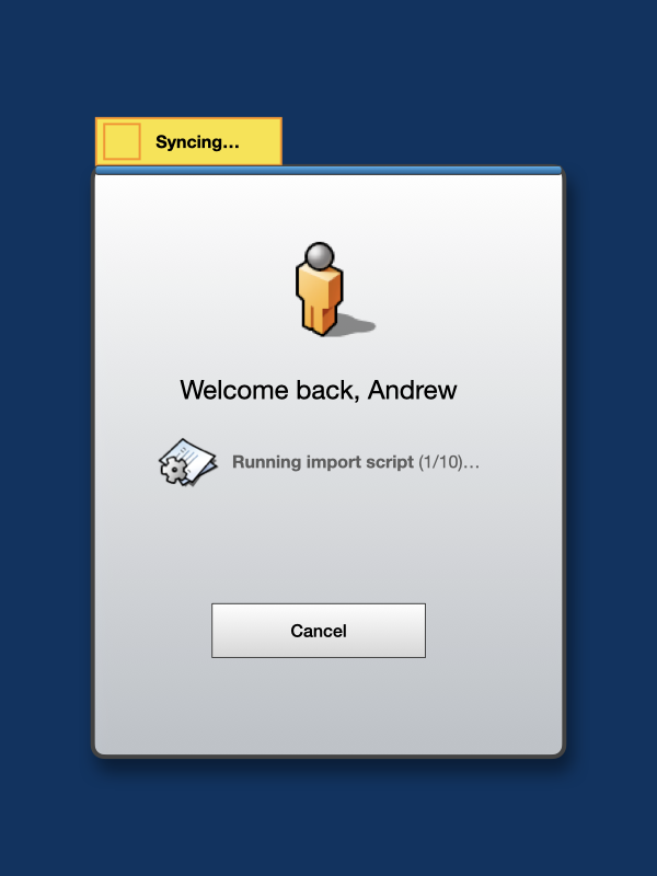
I’m thinking the feedback for this could look something like this while import scripts run:

But if someone doesn’t have everything nicely imported, then we’ll need to continue on :wink:

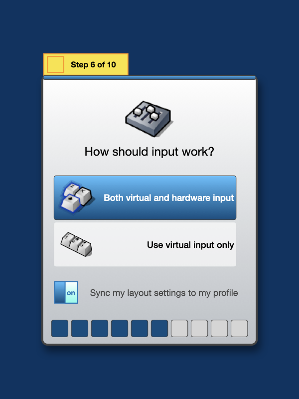
Mobile hardware can have both hardware and virtual keyboards, and accept multiple inputs like keyboards, mice/trackpads, and joysticks, so we can choose to have the system accept these out the box or just focus on virtual keyboards alone, which would be useful on a phone where it needed to be isolated and not accept external devices. We could import the keymap data from the user’s profile as well.

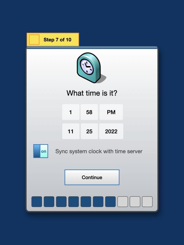
Again, time zone data should sync over and hopefully the time is right when things get set up, but we can set the time as well here.

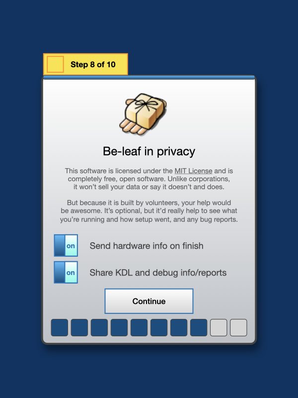
From here, especially if someone is new to the free/open source OS world, there’s a card that explains it and also allows us the option to share the hardware info and how setup went, as well as crash and debug info:

We would also have an option for a virtual assistant that would be integrated into the Leaf menu:

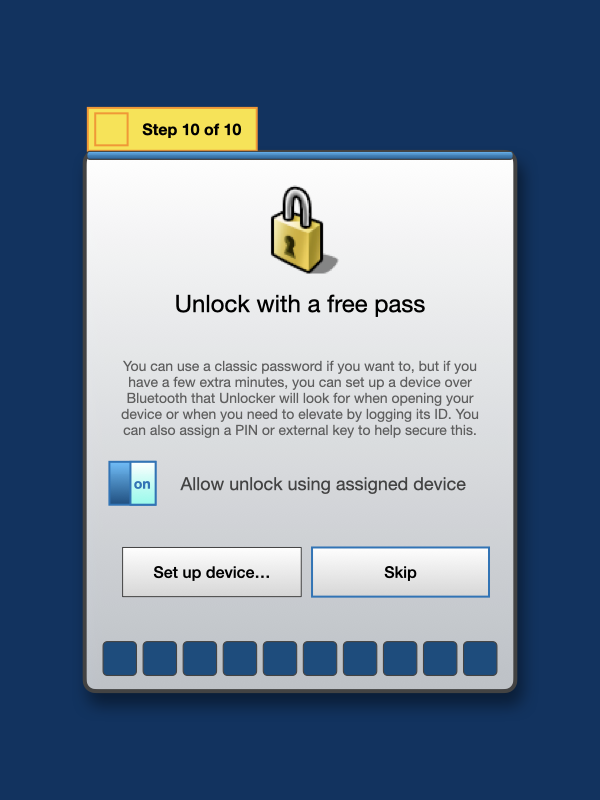
And finally, because custom builds of mobile tablets or phones cobbled together from parts probably won’t have technology like Face ID or Touch ID built in, we could use Bluetooth proximity paired with a device ID to quick unlock the device after setting it up.

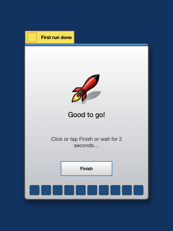
Once everything was done, First Run would automatically quit in a few seconds or someone could click Finish.

Something I feel missing from FirstBootPrompt and from the world of Be as a whole is some sort of welcome to the user interface (beyond like a welcome page, which isn’t the same), this would add that:

And that’s what First Run/Welcome setup for Chlorophyll would look like! I’m hoping that this Glass Elevator idea makes its way into Haiku, both in the classical desktop version and in mobile devices (whether that’s done by me finishing this someday or someone else doing it).

But let’s get to what I imagine the main UI would look like! :smiley:

5 Likes

What’s the purpose of the close button of the first-run program here?

Hi Andrew, lots of wonderful (and pretty) art conecpts. I love your fusion of title bars and BeOS tabs, very inspiring. Lots of other great artistic concepts, lots of though and a labour of love.

Personally, I think our community is too small to implement this at this point in time. With a major corporate player, maybe, but not small little Haiku.

What I’d love to see is native Haiku apps get a visual interface redisign by a proper artist. Lets be honest here, the BeOS application look is clearly done by engineers, not artists. A fusion of your art and interface with Haiku native apps would lift the visual appeal of Haiku considerably.

Food for thought.

Part 2/2: Redesign of Chlorophyll

Back in the first post of this thread, I’d proposed the original Chlorophyll concept (which was heavily inspired by a mixture of Gnome 3.x, Palm webOS, and iOS) but as @lelldorin had pointed out, it wasn’t really ‘Haiku’ in its look and feel.

I realized this and in the 10 days since, I think I’ve come up with a revamped design that I think is a lot better than the first one.

One thing missing from the original concept was a splash, that’s been added! It’s green here, but I imagine if Haiku used this idea, it’d be a blue gradient instead:

After bootup finished, I imagine like a rocket animation that’d shoot up from the bottom left and fade out:

From there (for those that saw/read part 1), I’ve thought of an idea that to unlock, we’d just bring a recognized Bluetooth device close to the phone or tablet we’d be using, and the UI might look like this:

And from there, we’d be free to either unlock with a tap (or optionally enter a PIN):

Okay, so that’s the splash and lock, and here’s the home screen! The style shown here is directly inspired by the Deskbar’s mini mode, which we need here, because we’re in a mobile environment, and I’m happy to say it definitely should look a lot more like Haiku:

But the default is this, where we have 1/2 of a Deskbar that should look familiar to a Be/Haiku fan, with a replicants space that takes up the empty space to the left of it (or right if the Deskbar is put on the left side instead):

Also if we put a backdrop on the home screen because most phones aren’t just blue :grinning: well, it’d look like this:

And that space where the replicants sit comes to life as a notification/alert space as well, so they don’t interfere with the app space underneath.

Same as before, I still believe Palm’s webOS had it right, applets should run as cards. And so here, applets still are presented this way. And that is the challenge I haven’t seen any other concepts tackle, every app would have to be made or remade from scratch to fit into this space.

It is less clean and compact than the app bar slide-over idea, but it definitely feels more Deskbar like this way, so switching applets would be done like this (again inspired by mini mode):

The quick controls sheet has been redesigned to take advantage of light mode, and is more compact with a more obvious close button:

If “Midnight Sun” (dark mode) is chosen, I think it looks better in black than the first try too:

Now, if you look next to the Deskbar, whether in mini mode or 1/2 mode, there is a side button and that is a Nap button, which would just blank the screen unless there was ACPI support or an equivalent to bind to. If someone needed to power down or restart the device, it’d look something like this:

Speaking of which, my last version of this concept did not have the Leaf menu; this one does. It does tweak it though with a “Do or find now” option that would open an assistant, and “All applets” and “Settings” links instead of submenus (that don’t make sense here). The other items you’ll recognize as similar to BeOS or Haiku.

Of course, there’s also a Dark Mode:

To save Haiku’s server space, I’m going to clip these somewhat :slight_smile: This is a quick idea of what the Find box could look like with ‘smart queries’ built into it, which would be scripts built into the UI that someone could type for to have things that virtual assistants do on other systems (like change a setting on the spot or recognize and pull up things from the last day or week):

But let’s get back to applets. I’d like to start with the Night Light applet from before to show the switches have been improved; I’ve chosen to not use the X switches from Be/Haiku here because this is a modern UI, but also stepped back from the larger ones I had here before:

But the tabbing idea is the same as before, where tapping add (the plus sign) will summon the Applets Box and allow tabbing a new applet, but the applet design has been improved to feel more like Be/Haiku, whose users enjoy the way the classic UI works. So there’s now a menu widget:

And when that’s opened, it takes inspiration from the classic/vintage Palm OS and pulls the menus down that were previously hidden, (both to save space and clean up the user interface). If a hardware keyboard is added, keyboard shortcuts would appear (and notice there’s no opt/alt/so on here since power users should know it goes with these keys, although this may change):

And there is definitely Dark Mode here too:

Colors has been slightly tweaked to add a ‘Midnight Sun’ option for Dark Mode. This will change as I keep messing around with everything!

Again, in just re-showing stuff from before, Screens should look more Haiku-like than before:

Same with Respawn (which was and still is an idea to have apps stay persistent across reboots and crashes), it’s been slightly tweaked. I think this would be unique in mobile UIs:

Disks (which would be a drop-in replacement for Tracker) should be more Haiku-like with back, forward, up, and a path bar, status bar, a cleaner Disks view, and a separator between net and local places.

Finally, (and this is a rough redo of the applets overview from the last concept), the Applets Box should feel closer to a BeOS/Haiku feel than before:

Preferences have been renamed Settings (which even macOS did in 13, since everything is a ‘setting’ on everything), so this does the same. But preflets still open in their own cards like Palm’s webOS:

And finally, this is what Chlorophyll would look like in landscape, with a full Deskbar since we have the horizontal space to allow it:

Thanks so much for reading through and looking at these concepts :smiley: I’m hoping everyone enjoys these “Glass Elevator” :elevator: ideas, thanks everyone! :slightly_smiling_face:

3 Likes

Thanks so much! I definitely love the BeOS and Haiku second only to the Mac, and I love working on this stuff whenever I get the free time to mess with it :slightly_smiling_face: I know Haiku is too small to tackle this, and just working on the core OS is a lot to ask out of such a small team. If I’m able to do it, I might breathe some life into this myself… I’ve messed around a little on my Mac and Devuan so far, when beta4 comes out, I might peek around the system to see if I can get an alpha of this shell to run on it. But again, that’s if I got some time to build it :slightly_smiling_face:

1 Like

Basically it’d just skip over everything and be the same as /var/db/.AppleSetupDone, so things would just be a default environment (so the default English, no direct network setup, no user handle or key, no time, privacy, or assistant questions), although if/when I build the real thing, I might change this decision and just go with the ‘import or set up’ idea instead so things get set up properly.

I’m not a fan of using different styles for window decoration counterparts, as it makes the interface rather inconsistent. Do you want a near-replica of the tabs or a somewhat inspired counterpart made for touchscreens? One of them has to be picked.

Regarding the switches, it would prolly be a good idea to not have any text on them at all. Having text on them means having to account for localisation and the potential for longer words in them, which may be cumbersome or outright unviable to fit into such a small UI element.

Another recommendation is to consider one-handed usage more. Smartphone screens are larger than in years past, certainly much more than classic webOS was still active and than was designed with screen sizes of 4 inches or less; it still works with tablet screen sizes though, but design decisions for those are a bit closer to the traditional desktop.

The use of gradients is also quite inconsistent, too. In some UI elements they’re more subtle (good), while in others they’re quite strong (bad).

1 Like