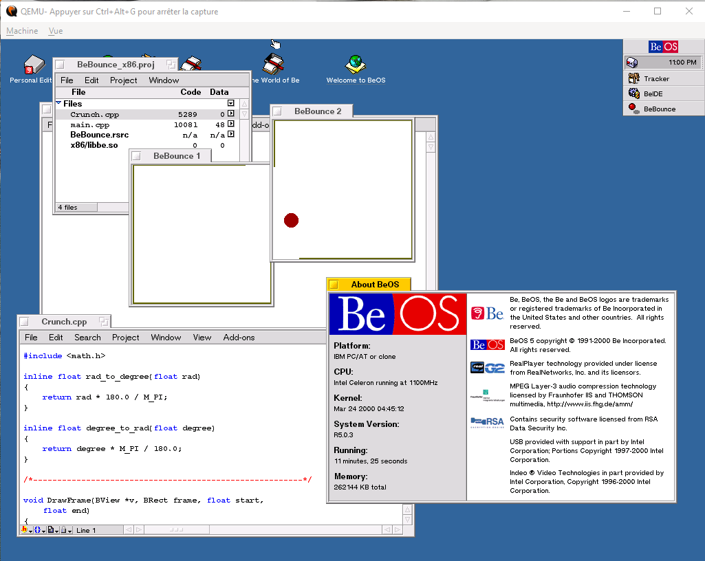
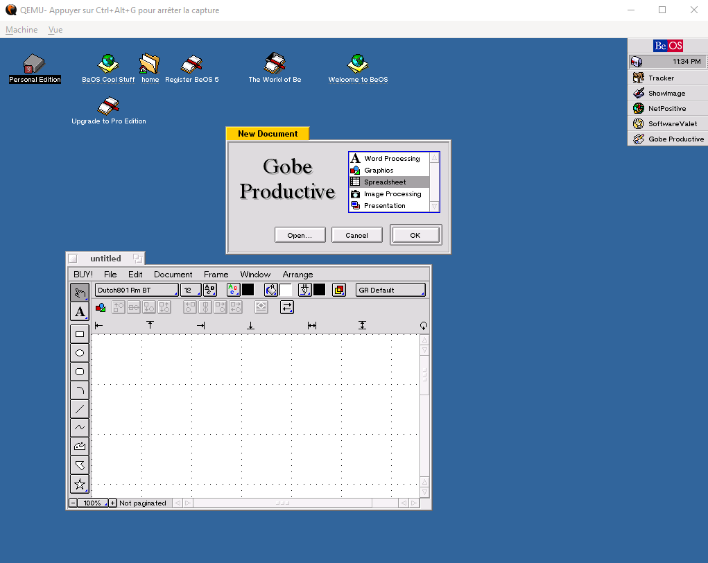
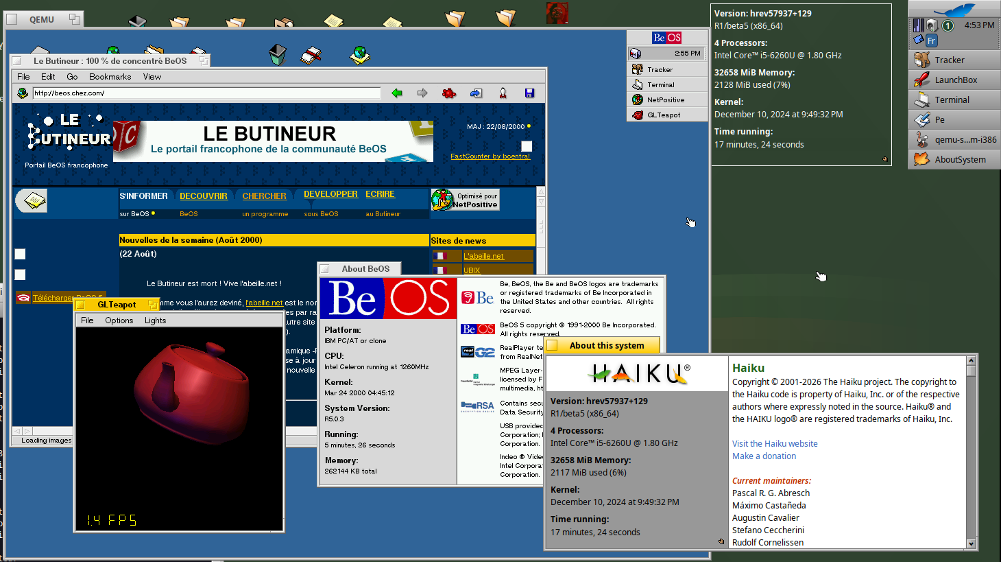
A bit of nostalgia with QEmu
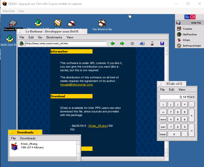
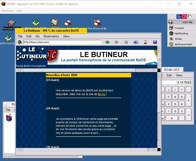
As the old site is still running with http, NetPositive can load it and download the XCalc package 
A bit of nostalgia with QEmu
As the old site is still running with http, NetPositive can load it and download the XCalc package
Thanks for sharing! That side-by-side screenshot shows how much better Haiku vector icons look like, but also how much cleaner Be menu button was compared to the Haiku’s blue leaf, where everything seems to be off: two gradients, a cropped leaf image, non-standard button borders and pressed feedback. Sigh.
The BeOS icons are perfectly crisp if you use an old 14 inch CRT 
I do think the Haiku vector icons, and UI polish in general, are much better than BeOS. Though I agree about the leaf button on the deskbar, I’ve never cared for it. I always thought it should be the full Haiku logo when rectangular, and switch to the H with a leaf or just a leaf if deskbar was in a more square shape. Or have an option to switch kinda of like how there was an app in the Windows98 era that let you switch the start menu icon and text.
I disagree completely, the vector icons are stunningly good looking on high resolution displays