Hi,
I have a simple class for hide scrollbar on BListView
The zip archive contains the source code and the pdf (French,English) explication.
download here: Download link
Thanks,
4 Likes
Please don’t do this. We want visible scrollbars.
12 Likes
Today I’m loving Haiku a bit more 
Disappearing widgets irritate me to say the least.
1 Like
I absolute like this idea. Who uses the mouse pointer to klick and scroll using the scrollbars?
Your sample code seems to be well documented. I’ll give it a try in my current development.
I suppose we cannot prevent people using their own GUI widgets, colour themes and usage paradigms that are anathema to Haiku. We can just hope that you please, please don’t… 
6 Likes
If somebody wants to use in their own machines.
Just please please do not include it in Haiku. Scrollbars need to be visible . And we use mouse to click on them.
2 Likes
Why not ! Can be included in a future theme pref AMHA.
NB: Merci JP pour la VF 
Ever smaller scroll bars with no buttons, that are more impossible to click on (if you can even find them), are a plague on UI ergonomics. This is not a phone OS!
4 Likes
IMHO from a productivity standpoint, software ergonomics was at it’s peak in the late 90s, early 2000s - a consistent style Haiku follows. So please don’t fix something that isn’t broken.
5 Likes
Hi all,
You are right, this example are made of a specific app not for use of 99% apps.
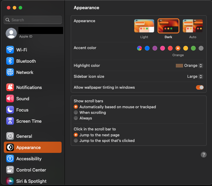
Can’t believe that this is so wrong on macOS.
Maximize the content, not the technical bars. People have mouse wheels this day. As a user, I don’t won’t to point and click on the bar, to move the content. If the bar will appear automatically, that might be good to enlarge the content space.
Sure, I checked the example from @rgb the bar suddenly appears on mouse-over which is not nice, but it goes to the right direction.
Me. All the time. Some software doesn’t allow it or doesn’t implement it correctly and it’s extremely annoying.
2 Likes
Another point against hidden scrollbars, at least for some views, is their secondary use as indicators for content size and position. This may not always be necessary and even when it is it can be achieved by other means (a minimap or a very thin but not completely hidden “scrollbar” that grows full size on hover, for example), but always-on is consistent and good enough for me, while those that completely hide are really annoying for me.
4 Likes
Didn’t know that setting was in there! Glad you called it out, because them hinding me drives me crazy. Was trying to pair some headphones with my Mac and didn’t think it was detecting them, tried all sorts of things, then eventually realised that I could scroll the list and it was off the bottom. The default window size showed an exact multiple of the items so it wasn’t obvious in the least.
3 Likes
Another possibility is doing something in-between, like firefox. The scrollbar is visible but thinner, and the up/down arrows are hidden. When the mouse cursor moves near the scrollbar area, the up/down arrows appear and the scrollbar gets wider (although still a bit too narrow for my taste). That way the visual indicator of the scrollbar position remains.
Personally, I prefer having scrollbars always visible as a default, but I think that implementation is a fair compromise.
2 Likes
As tclaus said, I haven’t used used the scrollbars as the main way to scroll since my first wheeled mouse in 1996 or so with Windows95, and even less since I discovered (a bit late though, only a few years ago) the usage of the PgUp/PgDn Home/End buttons.
But since Apple started hiding the scrollbars by default, I started to notice that one of the most irreplaceable functions of a scrollbar is not scrolling per se, but providing a visual cue that there’s content beyond the boundaries of a window or field, how much this content extends, and if the part that is visible is at the top, the middle or closer to one side or the other.
Every scrollbar is a unidimensional map, in a sense.
Also, they keep being the best way to browse fast inside a long list or webpage.
8 Likes
… and it should be just an option for the Apps’ developer.
Not great. I am forced tro survive this in Eclipse under Linux. The text editor can show one extra line on the bottom and one extra character to the left when the scrollbars are hidden, which gains hardly any useful space on screen. Then, whenever the mouse is close to the scrollbars, or during scrolling, that part of the text is hidden. So I have to insert a blank lines or two at the end of the text, so I can see the last actual line of code.
Scrollbars are 16px wide, on modern displays this isn’t a lot at all. The hidden scrollbars were invented for phones, and it’s mostly OK there. Although I wanted to access some very old pictures on my phone and got quickly tired of having to scroll by repeatedly dragging my fingers around the screen, where, with a mouse, it would be a single movement from top to bottom (just drag the scrollbar all the way down). I will accept it on a phone with a small display, but on a laptop? What’s the point of saving 10 pixels?
6 Likes
Even though invisible scrollbars might be a nice way to get a bit more screen estate, I’d like to bring the point of view that independently from UX concerns, Haiku is not ready for that.
Many people use laptops, and right now haiku has a very limited support for touchpads and multitouch. That was the reason why I had to implement GitHub - amol-/haiku_rclick_filter: Input Filter for Haiku that turns CTRL+CLICK to a right click. Helpful for touchpads missing right click. to handle both right click and scrolling.
Thus hiding scrollbars would make apps unusable by default by all the people who currently have a touchpad that Haiku doesn’t support properly.
4 Likes