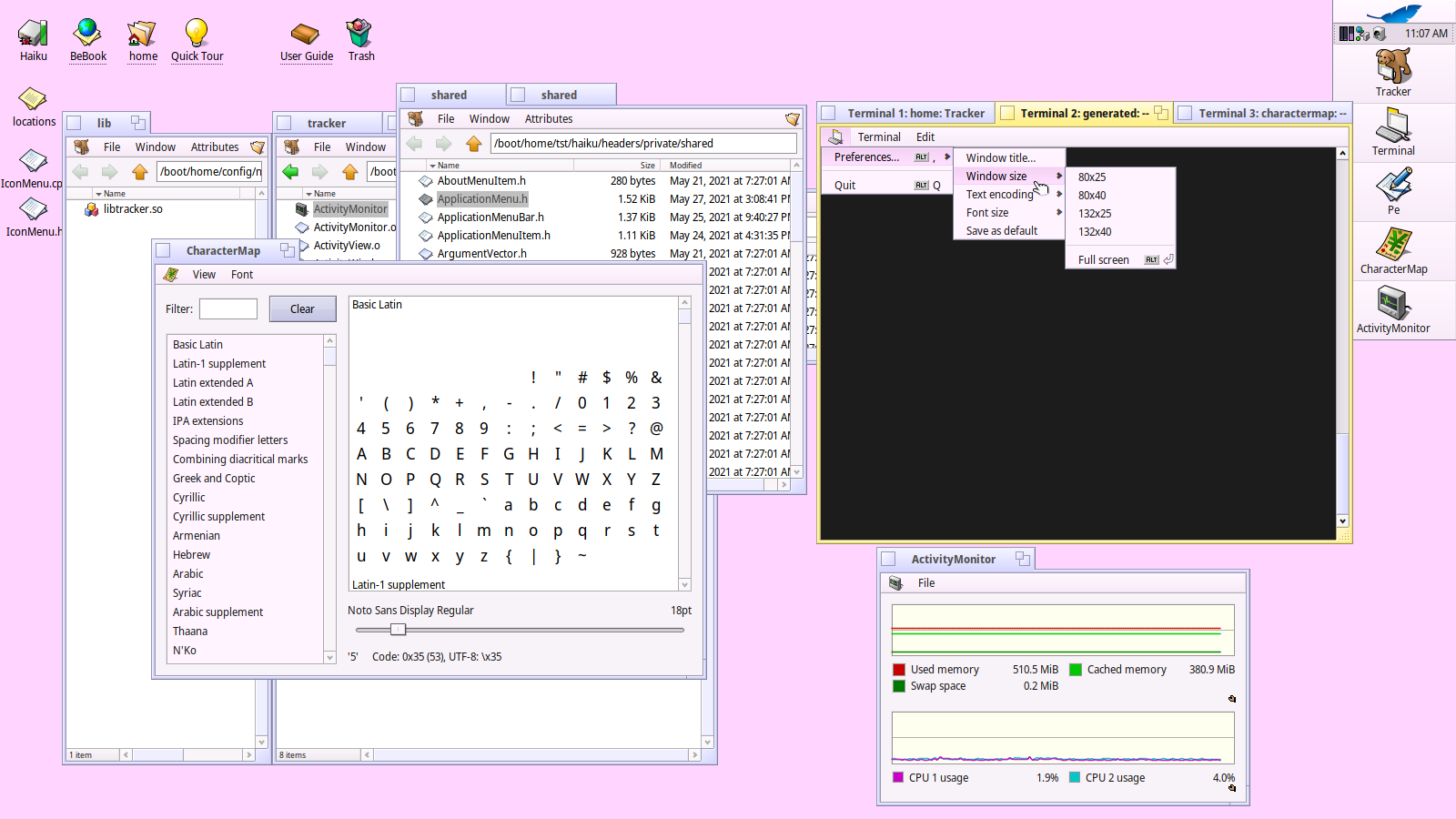
I have made the ApplicationMenuBar, a drop-in replacement for the normal menu bar, which I believe makes the user experience of Haiku even better by bringing more consistency and readability to the applications we use every day.
With no extra effort, applications using the ApplicationMenuBar get the application menu, which uses the application’s icon and holds the “Quit” item at the bottom, with the appropriate shortcut (on most systems, [ALT Q]). Adding a preference menu item requires minimal effort via invoking a special method that otherwise works as the normal method for adding menu items, and automatically supplies the appropriate shortcut (on most systems, [ALT ,]). In every other respect, it functions exactly like the (for now) default menu bar, so dropping it into existing applications requires only a few minutes’ effort, and using it in new applications actually saves time.
The ApplicationMenu helps quickly visually discern application windows from one another thanks to the icon below every window tab, and represents almost exactly the same clickable area as a “File” menu, in addition to offering a consistent place for universal menu items.
This small change greatly enhances the usability of Haiku, and I propose its adoption across all applications, first- and third-party alike.
It’s little enough code that I could share it all inline right here, but if there is a preferred place to share code (which is not GitHub), let me know.
For an application, basic usage looks like this:
CharacterMap/CharacterWindow.cpp
...
BApplicationMenuBar* menuBar = new BApplicationMenuBar();
...
The only other change to that app is removing the “File” menu item entirely (since all it contains is “Quit”, which is supplied automatically by the ApplicationMenuBar.
For something a little more involved, we still find ourselves in perfectly familiar territory:
Terminal/TermWindow.cpp
...
void
TermWindow::_SetupMenu()
{
	BLayoutBuilder::Menu<>(fMenuBar = new BApplicationMenuBar(Bounds(), "mbar"))
	...
	// Same as existing code, except move preference menu to below code
	...
	BMenu* prefMenu = new BMenu(B_TRANSLATE("Individual settings"));
	prefMenu->AddItem(new BMenuItem(B_TRANSLATE("Window title" B_UTF8_ELLIPSIS), new BMessage(kEditWindowTitle)));
	prefMenu->AddItem(windowSize);
	prefMenu->AddItem(fEncodingMenu);
	prefMenu->AddItem(fFontSizeMenu);
	prefMenu->AddItem(new BMenuItem(B_TRANSLATE("Save as default"), new BMessage(MSG_SAVE_AS_DEFAULT)));

	fMenuBar->ApplicationMenu()->AddPreferencesMenuItem(prefMenu, new BMessage(MENU_PREF_OPEN));
	...
}
This is very welcome. I’ve been meaning to do this during my yearly holidays, seeing it now makes me happy. Having a consistent menu structure among all Haiku apps is great!
Next step should be having standard Edit, View, Window, Help menus that have all the common actions.
Unless I’m misunderstanding, it handles all of the above as you expect it should. It is, after all, just a subclass of the MenuBar, in addition to pulling relevant info via app_info and menu_info. Thus, for example, icons scale along with menu font size preferences as one would expect.
Code is en route, once I’ve figured out the Codeberg situation, though, ideally, it would be included (as I have) in haiku/src/kits/shared for everyone — including system apps — to use without special effort.
For the app’s icon in the menu bar there’s already IconMenuItem.h in the private Tracker headers. I kinda fail to see the advantage of your AddPreferencesMenuItem(). Moving the “individual settings” in your Terminal example into a deeper menu sublevel makes them IMO less easy to discover and use. Just for an automatic standard shortcut ALT+, it’s a bit too much effort. People should use the Haiku Interface Guideline to be consistent in all respects, not just for shortcuts.
Or am I missing something. I’m just an amateur hobbyinst…
Part of fostering consistency is making it easy for developers to be consistent. In that way, this ApplicationMenu takes much inspiration (appropriately enough for BeOS) from Mac OS X. Among other things, Mac makes it easy for developers to adhere to its HIG, so most, historically, do. It works there more or less as this has been made to work here.
The Terminal example is deliberately made the way it is to emphasize the fact that this all just works as any other menu should, only making it easy for developers to remain consistent with what I feel should be part of the new HIG for Haiku. Developers may wish to keep the quick settings menu on the bar, or to add it as an independent item in the application menu (as I would, personally) separate from the “Preferences” menu item which opens up the preferences window.
In any case, the whole point of this is to establish a convention for where certain universal menu entries live, what their shortcuts are, and how they behave. This coherency and consistency is what used to make Mac the most pleasant interface in computing, and I fully believe that Haiku, in adopting a similar taste for coherency and consistency, stands to become the most pleasant desktop experience ever conceived.
I think it’s not the first time something like this is suggested, and replacing the main application menu (when there is one) with the applicationeicon may make sense (assuming it doesn’t create a discoverability problem and people still understand it as a menu).
The next step is submitting the code to Haiku, probably reusing the existing iconmenuitem or replacing it, and adding any new needed code in libshared. And then converting existing apps in Haiku codebase to use it. The previous attempt stopped there, I think the code was neâer submitted or was not following the Haiku coding guidelines.
The relevant header files are in their appropriate corresponding directory. There are also a few converted apps to look at, including Tracker, Terminal, and a few others.
This is meant to show that the work has been done and proven to function, and does not constitute pristine code in itself. Furthermore, I am still coming to terms with the Haiku code base, so there are likely less redundant and/or ugly ways to do what I’ve done. But that’s what the review and submission steps are for, should we make it that far.
Note: I had to split this up because I am apparently only allowed two links per post.
I surely appreciate the effort to create this, but personally I’m not a fan of having the application icon in the menu bar. Maybe I’m just old-school but it feels very out of place for me there.
Yes, most do. The one that does whatever it pleases is Apple itself. I recall how most applications there were Aqua, but some from Apple itself used a Metal appearance.
I can see the point in it. If you have a bunch of overlapping windows this gives you a quick visual clue which window is which program.
OTOH we’ve just reached the point where you need to look closely to distinguish between Native and QT applications. Unless someone thinks of a solution, this now makes ports (which is the majority of our software in the depots) look foreign again.
For me, one of the important parts of Haiku is not just the consistency, but also that when we find a better approach, we still have some freedom to change things a bit. This is what BeOS was about, starting fresh, keeping the good ideas from previous OS and throwing away the bad ones. So, I don’t think horted software should enter this equation.
Instead we should look attthe change in itself. Is it good? What problem does it fix? What new problem does it introduce?
Also note that the app icon has existed in Vision for a very long time without people thinking this looks not native.
So, what are the pros and cons?
Saves a bit of screen space on the menu (but that is not a place that tends to be too cramped)
Provides a substitute for a “window icon” that other OS do have, allowing to visually identify windows
May not be immediately identifiable as a clickable menu (but that is a guess, testing would be needed)
It may be harder to document. Telling users to open the “Application” menu is easier if “Application” is litterally the menu label (just a minor thing to clarify once in the userguide, I guess?)
Also, I understand this would only apply to windows that currently have a menu labelled “Application”. The ones that have a “File” menu, or no menutat all, would stay as they are. Or would all window get thns new menu even if they previously didn’t have an Application menu? Would it replace the File menu or be added next to it?
If it is to make identification of the window easier, could the icon be put in the tittle bar , alongside the written title ?
As for the new menu, maybe in the opposite side of the window, where it would appear (mostly) alone there, and could be described ( think explaining it to someone by the phone ) as to “click on that picture on the far right side of the window´s menu” . ?
If we’re using that kind of language, then what’s the difference between “right” and “left”? Actually, it being at the start (left) of the menu makes it more evident that it is part of the interactive portion of the menu.
I would argue it’s at least equally as identifiable as the Mac application menu, which is just the app’s name.
All application main windows should have this bar (and this menu), but modal windows, things like preference windows, &c. should not. This is why it is called the ApplicationMenuBar, because it does not necessarily belong where any other MenuBar would.
The application menu should not replace any other menu, except in cases like CharacterMap where the present menus contain only items that should live in the app menu (like Quit, About, Preferences, &c.).
I’m still not sold on the ApplicationMenuBar idea, but I did come to like the app-icon menu over the years. Even switched some of my own apps over to it.
It’d be nice to have the IconMenuItem readily available in the API without having to copy IconMenuItem.h|.cpp everywhere.
Yes. It also strengthens a user linking an app icon and the application itself. So it may speed up recognizing the app icon e.g. in the Deskbar’s “Application” menu or its list of running apps.
I doubt that would be a problem, and even if so, it’d be a very low learning step that only has to be discovered once.
Agreed. I’d probably go with “app-icon menu” with the icon image inlined.
IMO it should be added to all applications with a menu bar that has items pertaining to the app itself. Those have been put into “File” in the past, where they don’t really fit. For example: “Quit”, “Settings…”, “Help…”, “About…”