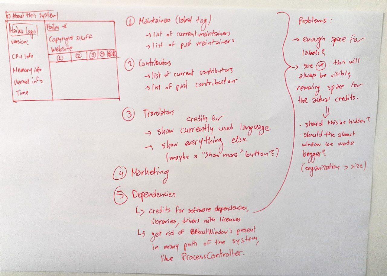
I recently noticed that there were some programs that were previously available for BeOS/Haiku and were later integrated into Haiku itself. I spent a reasonable amount of time modifying those programs so that they would use a built-in Haiku API feature to show the credits, until I realized that it would have been best if those credits were included in the Credits window of Haiku itself.
So, I decided that “AboutSystem” (or “About this system”, the prompt which shows information about your system and the long list of credits) needs some love.
Here’s a mock-up that also explains my ideas:
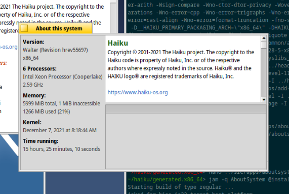
Here’s my attempt at implementing that window so far, so that I could get a general idea of what I was up to before taking these notes on that piece of paper. You can probably already notice that space is running low. The upper part would not be scrollable in the final result, whereas the lower part would:
I prefer the current simple scrollbar to reach all items in the list. Tabs look busy and not very useful.
To make the scoll less long I would consider showing the names on two columns instead of one.
If you want to make it fancy, have a way to fold/unfold parts of the text in the textview (maybe make it more like a BOutlineListView?). That would make more sense than tabs to me.
Well, it’s still true that a very long document also looks pretty busy. I think that the “busy look” is reasonable, considering that there are a lot of things that ultimately made Haiku what it is today.
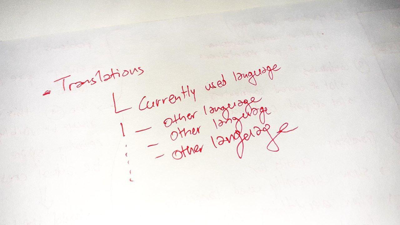
I also thought of your idea but ultimately decided against it because the desired information that the user may look for is still a click away, but there is still a whole lot of additional scrolling (considering the amount of translations) and navigation that would be required on the end of the user.
The translations, which mostly render your idea “problematic” from my point of view could be immediately resolved if something like this were to be done. I’m just not quite sure how I would make it less ugly in an actual implementation.
Using several columns doesn’t work well with very long names, e.g. “Γιάννης Κωνσταντινίδης [Giannis Konstantinidis] (giannisk)”.
AlwaysLivid’s suggestion above is an OutlineListView, right? That looks like a good solution. Have every sub-category - Current maintainers, Past maintainers, Website & marketing, etc. - get an expander in front. Click, and the names are displayed.
Another idea would be to have the list of names just comma-delimited instead of one name per line. That would cut down on vertical size, but does demote each entry from the lime light to being part of a contributers’ soup…
Current view ok. But if you switch language to Russian for example. You got very extended in width window. That’s sux. Need to change width calculation formula…
I have never seen an OutlineListView in such an applet. It’s usually tabs in similar applications. No one would click in individual outline list views to see the contributors, but people would scroll down a list. It makes sense to cut it down to tab categories to make it more scrollable.
With such a long list, the navigation would be irritating as well. Outline list view do not work well with long lists, because you eventually (definitely) get lost on where to collapse and see other stuff. Maybe it’s just me.
If I’m not mistaken, this outline list view would be collapsed by default? It is nicer to make names listed directly, not hidden under categories, not cool.
I am not a fan of removing the about windows of individual components, I like the current way of listing each creditee once (or twice if in severall categories) and having them in the individual apps aswell. I would bother checking about windows of apps, but not opening system about and then trying to find the part for that app, it seems like more of an indirection to me.
Isn’t it a bit weird how that isn’t consistent across separate apps? Why have that in the ProcessController, but not, say, in the Mandelbrot source code?
It should be consistent, but that is orthogonal to wether aboutSystem should be redesigned or not.
If you would argue that build in apps should not have authors listed or have an individual version that would be nicer i Think than stuffing this in aboutSystem.
I agree that native apps should have a consistent design. But, would it be then more consistent to have an about window in most ported apps and not in native ones?
I think this makes perfect sense, in all honesty. Or, other case scenario: Add an About window in every app that ships with Haiku to add a little personal touch.
But go on and try to figure who should be added, who made simple one-line changes, who doesn’t want to be added, and so on and so forth…
Anyways, we can talk about what we’re going to do with the About windows on a later stage. Deciding on how to fix up the About window and making it much more easy to navigate seems like a priority.
Just because I was inspired to fix a problem because of another problem that acted as a source of inspiration, that does not mean that the former problem that came up as a result of the latter problem can be dismissed, BTW.
I am mostly just trying to highlight that figuring out what to do with the About windows in seemingly random applications is “step 2”, and that the focus should remain on which design decision for the About window works best.
As for AboutSystem I don’t see a problem that needs fixing, your initial post only mentions it for consolidating about windows, which you dismissed above as unrelated.