Hello Everyone,
Myself, Venu. So, I am working with the issue #8 which says to create and integrate the missing icons of the Weather App.
I have few doubts regarding the icon ideas. So, I created this topic in order to discuss the various ideas for the icons.
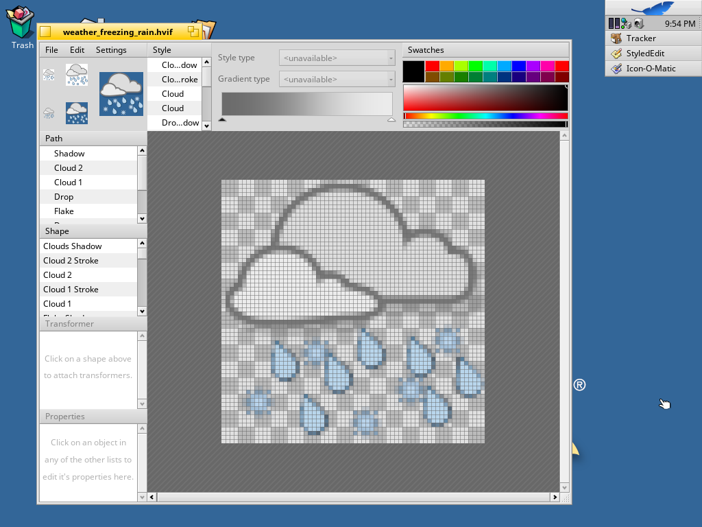
So, the first icon I created is freezing rain
The idea behind this icon is combining both rain and snowflakes from clouds.
Is this good or do I have to change anything?
3 Likes
Looks good but i would have a sun and cloud together
1 Like
@lelldorin
Sorry, I didn’t get you.
freezing rain
So, I thought of combining both snow and rain with some clouds.
Can you explain me what more to do?
Hi Venu,
thanks for working on this. Unfortunately, pretty similar icons already exist. See all the currently available Weather icons (you can open all the icons in the cloned Weather/Artwork folder and save them, in order to have the icons written to the files):
2 Likes
I hope a developer can add other weather services to the app, as Yr.no.
Here is the list of weather icons they use>
http://om.yr.no/symbol/
1 Like
I want to do the below icons. Can you correct me if I am wrong with some idea of the icons
-
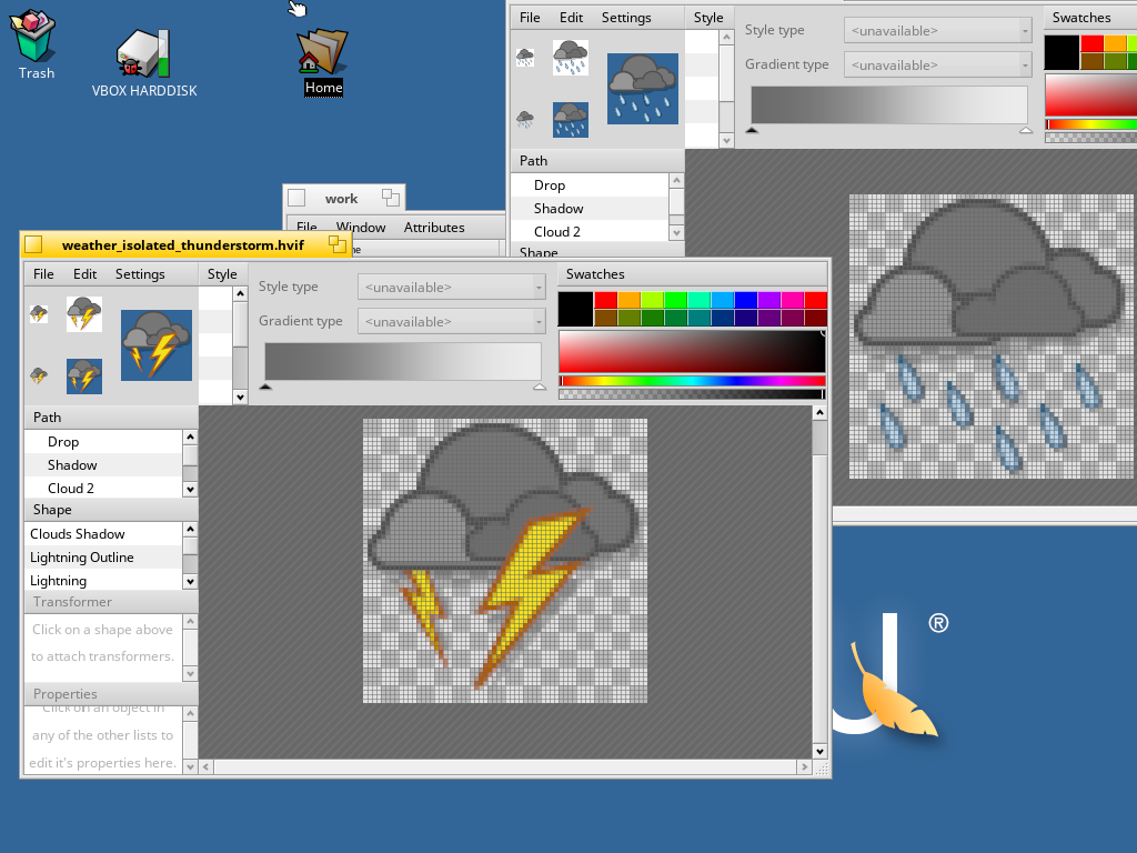
isolated thunderstorms
thunders with some clouds
-
heavy snow
clouds with five snowflakes (somewhat similar to weather-snow)
-
snow showers
I need some idea to do this.
-
isolated thundershowers
I need some idea to do this.
Thank You.
I commented at the Weather issue #8.
1 Like
Hello,
I designed two icons.
- isolated-thunderstorms
- isolated-thundershowers
Can you tell me is that ok or do I have to make any changes?
2 Likes
Those fit nicely in, because they build on the existing ones. Which is the right approach from a workload and aethetics pov.
The isolated-thundershowers looks good.
For the isolated-thunderstorms I’d suggest to remove the bigger flash and duplicate the smaller flash shape, to distinguish better from the existing severe-thunderstorm icon and convey the reduced severity of the condition.
Once you create a PR with your icons, I can have a closer look at the icons in IOM and comment on it there.
2 Likes
Thank you!! 
So, how many flashes should I create now?
Are three duplicates of the small flash enough?
As I said: “remove the bigger flash and duplicate the smaller flash shape” which leaves you with two small flashes. I’d leave the existing smaller flash where it is and put the new small flash roughly where the bigger one was. That way there’s not much jumping around when a condition changes from one icon to the next.
1 Like
Big flash must come from a cloud. And it is to big (it must look less important than clouds).
Some example:
http://old.meteo.lt/english/meteo_phenomena.php
1 Like
I would say the one single flash transports better the “isolated” semantic than two, even of the same size.
1 Like
When I see two flashes, one big, I think “strong thunderstorm”, not “isolated ones”.
Just the small flash, but coming from the darkest cloud, would make more sense to me for that.
Anyway, they already looks great graphically, thanks you for contributing your icon-shaping skills.
1 Like