Thanks a lot!
After check, when not selected drop down menus are still using document text colour on panel backgroud colour, both should be menu colours.
As you’re almost done with menus there are few others if you want
When you have a box on a panel, for example Native dialogs, OpenGL, QML in Qt Configurator, titles are using document text colour, it should be panel text colour or a derivative.
Items on Qt lists are using document text colour instead of list item colour otherwise lists colours are ok.
Column titles are using control text colour instead of panel text colour.
There seems to be other things to care of about list views and columns titles, so it can wait till you have time to look at them all.
Titles of panels on the right when you configure editor in Kwrite are using panel text colour but on list background, I’m not sure that is your concern.
I think that there’s nothing more about colours except the ultimate challenge : document loading bar in Otter. It’s such a weird mix of colours that there’s a bug filled upstream asking to make it customizable. So upstream problem not yours.
Thanks @mmu_man, let’s hope it’s of some use to someone.
By the way, this “dark theme” does not have dark “document background”. It’s the first revision. I’ll keep researching to improve it in further releases.
Thanks @3dEyes for the QT theming fixes. It will improve readability for sure!
Regards,
RR
Hi guys! How i can install the theme? i tried to move the folder to “/boot/system/data/UIThemes” but its an a read only folder. Exists any folder in my home directory?
You need to use a hpkg package or copy files to /boot/home/condig/non-packaged into the needed directory. Here you can write.
http://besly.de/index.php/en/package-system/manually-install-system-files
https://www.haiku-os.org/guides/daily-tasks/install-applications
Could you check and see if at least menu colours are correct now? You need Qt 5.15 for that.
Yes! main menus are ok. Including separators and other things that were not in previous version.
Drop down menus are ok when they are displayed but non active state is not.
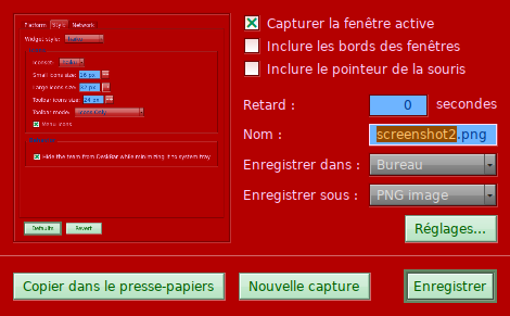
As you can see in pic below when non active they use document text colour on panel background colour.
They should look like those in screenshot app.

Args the red looks ugly.
Why? I’m starting to grow fangs, thirst for blood is rising!!! 


Night of the vampires!!!
This heat ain’t good… 
The purpose of this theme is to spot problems like these, not to be pretty.
To do that, everything panel is a nuance of red, everything doc is a nuance of blue, everything control is a nuance of green, everything menu a nuance of grey and everything list is a nuance of brown/yellow.