I’d be against that. No more hurdles to get to the actual Installer app. Even less so for something as non-essential as the GUI look. To get started, the default look is perfectly fine - for me and a majority according to this poll, it’s just as we like it. If someone wants to change it, they’ll have to find where to do so, just like with any other setting of the OS. The aptly named “Appearance” preferences should give a strong hint, even without opening the user guide.
The “EULA” is in quotes. It’s where other OS might show an EULA, Haiku has tips on the actual installation and how to add Haiku to a boot manager, and urges to read the Quick Tour and User Guide. I don’t see why summarize these 3 points and have them to ticked is any improvement.
No, it makes an annoyed user tick boxes.
That’s Tipster. Should it be bundled with the OS? Maybe. One more link on the Desktop, but I could live with that.
That is true - but as I mentioned, people tend to jump to conclusions when “judging” Haiku - not making it extremely obvious that we do have “modern” (and multiple) UI options might mean that potential users simply dismiss us and not take us seriously (I’m not making this up, I have seen comments online being dismissive of Haiku just because our UI looks different).
The Appearances preferences only give you options to change the decorator and ControlLook - not change themes. To change themes you have to install Theme Manager, which for some reason isn’t preloaded. Once we do preload it, then we can put a line in Installer reading (this is working off my previous proposal): Don’t like the default themes? Get more themes, backgrounds, sounds, screensavers and more from HaikuDepot. Open HaikuDepot under the Applications menu. You can install your new themes through Theme Manager.
I’d rather cater to the ins than outs, If people refuse to consider an OS because the default UI doesn’t look glossy enough that isn’t really a problem, it’s likely they will dismiss the OS over other superficial things too.
especially since those that do use it seem to think that it is perfectly fine, as your poll shows.
I am against making the installer more complex than it is, it is now already a really good example of why people use haiku over other OSes, it’s elegant extremely simple and really fast, if we try to make that workflow more complicated simply because of “some people refuse to read” you make the experience worse for everyone, but it is unlikely that anythibg will be gained imo.
This goes for putting themes or such in there aswell, The only things i would consider to put into the installer now would be a potential dark theme and maaaaybe a use big font checkbox, exposing less than the appearence prefs but maybe just enough for people with low vision.
This is on purpose, ThemeManager is unlikely to be included since it’s functionality is rather niesche and its functionality is too complex for the normal user. This is also the reason why appearence prefs is so easy to use, it does not try and ‘theme managing’ but simply expose simple costumization options. The colors tab for instance is way too complex like it is now and might be redone in the future, leavibg complex color adjustments to something like the thememanager.
I agree with the points about not making the installer any more bloated than it’s supposed to, but presenting a “Switch to dark mode” checkbox on FirstBootPrompt might be useful.
There is a very thin line between bloat and asking user for something. Themes (Decorators and ControlLooks) are a bit on the bloat side to ask during installation. However, Appearance preflet needs a makeover that’s for sure.
Decorators, ControlLooks, and Colours should be unified into one thing: Theme.
These themes should be user modifiable, e.g. create another theme based on one of the current ones, modify its colours and and save it.
Each theme should have two variants: Light and Dark.
Font settings can live separate on its own.
If we come back to the original subject, I think Haiku’s current UI should be preserved, one improvement I’d welcome would be slightly rounded buttons. Current buttons look way too unfriendly. BeOS had rounded and sticking out buttons, that’s why I love the BeOS CL.
Haiku’s current UI is what makes it stick among the other operating systems, with its prominent UI elements. @nhtello’s Flat theme is great but it still needs tweaks with its colours, I still find it way too low contrast at times. I still wouldn’t make it the default, because it’s still a departure from the 90s style, which Haiku should preserve at least for R1.
Controllooks decorators and colors are unrelated pretty much, merging them makes little sense to me, the only use Themes have is for users to share a complete UI configuration with other users (including fonts, settings for controllooks etc), those that wish can simply use ThemeManager, or an equivalent programm, forcing a canonical format probably doesn’t help much.
It would be nice if some devs would have a look into the navigate with keys only or shortcuts. I am very happy to have the UI as is. I love the right-click to bring the window to the back.
For me pressing the “list”-key opens the Tracker choosing “p” then (for preferences) will take me to the Applications Folder which is wrong.
I used [list-key] then [p] then [s] for going to the screen preferences for example.
Using the arrow key is not working properly in Tracker by now.
Hope this is related to the UI!?
EDIT:
Ah I found the reason, if I use “Translate application and folder names” in “Local”/ “Preferences” it will happen/ocures. So my fault!?
My suggestions so far for iterating upon this would be reducing the padding of the menubars a bit and perhaps eliminating the rounded corners between grouped tabs.
Haiku is exactly right in recreating BeOS before considering branching out any “glass elevator” stuff. (though, I really appreciate HaikuDepot and pkgman!) And please, stick to your guns regarding folks who come in and complain… “why doesn’t Haiku do what my other OS does?” … BeOS was my daily driver for 6 years. Haiku team has been heroic, as far as I’m concerned.
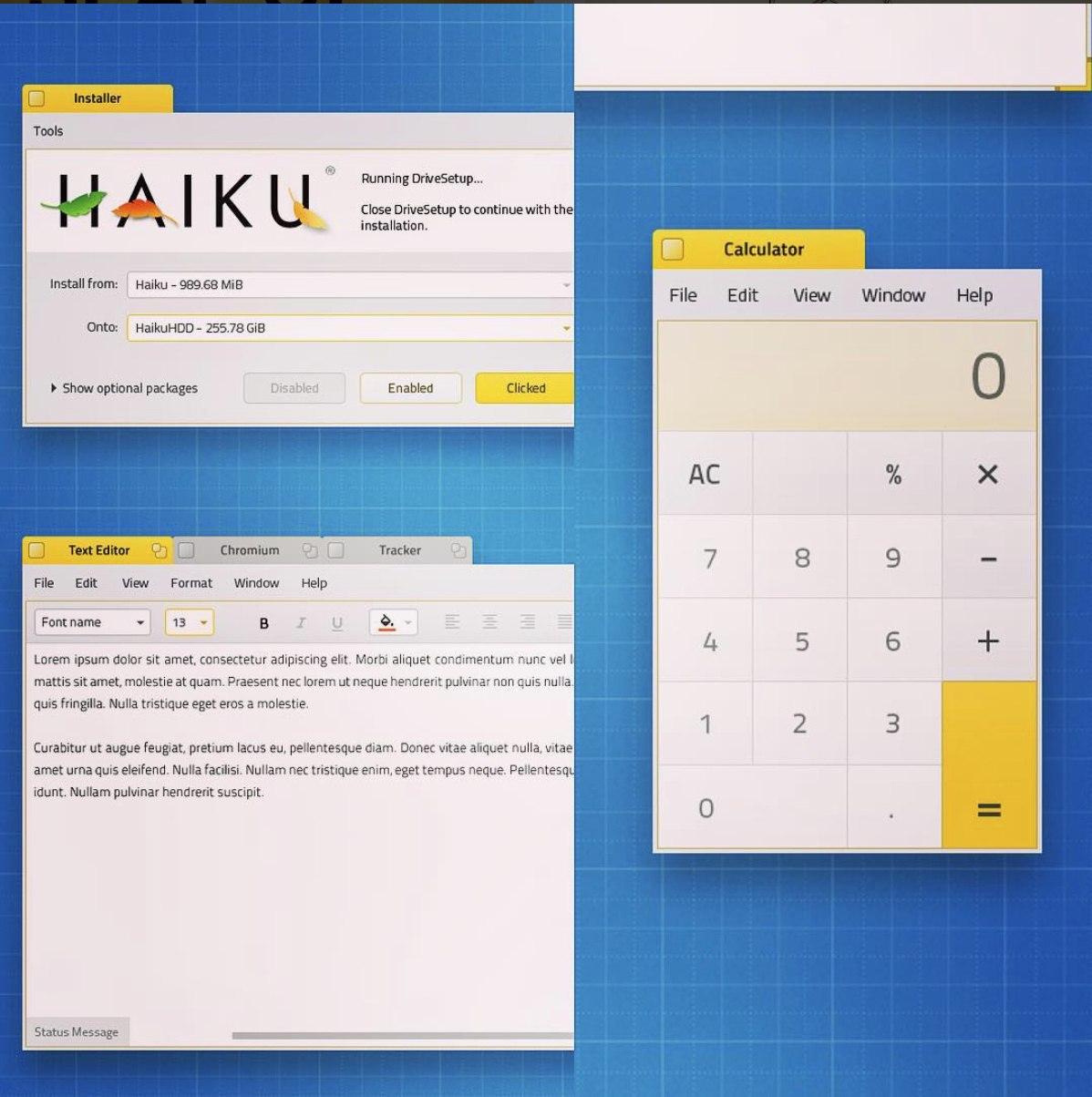
I love the look of this - as @fkap says it preserves Haiku’s unique identity whilst giving it a modern feel. Plus, the Microsoft Sets style concept (the stacked windows with Text Editor, Chromium and Tracker) seems like a great concept too. The design kind of reminds me of something like Elementary OS.
The poll is missing an option. The UI is neither bad nor very good. It’s okay and gets the job done but certain things are counter intuitive or cumbersome to use. One of my biggest issues are the combo-boxes besides and certain menu handling, both from user perspective but especially from a developers perspective. Another something which I find lacking is window alignment on screen. Maximizing is practically non-working and thus useless. The lack of proper stacking (not the one you are talking about) makes working with multiple windows of the same kind cumbersome. Showing/hiding windows is working half of the time. And if a window ends up behind another its pretty much impossible to get it to the front without hiding half the windows and then having to seek the next window which is now gone. Now I’m gone from this topic before the haiku-storm starts
I haven’t seen “Showing/hiding windows is working half of the time” yet and if a “window ends up behind another” and a right-click-to send-back the one in front doesn’t help (I try to spread over workspaces to avoid too many windows), there’s always the list of windows in the Deskbar.
Obviously, it’s just a concept, so understandably the original designer didn’t design this with usability in mind. I do agree with your concerns with the lack of window borders, way too generous padding and tiny scrollbars, but the font being used in the concept seems to be the exact same font Haiku currently uses by default, Noto Sans.