I like the term “iconlang”.
The first step is probably for me to spend some time devising the universal pictograms. Then I’ll bring the results back here and road-test them for public comprehension.
I’m not expecting Haiku to adopt this UI direction necessarily, but I will build the prototype system on Haiku.
Absolutely true, in the case of opening applications.
I’m proposing extending this ‘recognizing-by-icons’ into the menu systems as well.
This might be an interesting read:
It talks about how to design a good and practical icon language, complete with icon design examples. It’s freely borrowable if you have an Internet Archive account.
2 Likes
This book is fantastic. Thank you for recommending it.
Here’s an interesting bit where it describes the primal-elements of an icon’s geometry being significant in themselves. Throughout the book, the author (consciously or not) outlines a good case for an OS without words:
2 Likes
Even just clearer and more defined
Haiku icons are a good thing in themselves.
I love the current Haiku icons.
I’m just considering a methodology for extending the iconography into the menu systems.
But my ideas are highly-experimental and not something to be integrated into Haiku for a long time; if ever.
What I mean is that well-defined meaningful icon composition rules will also be useful for improving the Haiku icon system itself.
In other words, it would be good to have simple icon design principles available so that the icon designer can make meaningful use of them.
3 Likes
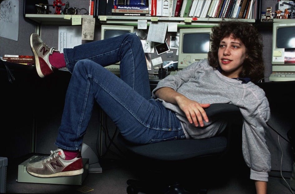
Definitely. The original icons for the Macintosh designed by Susan Kare in the early 1980s, for example, are a great example of exceptional clarity and economy in icon-design. Susan Kare was apparently running mainly on instinct in making the icons, however, as her later work was not nearly as good.
It’s often forgotten that humans have a psycho-emotional response to signs and symbols, and that this response frequently bypasses conscious-awareness.
Those who are aware of this language-of-signs, and know how to use it benignly, can communicate and enrich humanity. But those who know the language of symbols and misuse it (advertisers; governments; other cults) can manipulate society.
Repeated exposure to iconography bypasses rational-thought. It can be used to divide us against each other in cruelty, and mutual finger-pointing, and accusation:
Or unite us in collaboration by supporting the human values of kindness, compassion, closeness, equality, and mutual-respect:

Frequent exposure to OS icons that promote division, anger and domination will damage a culture. Often these divisive-icons promote their negative-value-systems without the ‘user’ being conscious of this process. The ‘user’ has their rational mind bypassed. They are ‘programmed’.
Conversely, frequent exposure to well-designed, intelligent icons can reconnect us.
My task now is to design an appropriate icon-set for use in a purely pictographic-UI layer.
1 Like
I think you are overstaying this matter.
Icons are just conventional signs based on certain (culturally motivated) abstracted connections with reality, and the understanding of icons directly depends on whether a person understands the meanings of those conventional cultural signs.
And these signs cannot and do not have any subconscious effect, decoding any symbols requires intellectual activity. Otherwise, there is no understanding to speak of.
…But, if a person does not understand some signs, all kinds of strange, crazy phenomena can certainly occur here.
Interesting paradigm…going menu-less will be very difficult after delving lower than two levels from the top-definitely will need labels.
For me, the Windows 8, MacOS and Gnome desktops suck–I hate the icon clutter. Or any desktop that uses the icon bar. Too big and too distracting.
For me, I prefer menus that tuck out-of-the-way (like Deskbar or KDE) to keep my workspaces clean and see more background. I prefer to use micro-icons if I need to place icons on my workspace.
So following your thought, menus full with icons would be doable (no labels)–but like you stated, getting the icons distinct enough will be challenging especially for very similar or specialized activities or applications.
Honestly, when looking through the system icons or preferences–the icons themselves “do not translate” in my mind; hence, I tend to use the labels to locate what I need to do. I often think about some of BeOS, ZetaOS and /or Haiku icons what drove the iconography to represent “X” since that symbol would not mean that to me (this true in current Windows platforms since M$ have really messed those up).
That’s the main challenge you face–good luck!
Some of it is intentional. For example, the icon for SerialConnect is a cereal box and cereal bowl (connected with a cable). The idea from this comes from the BeOS IconWorld series where each icon was interviewed about what they do:
There is a list of these here: IconWorld
Several other of these icons are similar. Since there is a text label near to them, we can allow ourselves to be a bit quirky and not immediately clear with the icon itself. And some people really have fun looking at them closely and suddenly realizing the stupid joke.
12 Likes
Thanks for this link, I didn’t knew this existed, what a treasure!
I have read just a few. Its a fascinating glimpse into the culture that made the BeOS so engaging and attractive.
3 Likes
I’ve also been wondering if not just cultural challenges exist, but also age-related challenges. I’ve been involved in tech for decades, and yet I find my iPhone difficult to navigate. All the colorful icons blend together and I can’t find my apps without searching. Maybe it’s because they are all rounded rectangles which is thankfully not the case in Haiku. Or maybe it’s because of the cohesive color scheme. Or, maybe I’m just getting old.
2 Likes
It’s not just you…we are many that dislike how Apple and M$ have screwed up simple, usable, and intuitive GUIs since the Macs went Intel and since Windows 7. Not sure who their test groups were but they failed in gauging what was really needed to changed or updated. I agree the newer iconography and interfaces seem “off”–IMO just sucks.
Gnome definitely died for me after version 2 and they still producing a very bad GUI desktop–I stopped using RedHat when they eliminated KDE as a core desktop option and, for work, I switched my servers and everything to Suse. I like KDE because it’s a very stable design and very functional and they have surprised me by enhancing it further–IMO best Linux desktop.
One reason I love Haiku is because they preserved what was true and working from the BeOS GUI desktop and incorporated reasonable enhancements into it to greatly improve functionality. I’m still an active ZetaOS user, which I really love to use. I imagine many of the Haiku developers were former ZetaOS users. I’m mostly using Haiku and its apps daily now as I vet it out (and use ZetaOS as needed since Haiku cannot do the job/task yet). Doing my part to help Haiku get things updated by reporting bugs as I go along.
I just read on OSNews how Apple has messed up the Mac GUI more by making it look more like the iPhone interface. Feel sorry the Mac users…a Mac is not an iPhone and vice-versus.
I like the current direction that Haiku’s GUI is maintaining and improving so far.
4 Likes
I don’t think there were test groups for these. They put “designers” in charge and they sure did a great job of making everything look nice and smooth and uniform. Which is, it turns out, not what you want in a computer user interface.
8 Likes