This is a melding of the Koki Mockup with my skin. I am lacking input from people right now so it is difficult to keep moving forward. So please write what you think ââ¬â even better, write why you think it an provide suggestions if possible. Please don’t write "the fonts suck" or "i hate I candy with the fire of 1000 suns".
Looking really good.
A few comments/suggestions…
How do the top navigation bar and content boxes look with the lines lightened? Might help make it feel a little more open (not that it looks particularly enclosed at the moment, just a thought).
I love the tone of blue you’ve used, looks fantastic.
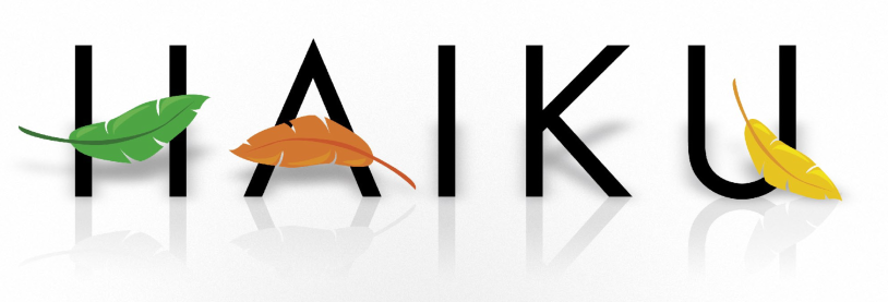
With the Haiku graphic at the top of the page, I don’t know about the leaves in the background. They sort of take too much focus away from the logo at the centre. Have you considered maybe using duller colours for them so the logo stands out more? Making them even grayscale perhaps?
In terms of layout (I know this isn’t so much your department as it is Koki’s) I think it would work best with the green introduction box above the other two and spanning the width of the page, with perhaps a screenshot of a fresh Haiku desktop thrown in for good measure. Then the other two boxes with perhaps a third one accompanying them below, perhaps used for logging into the site (username, password)?
No search?
All in all though I think you’ve definitely hit the right balance between professionalism and reflecting the community-based nature of the project.
While I find the content area great, I don’t like the top logo banner at lot because the official logo is quite too small and merged with too much colorfull background.
The only time I said myself “wow, very great Haiku logo” was when I’ve discovered the Technoid #8 ezine report about Haiku, page 7:
Official logo, shadows and reflections, oh my!
It’s looking very professionnal, giving an elaborate “apple.com graphics” look. Which is not bad… Maybe one could contact Matthias about reusing it?
This is a melding of the Koki Mockup with my skin. I am lacking input from people right now so it is difficult to keep moving forward. So please write what you think ââ¬â even better, write why you think it an provide suggestions if possible. Please don't write "the fonts suck" or "i hate I candy with the fire of 1000 suns".
I won’t comment on the header logo too much - but I’m not fond of it personally.
On the other hand, I like the blue navigation bar top AND bottom, and the dotted underlined links are neat (do browsers support that as standard?)
The lightly colored background of the sections is interesting though - and not so much that it’s distracting - so that’s nice
2. Is the consensus that I lighten the leaves in the background and reduce the zoom filter?
I’d be interested in seeing how it looks a little lighter, yes. The zoom isn’t a big problem I don’t think. Although it could be a little larger, I quite like how it looks centered at that size. The circle behind the logo looks really great.
Looking good. You should probably post to the mailing lists instead of just asking us though, seeing that the project members are the ones that will have the final say and all.
This is actually more about the visual appearance than the text-content. I was just replicating Koki’s layout (and I did some coding to get headlines from the indicated categories)
Question: does anyone know how to get a title listing of promoted pages?
