I often changed it - it was a fun sorta easter egg thing. So if we’re trying to be somewhat BeOS compatible, I think it’s important (if only for nostalgic reasons) to be able to change the logo. I like the leaf, but I like theming and this to me is a key component of the personalized theming / look & feel - even if to just change hue of the leaf color
Introduction of Plug n play and new DirectX forced a lot of people to renew their hardware for Windows 95. For M$, it was a big step and they desperately wanted people to adopt it despite the cost. Most users were ignoring the concept of desktop (at least PC users) and were used to DOS apps. So they had to guide them but, yes it became ridiculous.
Curiously, on linux, where plethora of DE and menu kinds are available, none is looking for the menu and everyone is clicking on the distro logo without wondering…
What all this says about users? That those using linux are more clever than average? I’m sure some would be happy with that answer. That somehow they have learned? But why this cleverness or this knowledge is disappearing when they try Haiku? I think that what really disappear is good will.
Position. (And shape)
Users are used to a bar at the bottom/side with the logo.
The Haiku Deskbar is not a bar occupying a whole side of the screen by default, and the Deskbar logo is not immediately associated with Haiku by new users.
This is what the HAIKU blue leaf reminds me always:

As you can see, it is not blue!
Admittedly the amount of developer-hours spent on Haiku is pretty low compared to a lot of projects…
Most other desktop environments choose to just copy Windows or macOS on such basic points, which automatically makes them “intuitive and discoverable” to users of those operating systems. KDE puts the launcher in a logo button that defaults to the bottom left corner of the screen (just like the Windows start menu), etc. And as PulkoMandy has already noted, it’s not automatically intuitive that you should look in the bottom left corner of the screen for a button to click, Windows has just gotten everyone used to that concept.
But we are not interested in copying other OSes just to appeal to more people. Anyone who wants to use Haiku should expect to have to learn how to use Haiku, rather than just reusing everything they already know from Windows/macOS/Linux/etc.
I cannot tell you what to do, but from what I have seen, the most constructive way developers do engage users is to ask the users for more feedback about the issues they report. It is best to leave answering the help-seekers to the user community! Or do what you want, but it will wear out your nerves trying to answer everyone, instead of using that time for a better use.
For the leaf menu problem, I would use the Windows format. Use the leaf as the symbol, and attach a text to it. It will be localised and every user will be able to distinguish it.
🍂 Menu
We still have the leaf, and it is obvious that there is a menu.
This is fair and square. I respect that. However, human brain works in a certain way about recognising objects and patterns. It is better to find a compromise, instead of being stubborn. There are many areas that Haiku can delve into its uniqueness, rediscovering a button’s shape shouldn’t be that.
I actually didn’t like the BeOS Deskbar logo that much. I didn’t dislike it enough to want to auto hide the Deskbar (like I do with Haiku) but I thought it looked a bit like a gaudy magazine advertisement banner rather than a tasteful emblem. When I changed it I often just muted the colours to make it ‘quiet’. I once replaced it with the ear/eye combination logo but the problem with that is it has a vertical shape.
The button is square and has the same gradient background that all other buttons and clickable things do, as PulkoMandy noted. What else are we supposed to do here?
The first time I used BeOS I was giddy with how much fun it was learning a new and much better interface. It was a joy mostly. I was so glad it was different from Windows. Mind you, I’d never used a Mac at that point.
I think this problem is exaggerated. Left alone, how long do you think it would take people to work it out? It’s not like it’s a flight deck interface.
No, it is not. You can see several youtube videos where this happens, but also I had friend trying out Haiku and emailing me telling me that the only way to start applications is to right click on the desktop and find your way all the way down into /boot/system/apps and it is very unconvenient. They found that and used Haiku for a few hours and did not notice that the DeskBar menu is a menu.
This is a real problem, however, it is one that only affects first time users, and, probably not all of them.
As I have already mentionned, Windows 95 had the very same problem, despite their button looking even more like a button than ours, being labelled “Start”, and having an animated arrow saying “click here to begin”, and also having pretty much nothing else on the desktop. The next step would be a blinking red “click here” at the center of the screen. Yet, somehow people would still look somewhere else.
And there is evidence of this in other OS as well, I know someone who maintains a Linux distribution for people who are not very computer litterate, and yes, they ended up clearly labelling the menu button as well because people wouldn’t find it.
So, clearly there is a compromise to make here. I think adding a label or some other marker on the button would be acceptable. I think Windows 95 went a bit too far with the animated arrow, but it was, after all, the first system with such a concept as a “start” menu. Which we aren’t, this has been in Windows for almost 30 years now and was copied by several Linux desktop environments as well.
I think a label on the Deskbar would probably look rather naff. The blinking red arrow might be preferable if it soon goes away. Or how about a Deskbar label that magically disappears after a few hours. Perhaps that’s what you meant.
For Windows 95 , that was the start of the Start button. After 30 years, people are ( should be ) already used to there being a Start Menu, Other then MacOS, Windows and Linuxes have it, on different corners, but it is there.
For some not-computer-literate ok, it may be difficult to find the button, and that would happen with any OS.
I believe that it was suggested for the Deskbar menu start expanded on the first boot, but I do not remember why that was considered not a good idea. How about a forced mini-HaikuTour ? If some impacient user just “next-clicks” that, well, we cannot help those kind of people.
Didn’t MacOS Classic have a clickable menubar even before Win95?
There were some ideas and discussion 3 years ago:
After installation, open the quick guide explaining how to use Deskbar.
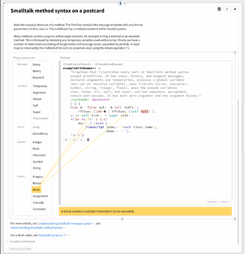
Also, here’s a simple trick straight from Glamorous Toolkit:
If Quick Guide was an application, it could directly point to relevant parts of the Deskbar.
Also Tipster could be a complement.
Having a label beside the Deskbar logo would require testing with all supported languages, ensuring that the text remains on a single line and readable. That is, unless the plan is to just have Haiku as the label text.
