I take it back, anyway - I changed background to a restful deep green, and the blue leaf looks even better now! Maybe the match with the background color doesn’t really help a bit. Anyway, I think we have a winner: the way it is.
Indeed the blue can clash but any fixed colour will do. It all depends of background menu colour chosen by the user and the orange one would have certainly looked better if you had tried it with one of the dark theme around. So, I’d say give the choice between blue, orange and green original colours and maybe add the silver one. This way, it would stay the same Haiku recognizable design but, you can avoid the clash.
I prefer the ones that actually say ‘Haiku’ on them, even just capital letters in black, on a light grey background, wouldn’t clash with desktop background colours - a definite improvement over that blue ‘leaf’ logo…
1 Like
For me it looks not better on imgur… So depends on the monitors resolution, then!
Anyway, having the HAIKU-Logo this way is for now, might be the easiest good-looking solution for now!
Some of us would like to know which files to edit, and use the logo what we like!
EDIT: The HAIKU Logo should look like everywhere the same.
And the HAIKU Leaf-only is not a Logo at all!
This one with the leaf would be nice too:

Should be looked at ca. 100%:
2 Likes
Both can be disasters, at least Skeuomorphism gives us some cool looking apps even if their utility is not ideal they typically have good discoverability, because they resemble a physical object we’ve used before or have at least seen someone use.
That said non-flat designs aren’t inherently Skeuomorphism … eg windows 9x largely isn’t Skeuomorphic and neither is XP at least when compared with typical poster child Skeuomorphic designs… which evoke thoughts of tube amps and woodgrain shelves… which are silly to have on a PC. Windows Bob… now that is bad Skeuomorphism.
You could think of Skeuomorphism’s fall as the first death of VR lol… I think there will be a VR crash eventually where people eventually realize it kinda sucks compared to just using a PC normally or it has its place for a few niche uses.
1 Like
typical poster child Skeuomorphic designs… which evoke thoughts of tube amps and woodgrain shelves… which are silly to have on a PC
Bread and butter of VSTs. Skeuomorphism is still wildly popular in audio software.
2 Likes
Until that object fades into history. We’ve all seen a version of this:
9 Likes
I know this will sound pessimistic, but I’ll say outright this is a problem with Haiku tbh. No one wants to risk trying anything new.
We had wallpaper and sound contests that went nowhere, we’ve had mobile discussions that went nowhere; the truth is, I left for a while because I got discouraged and tired of hoping Haiku would start seeing itself as a serious Linux competitor… and honestly, as long as it looks the same as alpha1 and before that, BeOS R5 forever, it takes away from that goal. I know the whole community will shut pretty much any idea down faster than a rogue program in the Tron series, so why try anymore?
tbh I don’t really care the leaf stays blue if that’s how everyone wants it (and I saw most of my ideas were ugly and sucked anyway) but I do wish at least the alignment on it could be fixed only to be told that’s a ‘feature’.
I truly, sincerely, deeply hope someone out there realizes Haiku is one of the last options in the entire world left to take on the monopoly of Linux in open source. The BSDs and illumos are far smaller, ReactOS is nowhere near complete at a stage I’d compare to Windows Whistler in 2024, and I truly say all this because I believe little Haiku even in beta stage has a chance. We must defeat Linux. And someone reading this might ask how to achieve this goal, and my answer is to support the developer team — and accept new ideas, (not necessarily this one), but those from the user community like the contests that were held for nothing.
5 Likes
Well you tried, Andrew. But they aren’t very receptive are they? People who like computer code aren’t known for their aesthetic sensibilities are they? Their own personal style is a giveaway.
1 Like
Well… I wouldn’t devolve anything into personal attacks either, the developers are awesome people and keep this project going (and I do maintain a belief Haiku is a beacon of hope in a Linux-dominated space), and the user base is committed in a way I’d say that rivals Apple’s fan base, even though I think it by majority wants things to be like R5 forever. And I can say even though I don’t write anything for Haiku itself, I do love software as well ![]()
Haiku is not a linux competitor.
Haiku targets the Desktop, which is the only nieche linux is unsucessfull in.
I don’t understand why you see the leaf as a bug in the first place. Disagreeing with the artistic choice is fine. But claiming it is a bug that must be fixed makes no sense to me.
And to your last comment: We cannot defeat linux. Period.
We won’t beat linux in it’s territory: the server market, the mobile market or the supercomputer market. I honestly don’t see what your idea is there.
And for Servers, if you don’t like Linux, just use something else: any of the BSDs for example, they are mostly all great.
The contests were misguided. The sound one was held without anyone even bothering to fix the system sounds so they could be tested. Funky. My brother (who is a musician, worked for FL studio before) Wanted to make a sound design, but could not because there was no way to test it. That was utterly ricidilous as far as community outreach goes. The icon contest was good, it gave results. The other two were “eh”. since haiku has no ambition to ship either wallpapers or a sound theme in the default install there was really no point of holding a contest for them.
But now if you do have a good sound theme and want to include it you will get told “but it wasn’t in the contest” so you are screwed that way instead.
1 Like
It wasn’t an attack, not even a passive-aggressive one, just an observation of reality (albeit not a uniform one). That doesn’t mean there wasn’t a disappointed tone inherent in the statement. Hey ho, never mind.
I can’t argue this point any stronger than I have, but the fact Haiku doesn’t see this honestly makes me sad — yes, Haiku is not a server operating system and never was, but for every non-server use, Haiku is POSIX compliant, has a growing number of ported packages, runs on more hardware with every year its developed, and has a wonderful opportunity to take on Linux.
Maybe it’s delusional on my part to say we can defeat Linux. I’d certainly like to, seriously, but even if we could ‘make a dent in the universe’ and have a larger share or user base in the open source space that the public would take Haiku seriously, that alone would attract more developers to the project and make Haiku a serious alternative to a Linux-only world — which is where I believe we’re all headed (my honest guess is 2040 or so) unless there’s viable options to choose over Linux.
Google ChromeOS and Android (Linux-based), Linux in enterprise, and in Windows 10 and 11, WSL all totally dominate; if I walk around campus, guess what every student and professor are talking about (for open source)? Linux. And with good reason — it’s a monopoly.
Apple’s macOS, iOS, watchOS, and so on (in-house BSD based proprietary forks) are my personal favorite, but by God, they’re locking down everything! There’s locks on everything and it’s not the OS X I grew up with anymore!
Outside the titans of proprietary space, we’re literally left with Linux (and maybe BSD or illumos) as the only choice, unless people do something about it. You guys sadly don’t see it; in 10 years, a time traveler will visit this forum and sigh. Haiku needs to take a Linux competitor role seriously if it’s to thrive and succeed!
1 Like
Whilst I don’t see Haiku as a Linux competitor, I think it has a chance of becoming a good desktop system, but usability aesthetics need looking at, every other O/S has done, this isn’t the 1970s, it just needs tweaking up a bit to make it, at least, look modern.
All because it isn’t obvious why the leaf placement is a feature?
I have ideas on that, but of course it wasn’t my design and I’m not going to step out into the arena to make the case for it. Maybe it’s a mistake, maybe not, but while I can’t guarantee the author was a graphic design genius, I can’t guarantee you are either. This is a weird horse to ride into the recurrent theme “Haiku is doomed unless we do as I say!” The leaf!?
By what measure is Linux unsuccesful? It has probably several hundred of thousands of users on Desktop machine, most of them reasonably happy about it (otherwise they would be using or at least developing something else). Haiku has… maybe hundreds of users?
Let’s be realistic, Haiku is just a drop in the ocean.
But that is not what we set up Haiku to do. We just want to continue the legacy of BeOS. Which admitedly has its quirks and, let’s say, unusual design choices. This is the system we want to use and this is the system we are building. The fact that it doesn’t work for everyone isn’t an incident, it’s a decision. We build the system that we want to use ourselves. And we’re not even being too crazy about it, compared to a few other options.
So, yes, it remains looking like BeOS and few things get changed. Because we are here for some stability and peace of mind, in a world where everything keeps moving so fast.
If you look at any modern UI study, you will see that people are completely lost because every 3 months there is a new UI trend and some apps get a completely new look and feel and custom control - before the old apps could even all be migrated to the previous “new” style. The result is that there is not a single UI “language” that people can learn and understand anymore. So, yes, maybe the look of Haiku looks very traditional and boring and from the 1990s. That’s the whole point. That’s what we try to do. User interfaces peaked in the 1990s as everyone went into great effort to make them functional and adopted by a lot of people. BeOS was merely walking in the trail of Mac OS and Windows (and a few others such as NeXT, Smalltalk, …) there. But only a few years later, the controls were put to designers who decided that, instead of making things functional, it was more important to make them look beautiful. And usability has been going mostly down since then.
To me, the lack of change is what makes Haiku a good place to be. That I can leave one of my projects on the side for a few years, come back to it, compile it again and have it running in at most a couple hours. On any modern platform, your framework would be obsolete and unmaintained. Even your programming language may have changed and your code would not compile. And even if it ran, your app would look old and dated because there is a new UI trend. I don’t want all that. I want a stable platform where I can write an app once, call it done, and use it for the next 10 years without having to touch its code again.
That’s why all changes tend to be pushed back. That’s the first thing I worry about. Why was it done this way in the first place? What could break if we change it? It doesn’t mean a straight “no” to all changes, but a careful consideration of what compromise we’re making. Is the end result worth the effort to change things? Is the new feature that much better? Sometimes. But, after several decades of research on user interfaces, and with the current trends being to ignore that research or misunderstand it, quite often, the ideas are not that great, or maybe they go in a direction so different from ours, that it doesn’t work for us.
9 Likes
I think Haiku still has to learn a thing or two from Amiga tradition. Make UI customizable, so people could try things.
Magic User Interface was and still is the pinnacle of customization.
So, yes, it remains looking like BeOS and few things get changed.
Let’s remember what BeOS looked like.
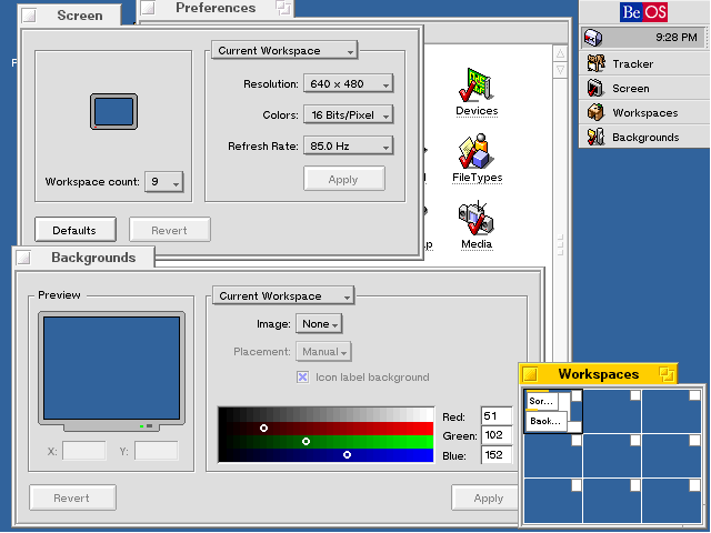
No leafs in sight, only centered logo in the deskbar. So the thing you try to protect is not BeOS tradition, it’s Haiku’s historical choice.
Is the current icon in the deskbar good? Maybe, but why not give the user a choice to pick something else?
1 Like
Going to come clean here:
I actually thought that it really was a bug, just a minor one that the Haiku developers haven’t gotten to yet or decided wasn’t a big enough problem to bother with.
Design choice or not, to the average user it prolly does indeed look like a bug (even if it isn’t).
4 Likes
Have to say I have also never really liked the leaf. When I arrived I thought that compared to BeOS it stuck out like a sore thumb. I was also not sure if it was supposed to be a feather or a leaf for quite a long time. The logo in its place as shown by @Lrrr looks a lot better IMO.
2 Likes
On the desktop,
By the measure of linus torvalds own quotes on the matter ![]()
He has mentioned in interviews beeing annoyed that the desktop, his original target, is the only area linux isn‘t sucessfull in.
I do think he means commerical in that sense, or just mainstream adoption.
But regardless, my point was more that we are not competing against linux on the desktop.
People that want to use linux on the desktop don‘t neccesarily want to use haiku or vice versa.
I can understand that viewpoint, however there was no ticket for it that I am aware of, it could have quickly been pointed out then.
I don‘t understand continuing to call it a bug after it was pointed out it was intended however.