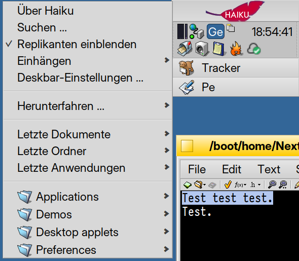
I’d disagree, it is a button that opens a menu, not a menu.
It doesn’t look like the menu entries in the MenuBar in applications.
1 Like
I know! Just saying, it is maddening to watch. I find myself talking to the screen, click the menu! click the menu! Not sure why they can’t hear me. ![]()
First boot should open the user guide in WebPositive like BeOS did. If they close it, well, other than a shock collar, not much else to do.
3 Likes
I know, right?
I was watching a BeOS review… the reviewer was going on about how the 3dmix samples were lost to time.
They’re right there on the BeOS install, if you selected the right options in the installer.
I must have missed that. Could you post it here?
Just teach to major IAs where the menu is. After all, it’s the place where people get answers nowadays. ![]()
The triadic color scheme Red, Blue, and Yellow as used by many artists in the past, like e.g. Mondrian, seems to be the original idea behind the BeOS design. At least this is my perception.
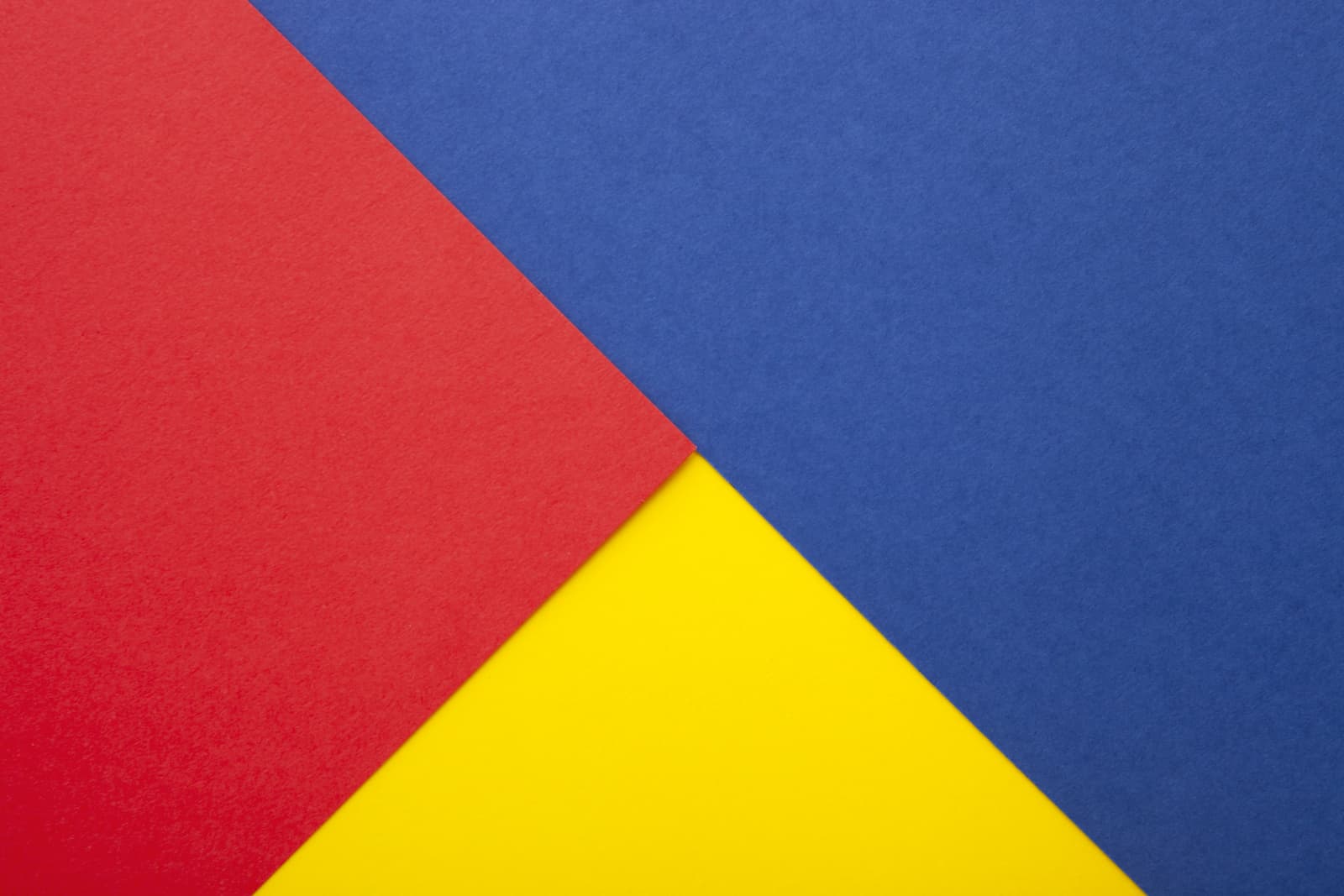
In BeOS, the blue color is in the desktop background, the complementary color yellow, which gives a strong contrast, is in the window tabs and the red color is in the logo as an accent color in the right upper edge:
Since the leaf in Haiku is blue, the red accent color is missing:
Thus I wanted to propose to replace the blue leaf with a red leaf or another red element.
4 Likes
There is no Red as such in the Official Haiku color palette. I think the original decision was to respect the contrast but expand it to a quadratic scheme with the 4 colors of the Four Seasons (Spring ![]()
![]() , Summer
, Summer ![]()
![]() , Autumn
, Autumn ![]()
![]() and winter
and winter ![]()
![]() )
)
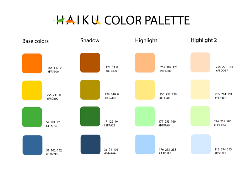
Haiku being the poetry that describes nature in all its forms seems to me to be a more complete visual concept than the three colors.scheme of the original version. It is assumed that more than an aesthetic recreation of the original, it is an Evolution of the previous one.
6 Likes
I love this idea: You are right, those colours instantly put BeOS in mind, and to me it seems a shame that the red is not present in the haiku palette. Lots of very bold colours were in use all over BeOS but there seems to be a conscious decision to use muted/pastel colours in haiku. So perhaps your idea will not gain traction, but I would love to see a mock-up or an icon set re-introducing it.
I’m not very visually astute and would never have noticed this on my own, but now you have pointed it out it instantly seems right to me, so kudos for that!
1 Like
To be fair, also BeOS had four “colors” – the 4th was grey.
And these colours seemed to symbolize a hierarchy:
1.) Red: most important, least used: Menu button of the Deskbar, logo of the root folder etc.
2.) Yellow: second most important: The Window Tabs, important for the organization of the users work process
3.) Blue: the desktop, where you put your daily used stuff – some important files, links.
4.) Grey: Genereal UI elements.
Even if the red color is not part of the Haiku color scheme, it is still presented in some icons. (Home, Trash …)
3 Likes
But actually I’d go a step further and think about, how these design principles of the four color hierarchy levels would work in dark mode.
1 Like
why isnt the blue leaf stored as a read write vector instead of being hard coded in
3 Likes
I’m really glad this bikeshedding armchair UX thread turned interesting after all, thanks to the last posters and devs!
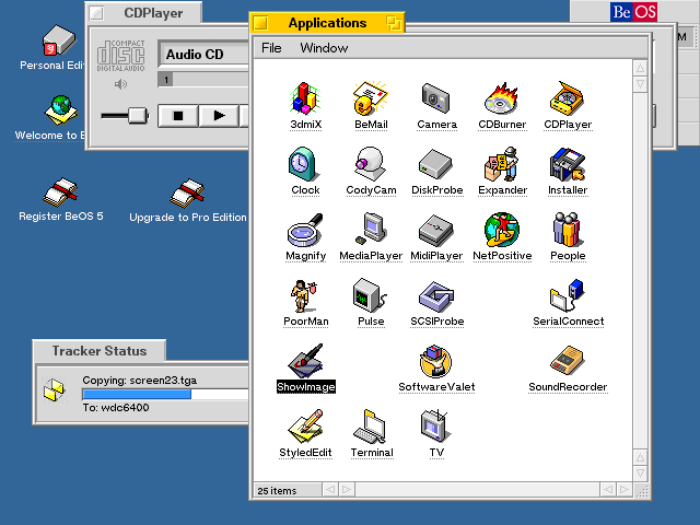
What I always wondered is why Haiku didn’t keep the original folder colors for the desktop menu and made them all blue, this seems counter intuitive to me and unnecessarily uniform. Was this on purpose?
Compares this to the original menu folder icons, e.g. the R5 PE screenshots in this article.
The blue folders are described in a bit of detail in this post by @PulkoMandy. Basically, they are virtual folders which contain apps from multiple locations. You are still free to create your own folders in the Deskbar menu which can have other colors or icons.
1 Like
Ah I remember now, thanks. But he also writes that it was actually an oversight and could be implemented:
That being said, this has nothing to do with the folder icons. We could certainly add the icons to the underlying folders, not sure why that’s missing, it looks like an oversight. Then I’m not sure if the icon will be “transferred” to the “blue folder”, but we can make that happen, too. It’s just a matter of someone writing the code to make it work.
There’s also an open ticket for this:
https://dev.haiku-os.org/ticket/18742
2 Likes
Did you ever submit that?
I don’t find it in the review site and I would very, very much like to see something like this happen.
It did get accidentally submitted when I had a git malfunction and pushed a bunch of changes by accident. I left the change request up to see if there was any useful feedback.
1 Like
Aaaand I just remembered that my login on the review site is still borked so I can’t comment there.
Comment here instead: there’s a nice open spot in the middle of the left pane of the Deskbar preferences where this could go; it should be pretty easy to add GUI support. Maybe just a preview of the current image with a button to pick a new one that would just copy the .hvif file into deskbar/icon.
Pretty simple, though of course my BeOS C++ experience is many, many years old. ![]()
1 Like
The Haiku logo really should be the title of the menu.
It also becomes free advertizing anytime someone sees a screenshot of the desktop anywhere online
2 Likes
Can you fix your Gerrit login and comment in the change request itself? That way your idea is not lost over time.
I would love to. ![]()
I can’t fix it myself, though, and I haven’t gotten responses on the forum and I can’t find any contact info on the review/sso site for emailing whoever’s responsible for sso.
I describe the symptoms at https://discuss.haiku-os.org/t/workspaces-command-line-was-key-combo-remapping/18551/49?u=us3r1d; if anyone can help I’d really appreciate it.