Haiku in media

In-depth look at Haiku and a fairly recent one: https://www.youtube.com/watch?v=9dyJxcSmODI

2 Likes

OSNews wrote an article about @X512’s recent progress porting Haiku to RISC-V:
https://www.osnews.com/story/133440/haiku-developer-ports-haiku-to-risc-v/

Also here:


https://hacker-news.news/post/27129305
10 Likes

Another Beta 3 review: Giving Haiku Beta 3 A Try: Thoughts & Experiences - Marc Stuff

Summary

Edited: I removed that excessive quote from this post, hope nobody minds.
It deprives Marc from well deserved traffic to his site and also may lead people to believe he had nothing good to say abaout Haiku, when only reading this part of the review.

6 Likes

Well one thing to (almost) strike from his wishlist, CudaText, not published, but @roiredxsoto has a 64bit version to test, and I’ve got a 32bit recipe in the pipeline :slight_smile:

5 Likes

I’ve never bought the magazine “Linuxuser” before, but for some reason I got stuck on this shelf in our kiosk: A benevolent article on Haiku and its history and development. Unfortunately in German only, but I was very happy that Haiku didn’t just appear as a side note.

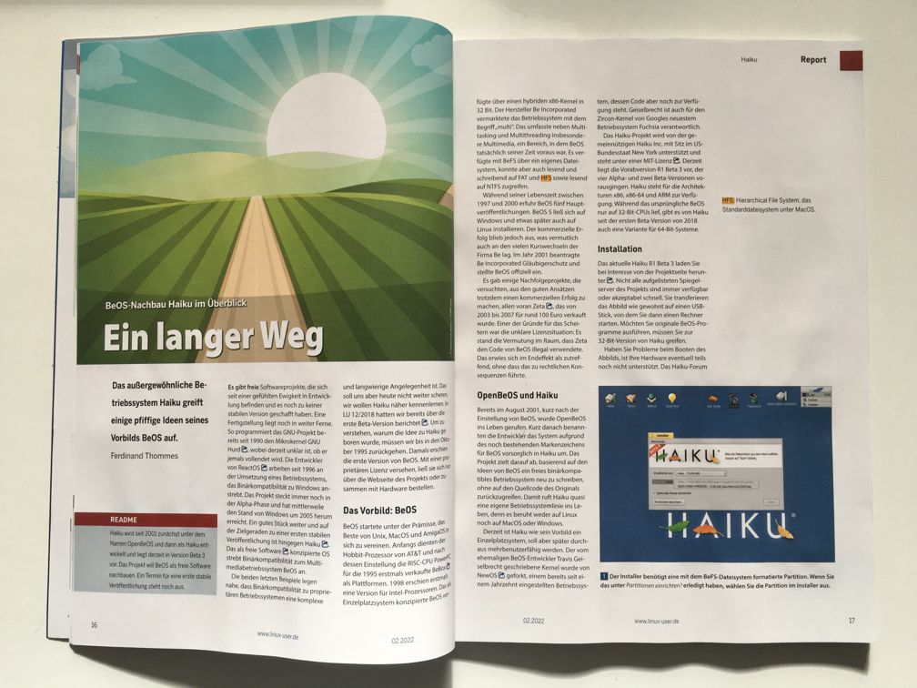
IMG_6594

IMG_6595

https://shop.computec.de/de_DE/einzelhefte/einzelausgaben/linuxuser-02-2022/2060574.html

11 Likes

That article looks really interesting.
Is that the whole article in your photo or has it more pages?

The article contains six pages in total. I would like to translate it for you, but I don’t want to run into copyright-trouble :frowning:

1 Like

I managed to track down a copy. The article is overall quite positive and states that with the steady progress over the years, it is to be expected that there will at some point be a 1.0 release. It concludes that Beta 3 is already quite usable, but not quite suitable for production use yet. The rest of the article is primarily a description of the features, including a spotlight on the package management system.

They start with a comparison with ReactOS and state that Haiku is much closer to being a finished system than they are.

The only real critical point mentioned is the discoverability of the applications menu (and again the leaf is mistaken for a feather). This is consistent with problems I see many first-time users face in youtube video reviews. Some never figure out how to start an application, leading to less than optimal reviews.

The solution might be to display a smaller leaf icon and a title like “Applications” on that button.

1 Like

Little by little, it seems Haiku is slowly approaching critical mass.

1 Like

I only wanted to know if it makes sense to buy the magazine or if it’s only the same text I can already read in the photo,thanks :smiley:
I’ll try to get one if I can,to read the other 5 pages.

2 Likes

You may have a look at
https://www.linux-community.de/ausgaben/linuxuser/2022/02/beos-nachbau-haiku-im-ueberblick/

4 Likes

Thanks,that seems to be the full article of the print edition,so need to buy the whole magazine anymore :slight_smile:

A problem that would be solved by taking one minute of time to look at our excellent user guide. Something that seems to be beyond the capabilities of most reviewers. Also applies to their statement of “you can only find the web browser if you know that it is called WebPositive”.

That said I think the main question we are facing in this regard is: Do we give in to this behavior and “dumb down” the interface (putting “Click here to find the applications” on top of Deskbar, renaming the core applications to exactly what they do, eg. Tracker → File Manager, WebPositive → Web Browser) or do we stay on track and just live with the criticism. I am leaning more to the second option myself.

1 Like

Discover ability should be a prominent ui feature. The leaf being mistaken for a leaf is also, problematic.

Probably should be adressed

1 Like

Live with the criticism. Even Internet Explorer is no more. What does something called “Edge” should do ?

One idea that just ocurred to me, while installing one of the nightlies : would a desktop background during the install, darker then the normal so not to distract from the install dialog, but showing the Tracker menu expanded ( and only it, no other icons on the desktop ) help in part of the cases ?

Also, people that are trying to do a review of something should try to learn and understand that something, instead of complaining because it is not the same as some other thing they prefer.

4 Likes

The thing with the user guide is that people just don’t seem to find it, even though it is right there on the desktop. I think the best way to address this would be by offering a quick visual wizard-type tour on first launch, similar to how Apple introduces new features.

A version of that concept could be implemented very easily with a basic message box at first launch saying “Welcome to Haiku! Would you like a quick tour of the system? You can always view it later by double clicking the icon on the desktop.”. If the user clicks “View Now”, it would launch the quick start guide in the browser.

As for Tracker and WebPositive, I think so far every reviewer has ultimately figured them out without too much effort, which unfortunately cannot be said of the application menu.

Just making a button say what it actually does can hardly be called dumbing down the interface. But it would dramatically improve clarity. I’d say the best user guide is the one the user never needs to read.

The only application I would really consider renaming would be PoorMan. Calling it “PoorMan Webserver” would make its purpose immediately obvious. Some reviewers could not figure out what it is supposed to do, even after launching it and playing with its settings. Most other programs are usually fine in that regard.

2 Likes

I always wondered, why we do’t have a hey open deskbarmenu like command in the first boot script?

2 Likes

There is a quick tour and userguide icon on the desktop. If people don’t click there, guess what they will do with the quick tour window? My guess is they will go “I know this, it’s a UNIX system!”, close the window, and start messing around. Especially video reviewers who really want to do “I know what I’m doing and I’ll show you guys” type of videos, and not “I just sit there for an hour reading the user manual of an operating system”.

Video reviews are not the same thing as normal users getting their hands on the system. The fix for better video reviews is making a press kit with some help for reviewers (here’s the things to take care of in setting up your VM so you don’t run into network problems, here’s how to start apps, here is a few cool features to show). And also don’t forget to “roast” these people in their youtube comments (kindly and politely of course) so they don’t do such a mistake again.

We can also improve the user interface, of course, but it doesn’t have to be so dramatic. Subtle changes like a little arrow/triangle on the leaf button could do a lot already.

6 Likes

When it comes to the user guide, I fear that they genuinely just overlook the desktop icon or ignore it since there is just so much new stuff to take in, or ignore it expecting a lengthy tech manual. It doesn’t really strike me as a conscious decision to ignore it, more like people being used to there being a lot of random default stuff on their Windows desktops.

If it’s really them actively ignoring the icon to prove how smart they are, then I’m afraid they probably won’t really look at a press kit either,

1 Like