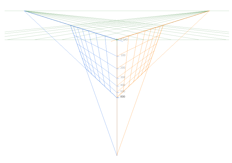
One thing that I feel could help when drawing icons is the option to have perspective guidelines/grid, with the option to snap to the guidelines. The guidelines should be configurable, but the default one should adhere to Haiku’s Icon Guidelines.
Ticket #8758 talks about an idea similar to this. In its case, though, it doesn’t make a mention about snapping to the guidelines. Maybe you could add your comment mentioning that there. Oh, and, if you haven’t already, you can upvote it .
In practice only the front-bottom corner angle is really important and should correspond from icon to icon, while the top-rear corner may vary. The height of the icon determines the other perspective lines, so those will vary as well (along with their corners).
You can simply draw that front-bottom angle (based on the illustrations in the Haiku Icon Guidelines documentation), then save it as a .hvif file and append it each time you start a new icon to make sure you get it consistently right.
But yes, that ‘help angle’ can of course be built into IOM as an improvement.
Now the menu item does something: it loads a image from a hardcoded path. The image disappears as soon as it looses focus. At least it can be moved around and rotated.
The progress I’ve made so far was mostly going down a dead end. I’m going to have to write the code differently if I want to allow treating reference images like any other shape.
The question is if the reference image needs to be modifyable like Shapes.
Adding Transformers like Stroke and Contour isn’t needed.
We could also dispense with moving and rotating. I think we can assume the user already has a vaguely square icon-like image for a reference. It could also be pre-edited in an image editor. And even if isn’t a perfect fit, it can serve as a reference for creating Paths and the Shapes can later be moved and rotated.
We also don’t need to duplicate and reset/freeze transformations.
So we’d really only need a bitmap as un-editable background, similar to the transparency checkers grid. The checkers should still be visible, of course, so the reference image should be added half-transparent.
The menu item “Add reference image…” could move into the “File” menu.
I disagree, moving and morphing it should be doable. Otherwise I can just put the image in ShowImage next to it. Or worse have to edit the image every time and replace it if I’d like to have it in a different place on the canvas.
The idea is not to make a generic image editing tool here. The use for this feature is quite specific:
You already have an icon, but it isn’t in a vector format
You want to manually design something that has the same general shape (probably with the Haiku native style)
So, the image should be at the right size and shape already and fill the whole area. It is convenient to have it overlaid with the icon you are designing to quickly position your new shapes at the key points in the icon, and match the original. That would be harder to do if the reference is in a separate window.
I agree with humdinger here, if you want to do something more complex, you’ll have to do it in some more advanced tool, Icon-O-Matic is not meant for it. And when you’re done, you can import your finalized reference into Icon-O-Matic as a single bitmap.
Beeing unable to move the reference icon, or beeing able to skew it makes the part of aligning paths difficult or impossible unless you painstakenly indeed edit the pocture in another programm and reimport it as another reference image.
I disagree with the assertion that reference icons are the right size and fill the area, if they use another style they probably are not doing that, moving or scaling the image is crucial to get a proper base to work from.
If this is the plan, we should note the following:
original upstream icons almost never can be used as-is because the difference in the projection. Nowadays most project uses simple 2d shapes as icons
it is not possible to transform a 2d icon into Haiku projection (correct me if you disagree), therefore we cant just “draw over”, or align points using the original icon
if we start to draw an icon, we will cover the original icon with a different shape (because the difference in the projection), therefore this new function quickly looses its utility value as we progress with the icon design
to make possibe to see the already covered part of the original icon a “quick transparency toggle” could be implemented, which would allow to switch every existing shape to become ~25% transparent on-the-fly without affecting the defined styles
Without the described toggle i personally dont see much point of this “reference image” feature. One can argue simply being able to see the original icon in the IOM window (to eliminate the need to having open an extra image-viewer window) would allow us to maximize the IOM window size, but then it simply needs an additional view beside the vector design area, and it shouldnt be covered by the new icon design.
Not all icons have to be in the 'Haiku projection". T’Would be nice, but few people are really good HVIF creators. Having an approximation to a port’s 2D icon is better than many apps sharing the standard 3-cube icon.
Instead of having the reference image layer at the bottom, we’d of course superimpose it half-transparently to avoid obscuring it with our Shapes.
There should be a way to quickly toggle the reference image on/off.
I suggest we let @Zardshard have a go at a basic implementation and explore the possibilities and pitfalls first. Then we’ll see what additional bells and whistles should be attached later.
If it turns out moving/resizing the reference image would be a benefit, I’m sure that can be accomplished. But I could imagine, even if you could align the reference image to have a few vertices match to our ideal 16/32/64 pixel grid, other vertices would just happen to fall outside it. The Paths we create in IOM will always be an approximation of the original’s lines. But we’ll see…
And having the option to superimpose a semitransparent version of the same checkered background we already have at the bottom (but sadly obscured as the icon advances) will also be nice.
I use it a lot as a visual reference: always have the 64px grid on, and just looking at the background you can see that a full square corresponds to 16px and half square corresponds to 32px.
I find it faster than constantly changing the alignment grid.
It could already be done by appending a premade version saved as an icon, but having it as a reference layer wouldn’t falsify the final hvif size as it does now, apart from being more convenient.
Having reference images act like shapes has a couple of advantages:
Being able to move around reference images will allow users to overlay a perspective guide such as one from the icon guidelines. It can also be resized and moved around as the user works on different parts of the icon.
The skew transformation has not been implemented yet, but, it is likely that I will. If working with a reference image of a flat icon or an icon in the wrong perspective, being able to skew the reference image would be useful. If it is a flat icon, skewing can put it into perspective. If the icon is already in 3d, skewing each face before drawing it can help put it into the right perspective.
The opacity of the reference image can be adjusted in the already existing properties panel.
The user can put the reference image above everything, below everything, or only above some things as they see fit.
The user can use multiple reference images at a time, like having the checkered background as a reference image while having another reference image of the thing they’re drawing.
Alas, in this case the code will look very different depending on which path I go with.